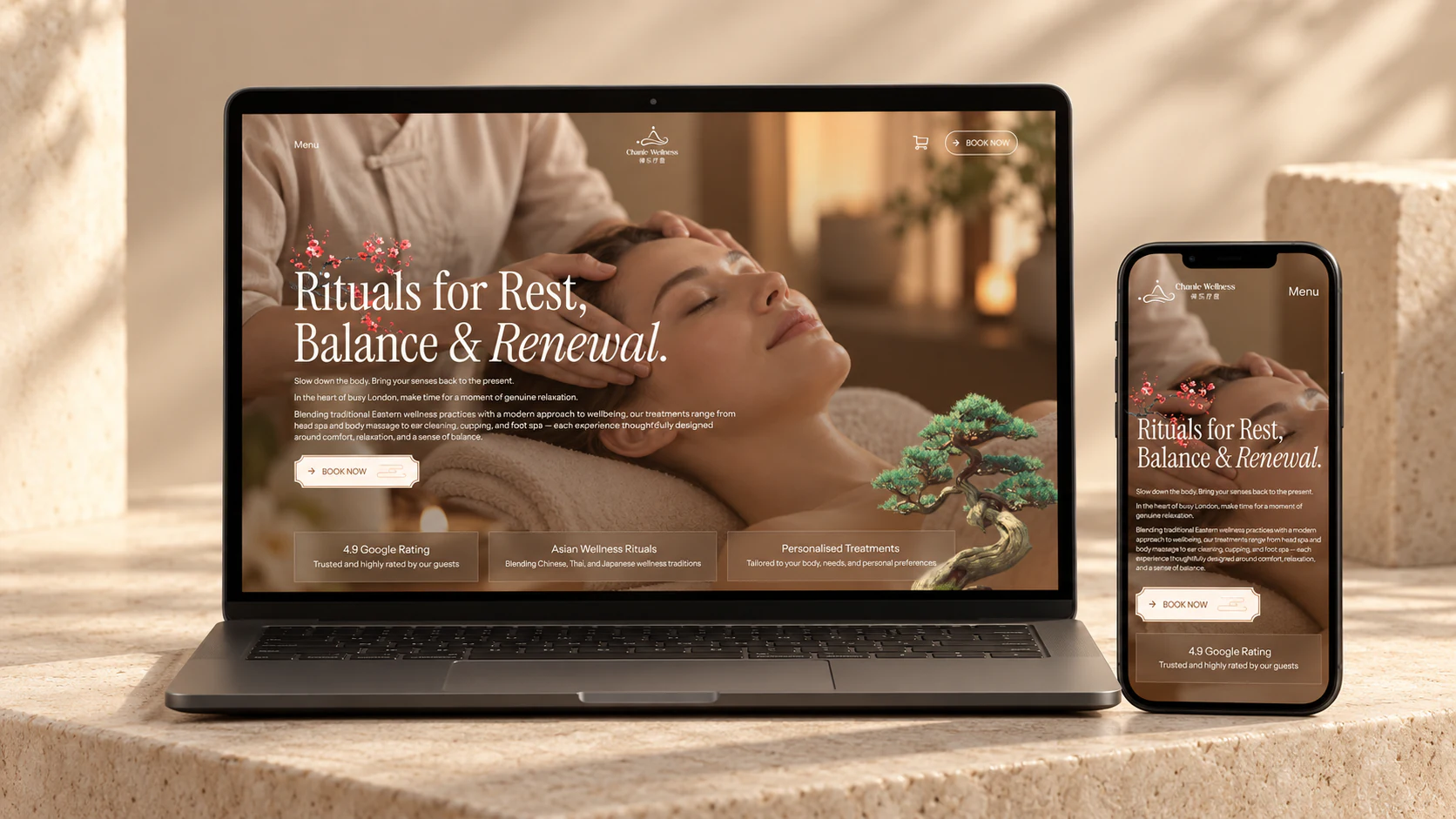
For today's corporate websites, “building a mobile website” usually no longer means developing a separate site on an m. subdomain disconnected from the desktop version. Instead, it means using Responsive Web Design or creating a Mobile-First layout tailored to mobile viewports for common situations such as opening a page in WeChat, scanning a QR code at a trade show, or landing from a mobile search. A standard corporate mobile website or responsive mobile project typically takes 2 to 5 weeks (10–25 working days) to develop. The actual time depends on the number of page templates, interaction complexity, and scope of backend interfaces.
1. Development timelines for different types of mobile websites
| Project type | Business use cases | Core pages and functionality | Standard delivery timeline |
|---|---|---|---|
| Campaign or trade-show landing page | Product launches, advertising campaigns, and lead capture through QR codes at offline trade shows | 1–3 core long-form pages, anchor navigation, lead capture forms, and WeChat share-card setup | 1–2 weeks |
| Standard responsive corporate website | Brand presentation, key product introductions, case studies, and business inquiries | 8–15 pages with distinct layouts, including responsive breakpoints for desktop, tablet, and mobile | 3–5 weeks |
| Large B2B product catalog or multilingual mobile site | Product selection by multiple parameters, PDF downloads, language switching, and CRM integration | 15–30+ page templates, mobile filter drawers, multilingual routing, and inquiry interfaces | 5–8 weeks |

2. Time required for the four core stages of mobile website development
- Mobile information architecture and viewport planning (3–5 working days) Mobile screens have limited width, with common viewports ranging from 375px to 430px. A multi-column desktop layout cannot simply be scaled down. This stage identifies mobile visitors' core tasks—for example, converting a complex desktop Mega Menu into a clear hamburger menu or a fixed bottom conversion bar for calls, WeChat inquiries, and inquiry submissions. It also confirms that the first screen communicates a clear value proposition above the fold.
- Mobile UI and touch interaction design (5–8 working days) Designers create dedicated mobile layouts and component specifications in Figma. Particular attention goes to touch targets (a minimum button target of 44×44pt), mobile typography hierarchy (body text no smaller than 15px–16px to avoid automatic browser zoom), and form entry, including opening numeric keyboards and reducing optional fields.
- Responsive frontend development and performance optimization (5–10 working days) Frontend engineers implement the site with modern CSS Grid/Flexbox and fluid typography. Because mobile network conditions vary, development must also cover on-demand loading of WebP/AVIF images at appropriate pixel densities, preloading critical first-screen resources, and deferring scripts as needed, so that mobile Core Web Vitals measured in Google PageSpeed (LCP, INP, and CLS) meet their targets.
- Real-device compatibility testing and deployment (2–3 working days) The site is reviewed on real iOS devices, using Safari and WeChat's built-in browser, and on common Android devices. Checks focus on details such as on-screen keyboards obscuring fields, fixed bottom bars being clipped by full-screen device safe areas, and broken WeChat sharing thumbnails. The site is deployed after acceptance testing passes.
3. How can mobile website development time be shortened?
If your business has a fixed launch date, such as an upcoming industry trade show or product launch, prepare approved brand identity assets, key product specification sheets, and high-resolution original photographs before the project begins. Use the phased delivery approach described in Website Development and Design Implementation: launch the core pages first and add secondary sections through subsequent iterations. This can establish the core mobile conversion journey in as little as 10 working days.