Key Takeaway (TL;DR)
Creating a sense of three-dimensional depth on a two-dimensional physical screen is fundamentally a process in which visual cognition jointly decodes seven monocular depth cues: occlusion, relative size, height in the picture plane, linear perspective, texture gradient, shading and shadow, and atmospheric perspective. JVDS emphasizes that excellent digital visual quality does not come from blindly piling on heavy pseudo-3D effects. It comes from making every depth cue in a composition obey the same geometric and optical laws, using minimal, restrained elements to establish clearly ordered spatial layers.
1. A Three-Dimensional Illusion on a Two-Dimensional Screen: Seven Monocular Depth Cues
Even with one eye closed and binocular disparity unavailable, people can still judge the relative distance and order of objects on a flat canvas or retinal image. This perception comes from the brain's inferences based on seven monocular spatial cues.
- Physical occlusion: an intact foreground covers the background: The strongest, most irreversible depth cue; continuous outlines establish front-to-back hierarchy.
- Relative size and picture-plane height: near objects appear larger, with the horizon as reference: Retinal image size for objects of known scale, and their spatial positions relative to the horizon.
- Linear perspective and texture gradient: parallel lines converge and textures grow denser with distance: Lines meet at vanishing points, while microscopic surface particles change progressively as viewing distance increases.
- Light, shadow, and atmospheric perspective: tonal relief and gray-blue distance attenuation: Surface illumination and cast shadows establish physical elevation, while scattering by airborne particles reduces distant contrast.
- Interposition / Occlusion: The strongest and most irreversible depth cue. When object A's edge remains continuous while object B's outline is interrupted where they intersect, the brain necessarily reads A as foreground and B as background. Occlusion establishes clear front-to-back order, but cannot alone indicate how many millimeters separate the two layers.
- Relative Size: When two objects are known to have similar physical dimensions, the one producing a smaller retinal image is perceived as farther away. Introducing a familiar scale reference such as a person, pencil, or coffee cup instantly establishes the image's physical sense of depth.
- Height in Plane: From an ordinary ground-level viewpoint, objects closer to the horizon tend to appear farther away, while objects lower in the image are read as nearby foreground at one's feet. This rule, however, depends on a clear reference horizon.
- Linear Perspective: Parallel lines extending toward the horizon, such as runway edges or ceiling grids, appear to converge at a vanishing point in the distance. The convergence represents infinity, while the expanded end represents the nearest viewpoint.
- Texture Gradient: Originally uniform microscopic surfaces, such as grass, woven carbon fiber, or brushed metal, gradually shift with distance from full, distinct nearby texture units to dense, blurred distant ones.
- Shading and Shadow: Transitions between illuminated surfaces (highlights) and unlit surfaces (dark areas) reveal the orientation of an object's three-dimensional curvature. Cast shadows on a supporting surface establish the object's physical height above that surface and its point of contact.
- Atmospheric Perspective: In large-scale scenes, Rayleigh scattering by suspended particles in the air reduces the contrast of distant objects, removes high-frequency detail, and gives them a characteristic gray-blue cast.

2. Spatial Resonance Between Classic 3D Games and Digital Interfaces
Lionhead Studios' classic god-simulation game Black & White achieved exceptionally striking three-dimensional immersion on two-dimensional monitors for its time.
- The camera moves between clouds, mountain peaks, and tiny villages; the divine hand cursor occludes trees; road paving converges toward distant vanishing points; and a thin atmospheric mist veils forests across the valley.
- The crucial point is that all cues refer consistently to one physical universe: the sun's elevation determines the length of a giant creature's shadow on the grass, the direction of shadows on unlit mountain faces, and the illuminated sides of village houses. None of these cues conflicts with another.
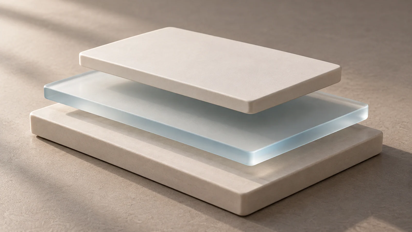
In contemporary digital UI and web layouts, the end of the flat-design era and the rise of modern neumorphism and glassmorphism likewise represent a restrained return of these seven cues at the interface scale. Soft, diffused shadows under floating cards (shading), translucent frosted-glass blur over underlying lists (occlusion plus atmosphere), and the physical displacement of a sliding side drawer together create an orderly, three-dimensional digital workspace.
3. A Four-Dimensional Comparison Matrix for Depth in Corporate Website Design
To help design teams eliminate spatial confusion and achieve sophisticated depth in corporate website design and product rendering, we have distilled the following four-dimensional matrix.
| Experience Dimension | Frequently Used Core Functions / Assets | Infrequently Used but Necessary Functions / Assets | Redundant Distractions / Pseudo-Functions / Formalism |
|---|---|---|---|
| Layer occlusion and modal behavior | A physically intuitive z-index hierarchy: navigation > drawers / modals > floating cards > base canvas | A lightly darkened backdrop overlay beneath an open modal to reinforce depth | Multiple dialogs overlapping one another with indistinct boundaries until the current focus becomes impossible to identify |
| Shadows and elevation | A unified global virtual key light, such as illumination from the upper left, with progressively adjusted shadow diffusion and opacity by elevation | A slightly expanding shadow on card hover to simulate a small physical lift | Three cards casting shadows left, right, and downward respectively, destroying spatial coherence |
| Product perspective and realistic rendering | Strict adherence to realistic one-point or two-point perspective and camera focal length, such as a standard 50mm human-eye-equivalent view | Realistically scaled references, such as a holding hand or office desktop, to communicate the product's actual size | Forcing an oddly distorted wide-angle product image into the same composition as a straight-on orthographic background |
| Background depth and parallax scrolling | Foreground content scrolling normally while a large background image translates gently at 0.3 times that speed | Very subtle tilt-based depth feedback using a mobile device's gyroscope | Violently moving 3D parallax effects filling the screen, making visitors dizzy and seriously degrading rendering frame rates |
4. JVDS Practice: Unified Spatial Optics
When building flagship brand websites and premium digital products, JVDS follows a spatial engineering standard of unified physical laws.
- Define a Rigorous Global Virtual Lighting Engine: In creating design systems for leading companies, we define not only colors and type sizes but also a consistent global light vector and elevation tokens. From subtle 1dp card-edge highlights to 24dp full-screen modal shadows, the attenuation and hue mapping of every element's lighting are governed by precise mathematical formulas.
- Remove Meaningless Pseudo-3D Visual Noise: We understand that depth must serve information order, not visual showmanship. In text-reading contexts and core transaction forms, we remove all unnecessary complex three-dimensional bevels and reflections to keep the interface exceptionally clear. Precise perspective and section views are reserved for high-value moments such as industrial product breakdowns and core technology explanations, where they communicate structural beauty.
- Validate Spatial Robustness Across Devices and Layers: We rigorously test the clarity of spatial depth under different screen color gamuts and contrast levels. Occlusion relationships and Gaussian-blur edges must remain distinctly legible on both low-end office monitors and top-tier OLED mobile screens. Explore our design portfolio to experience restrained, authentic digital spatial design in which light and shadow work together.
5. Frequently Asked Questions (FAQ)
Q1: Why do some 3D renderings look fake even when material reflections are extremely detailed?
The underlying problem is usually conflicting depth cues. For example, a cast shadow indicates a light source directly in front, while the surface highlight appears on the left. Or a distant object becomes smaller, yet its microscopic surface texture remains sharper than that of a nearby object. When the brain receives contradictory spatial signals, it instinctively raises an alarm and judges the result to be a fake, low-quality model.
Q2: Is emphasizing depth still meaningful when flat design continues to dominate interfaces?
It is highly meaningful, because absolute flatness has been shown to have serious usability deficiencies: without affordance cues, users cannot tell which elements are clickable buttons. Contemporary mainstream design languages, including Apple's visionOS and Microsoft's Fluent Design, are fundamentally a rational, lightly skeuomorphic approach with rigorous physical order. They use subtle highlights, finely diffused shadows, and material layering to give the brain unconscious guidance for spatial interaction.
Q3: What is the simplest way to give a corporate website's product image an immediate sense of premium depth?
The most effective three-step method is: first, add a precise contact shadow so the product feels firmly planted on the ground instead of floating; second, add an extremely fine 1px inner highlight along the product's top edge, at 15%–30% opacity, to define the firmness of its contour; third, ensure the background has a subtle top-to-bottom gradient to establish a stable spatial reference plane.