
Key Takeaway (TL;DR)
Symmetry in design is one of the oldest and most stable laws of balance in human perception, with a natural privilege in the brain's reward system. Mathematically, it is not a rigid, monotonous division into identical halves, but a dynamic system of order woven from three classic spatial transformations: reflection (a mirror image across an axis), rotation (radial organization around a center), and translation (periodic displacement along a vector). JVDS emphasizes that outstanding commercial visuals and corporate website layouts should never resemble a mechanically cold, perfectly mirrored artificial face. Instead, they should introduce the vitality of local asymmetry into the ceremonial grandeur of overall symmetry, achieving sophisticated aesthetics through broad balance and subtle movement.
1. The Three Geometries of Symmetry: The Visual Topology of Spatial Transformations
The scientific core of symmetry is invariance: a figure still coincides with itself after a particular geometric transformation.
The Three Geometric Transformations and Dynamic Disruptions of Symmetrical Design
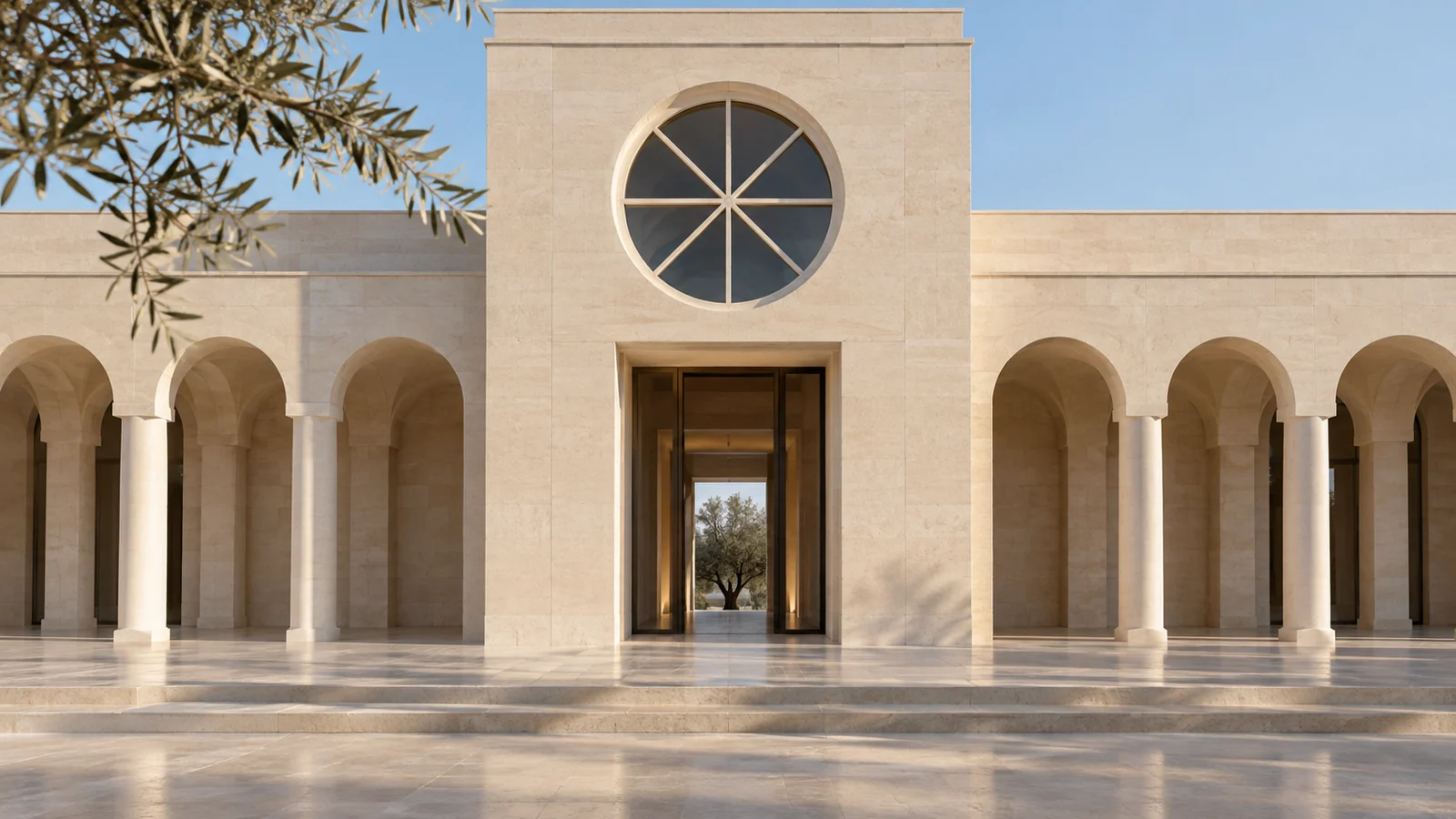
- Dimension One · Reflection (mirrored alignment across an axis): Exact mirrored correspondence across a vertical or horizontal axis awakens the gravitational balance perception associated with upright walking, communicating stability, sanctity, and sublime order.
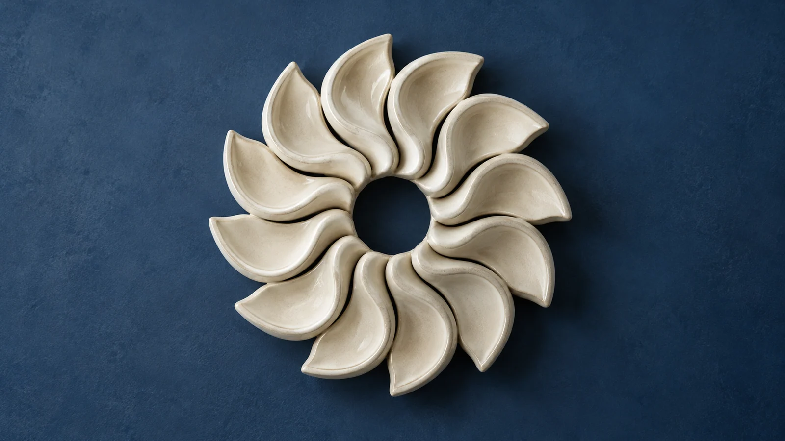
- Dimension Two · Rotation (angular radiation around a center): A figure radiates from a central anchor through specified angular displacements, breaking mechanical left-right balance and introducing powerful centripetal cohesion and a dynamic vortex.
- Dimension Three · Translation (uniform displacement without changing orientation): Elements retain their shape and orientation while repeating periodically at constant intervals, establishing a clear reading rhythm for multicolumn cards and long-form content.
- Dimension Four · Dynamic Disruption (a small asymmetrical intervention): A local departure from symmetry, such as a highlighted badge or slight displacement, is placed within a rigorously symmetrical framework to dispel lifeless coldness and introduce vitality.
- Reflectional / Bilateral Symmetry: Gravity's Mirror:
- Geometric rule: A reflection axis exists, and the forms on either side correspond point for point, like a reflection in water or a mirror.
- Psychological mapping: A butterfly's open wings and the eyes and arms of an upright human figure are typical examples. Because humans have had to walk upright on two feet within a gravitational field for millions of years, we are most perceptually sensitive to vertical reflection symmetry. It instantly sends emotional signals of profound stability, solemnity, sublimity, and sanctity.
- Rotational / Radial Symmetry: A Dynamic Vortex Drawn Toward the Center:
- Geometric rule: A figure coincides exactly with itself after rotating through a specified angle smaller than 360° around a central anchor.
- Typical examples: The spiraling petals on a sunflower's head, car wheels, and the enormous rose windows high in cathedrals. Rotational symmetry breaks monotonous left-right balance, introducing strong centripetal cohesion and radiating kinetic energy into a static plane.
- Translational Symmetry: A Stepping Rhythm Through Space and Time:
- Geometric rule: An element retains its absolute size and spatial orientation, undergoing only periodically repeated displacement by a constant distance along a particular vector.
- Typical examples: Continuous bracket sets beneath the eaves of traditional Chinese buildings, ancient Greek meander borders, and multicolumn rows of product cards in modern web layouts. Through a clear geometric beat, translational symmetry gives long-form content an unparalleled reading rhythm.
- The Grand Chorus of Notre-Dame's Western Facade: The front of Notre-Dame de Paris represents a pinnacle of interwoven symmetries in architectural history. The entire facade aligns from left to right (overall reflection symmetry); the rows of statues in the Gallery of Kings and slender arches on the second level create horizontal translational symmetry; and the enormous central stained-glass rose window provides centripetal rotational symmetry. Nested at different scales, these three symmetries each contribute their brilliance to a harmonious sacred setting that stirs the soul.
2. Common Forms of Mechanical Rigidity in Digital Layouts
In commercial websites and brand interfaces, beginners who lack a deeper understanding of symmetry repeatedly produce stiff, suffocating dead ends.
2.1 The Zombie Layout of Mechanical Mirroring
Some web designers pursue absolute left-right correspondence above the fold: if there is a large centered square on the left, there must be an identically sized square on the right; if the left contains three lines of text, the right must be forced into three lines too, even with exactly the same character counts. This rigid mirroring strips real commercial content of its individuality, giving the page the chill of a morgue. A single glance leaves audiences feeling oppressed and bored.
2.2 Mirrored Portrait Retouching That Ignores Retinal Center Preferences
Many portrait studios or novice retouchers use Photoshop's layer-flipping function to duplicate the left half of a photographed face, flip it, and cover the right half, believing this creates a supposedly flawless symmetrical face. Yet cognitive experiments indicate that real people viewing such mathematically mirrored faces immediately experience the uncanny valley, finding the person blank-eyed, dead-looking, or even alien. Genuine living things in nature always possess a subtle, lively asymmetry.
3. A Four-Dimensional Comparison Matrix for Symmetry and Asymmetry in Visual Engineering
To help teams systematically harness multiple forms of symmetry and create modern layouts with both ceremony and vitality, we summarize the following four-dimensional screening matrix.
| Evaluation Dimension | Frequently Used Core Functions / Assets | Infrequently Used but Necessary Functions / Assets | Redundant Distractions / Pseudo-Functions / Formalism |
|---|---|---|---|
| Brand marks and emblematic forms | Build the core logo through pure reflection or rotation, providing industrial-grade geometric stability and high recognizability | Introduce elegant translational patterns into supporting brand graphics to enrich the background layers of extended materials | Unintentionally misalign the two sides of a mark by 1px, creating an amateurish, rough-edged distortion |
| Overall hero structure and presence | Maintain the balance of total visual weight in the desktop framework (symmetrical balance), conveying composure | Use absolute centered symmetry boldly on solemn ceremonial presentation pages to convey supreme authority | Cut genuine corporate copy of different lengths or fabricate wording simply to force axial symmetry |
| Dynamic accent / breaker | Introduce a striking color highlight for the recommended option within an orderly translational card grid, breaking symmetry | Allow users to expand an individual secondary-detail drawer in a multicolumn translational layout | Distribute everything uniformly with no emphasis or disruptive focal point to guide the eye |
| Responsive adaptation across devices | Let horizontally translated desktop card rows collapse gracefully into vertical translation from top to bottom on mobile | Adjust the size of large rotationally symmetrical icons on mobile so they neither overflow nor become clipped | Force widescreen columns to remain side by side on mobile until each becomes a thin, unreadable strip |
4. JVDS Practice: The Symmetrical Central Axis and Dynamic Disruption
In the premium multinational brand portals, luxury watch and jewelry websites, and contemporary bespoke corporate website design projects undertaken by JVDS, symmetry becomes a sacred geometry for precisely shaping brand presence.
- The Monumental Axis as an Overall Framework: When planning official portals for global industry leaders of hundred-billion-scale stature, JVDS prohibits scattered, frivolously floating compositions. Drawing on classical architecture's central-axis philosophy, we anchor global navigation, hero flagship-product parallax, and the closing brand vision to the physical center of the screen, with deep, evenly distributed bands of negative space on either side. In its very first second, the company communicates an unshakable, temple-like foundation of leadership to the world.
- Divine Imperfection Through Subtle Motion: We recognize absolute symmetry as a sign of lifelessness and locate true luxury in controlled imperfections. In JVDS's symmetrical compositions, we deliberately introduce a dynamic element that breaks symmetry at a golden intersection: a pulsing vermilion badge on the right-hand card, for example, or a faint diagonal shaft of natural Tyndall light crossing the screen. One carefully placed asymmetry instantly animates the static order, creating a striking sense of vitality. Explore our design portfolio to appreciate the interplay of disciplined axial symmetry and vigorous contemporary art.
- A Precise Torque Balance Review of Visual Weight: Before finalizing a design, JVDS brings out its physical-torque review tool, assigning values to dark areas, text length, image centers of gravity, and color brightness on both sides of the interface. A large area of light-toned copy on the left and a smaller dark, highly saturated product on the right must reach absolute torque balance on the virtual central-axis lever, eliminating any sense of one-sided visual tilt.
5. Frequently Asked Questions (FAQ)
Q1: Why are leading luxury carmakers such as Rolls-Royce and Bentley so committed to extreme vertical reflection symmetry in their front grilles?
Because vertical reflection symmetry directly corresponds to a frontal gaze and absolute dominance in the mammalian brain! When predators such as lions and tigers stare directly at prey, their eyes and faces exhibit extremely precise left-right mirror symmetry, while herbivorous prey generally have eyes on the sides of their bodies. Through stark vertical mirror symmetry, Rolls-Royce's signature Pantheon Grille and Spirit of Ecstasy ornament project a commanding gaze toward the vehicle ahead through its rearview mirror, silencing the scene without a sound.
Q2: How can breaking symmetry improve conversion when three cards are displayed side by side in a web interface?
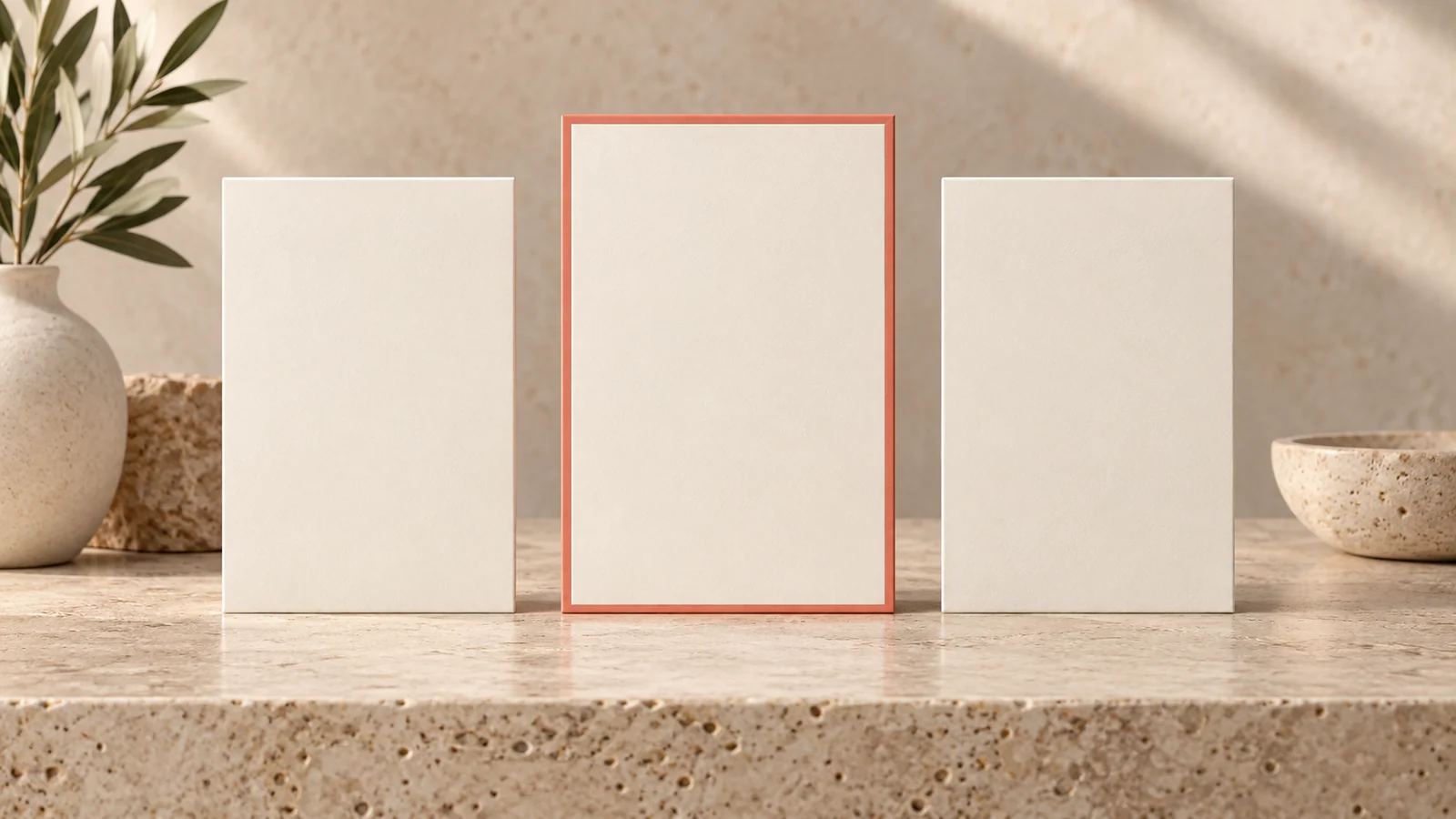
The classic approach is tier highlighting: enlarging and emphasizing the preferred package! Three pricing cards run from left to right in translational order—Basic, Professional, and Flagship. If they look exactly alike, users delay choosing. We therefore deliberately break that symmetry: raise the middle Professional card, the option we most want to promote, by 20px; give its border a bright brand color; and add a small Most Recommended label at the top. This intentional local disruption captures the audience's prefrontal attention within 0.05 seconds and sharply increases conversions.
Q3: Why did the mosaic tile patterns of traditional Islamic architecture, such as the Alhambra, take the mathematics of symmetry to such heights?
Because Islamic religious culture prohibits idolatry—the worship of images of specific people—ancient Arab mathematicians and artisans poured their lifetime's creativity into abstract geometry. On the Alhambra's walls, using compasses and straightedges, they fully derived all 17 wallpaper groups mathematically possible in the two-dimensional plane! They combined reflection, rotation, and translation in dreamlike, infinitely extensible patterns, using eternal geometric symmetry and invariance to symbolize the infinite supreme order of Allah. These achievements remain an unsurpassed summit in world art history.

















