

When creating a visual brand identity for a consumer product, such as a cup of coffee or a skincare product, you have many tangible starting points: plant ingredients, scent associations, and everyday scenes from users' lives. But when designing a brand for a deeply technical company working on foundational technology protocols, blockchain infrastructure, compilers, database engines, or AI compute layers, designers often find themselves staring helplessly at a whiteboard. The product has no physical casing and rarely even a conventional admin interface. It consists entirely of lines of code and consensus algorithms running on servers. How do you establish a visual identity for that?
Unable to think of tangible graphics, many technology companies end up using the same formula: “deep black background + glowing neon purple gradients + floating abstract wireframe spheres.” Put ten foundational technology companies' websites side by side and cover the names in the top-left corners, and nobody can tell them apart.
Let's look at smart technology branding examples such as GenLayer and see how they solve two problems: “making abstract technology tangible” and “routing visitors through different entry points above the fold”:
1. Build graphics from “structural logic” instead of piling on lighting effects to look technological
GenLayer's core business is a “multi-node consensus layer for smart contracts and large language models.” In developing its visual graphics, it avoided clichéd brains or robots and instead focused on the core actions in the business name: “layering, cross-validation, and convergence”:
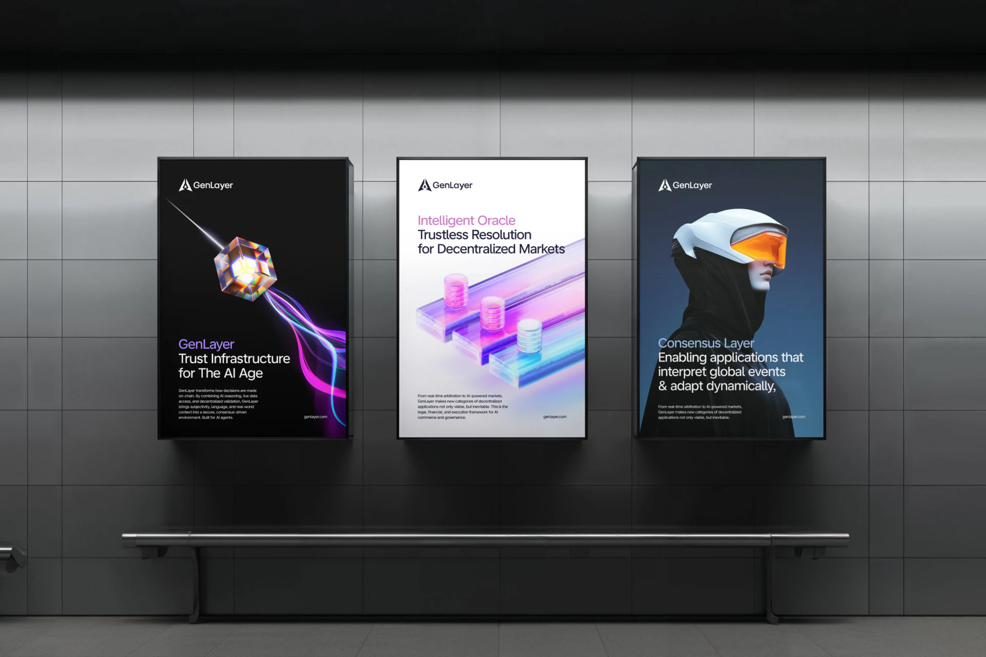
- From the logo to the entire supporting graphic system, everything is built from groups of three-dimensional slices and layered channels set at precise angles.
- The greatest advantage of these graphics is their “built-in storytelling ability”: as they unfold on the website, each slice can directly correspond to a layer of the technical architecture. For example, the bottom layer can represent compute nodes, the middle layer the validation protocol, and the top layer application interfaces. The graphics stop being decoration pasted onto the background and directly become the visual framework of an architecture diagram.
2. The entry points above the fold must immediately separate “people who read papers and write code” from “people discussing business partnerships”
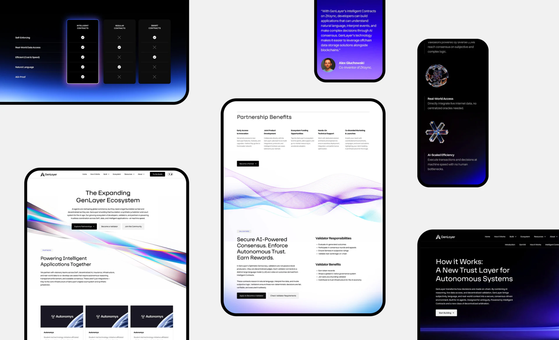
Visitors to foundational technology brands' websites fall into sharply different groups. One consists of highly technical developers, who strongly dislike empty PR language and come straight to the site for white papers, GitHub repositories, and Quickstart Docs. The other consists of investors, ecosystem partners, and senior executives, who want to see the technology roadmap, the ecosystem landscape, and typical use cases.
So, below the main visual focal point above the fold, avoid offering only a vague Learn More. Follow GenLayer's example and clearly split the calls to action into two routes, one on each side:
- The primary route is for developers:
Read the Docs / Open Playground(leading directly to a code sandbox and technical documentation); - The secondary route is for ecosystem and business audiences:
Explore Use Cases / Partner with Us(smoothly scrolling down to a visual breakdown of business scenarios). This approach—“let form follow architecture, and organize entry points by audience”—offers a useful model for Chinese technology companies developing foundational tools for large language models, industrial infrastructure software, and semiconductor chips.

















