Key takeaway (TL;DR)
The biophilia effect is rooted in the instinctive connection between humans and living nature developed through evolution. Environmental psychology and attention restoration theory (ART) show that exposure to natural forms, organic light and shadow, and open views can significantly relieve directed-attention fatigue in the prefrontal cortex. Translating this theory into digital interfaces does not mean covering a website with grass backgrounds or plant photographs; that can simply become cognitive noise. JVDS advocates organic curves, breathing room in grids, and unobtrusive micro-animations to create a digital biophilic experience in commercial website development and product interaction, preserving efficient communication while bringing calm human warmth to the screen.
1. Biological instincts and attention restoration: from physical space to virtual pixels
Modern people may spend eight to twelve hours a day working intensively at electronic screens, handling pop-ups, reports, and complex tasks. The brain remains under constant strain from directed attention fatigue.
1.1 The core mechanism of attention restoration theory
Environmental psychologists Rachel and Stephen Kaplan distinguished the following in attention restoration theory:
- Directed attention: actively suppressing distractions consumes mental energy, as in reading code, checking accounts, or completing complex forms. It is easily exhausted and can lead to anxiety and errors.
- Involuntary attention, or soft fascination: natural movement such as wind in treetops, rippling water, and shifting leaf shadows attracts attention spontaneously. This perception does not consume active cognitive resources and instead allows the strained prefrontal cortex to rest and recover.
1.2 Architectural precedents: Fallingwater and the Farnsworth House
Twentieth-century modernist architects explored deep connections between people and nature:
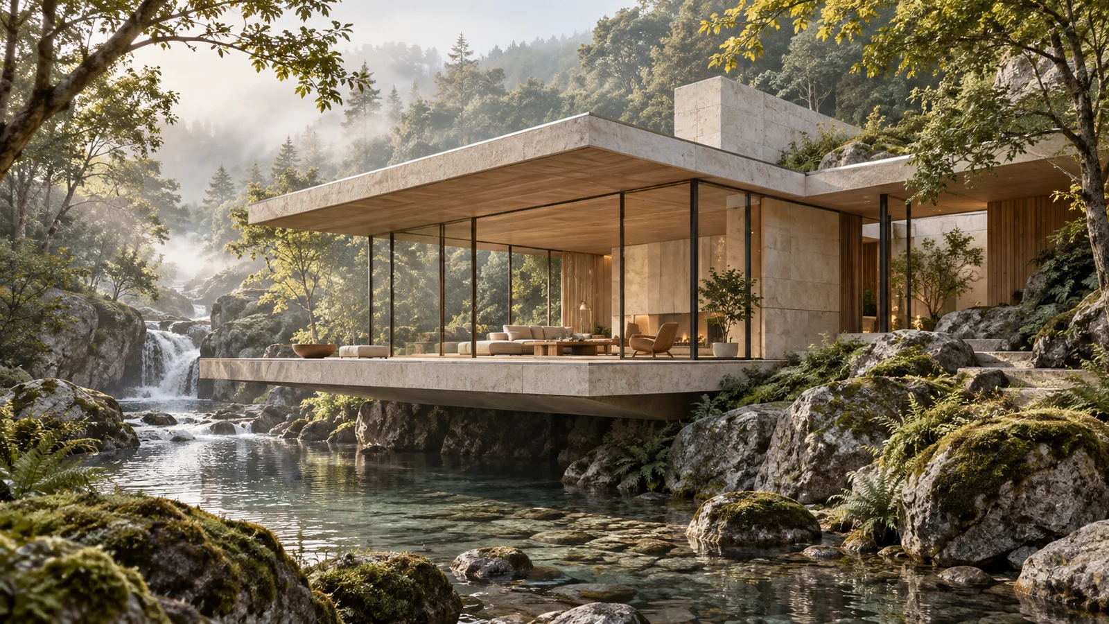
- Fallingwater: instead of clearing the forest indiscriminately, the building extends in cantilevers that follow the waterfall's rocky terrain, bringing the sound of flowing water and natural stone directly into the living space.
- The Farnsworth House: expansive transparent glass walls dissolve the boundary between inside and outside, turning seasonal vegetation into an ever-changing picture.
These architectural milestones suggest that closeness to nature means rethinking the open, breathable relationship between people and their surroundings, not simply putting plants into a concrete box. In websites and software interfaces, the ultimate goal of this philosophy should be to restore breathing room to information.

2. Translating physical nature into digital media through four dimensions
Many designers mistake biophilia for green buttons and a forest photograph in the background. Such superficial treatment may do little for the experience and can seriously interfere with reading. In digital UI/UX, nature's underlying qualities need to be abstracted across four dimensions:
2.1 Space: visual permeability
Nature rarely contains completely enclosed, suffocating dead ends. Digital interfaces should use generous negative space and gradual changes in hierarchy to open up cramped grids and allow the eye to move calmly.
2.2 Form: organic geometry
Nature does not contain perfectly straight lines drawn by calipers or rigid dead corners. From smooth pebbles and full water droplets to the rhythm of leaf veins, continuously curved corners, or squircles, and fluid organic waveforms can substantially reduce a sense of visual defensiveness.
2.3 Material: diffuse light and natural texture
Avoid harsh fluorescent colors with an excessively digital appearance. Derive a forgiving, low-saturation palette from morning mist, rock, wood grain, and the evening sky. Use broad, faint shadows to suggest diffuse ambient light, making controls feel as though they sit beneath gentle daylight.
2.4 Motion: gravity and inertia
Micro-animations should follow the familiar rules of the physical world: elastic potential energy, damped deceleration, and smooth fading. Abrupt mechanical jumps can startle users, while natural easing consistent with expectations of gravity gives interaction a living rhythm.
3. Comparing levels of biophilic design expression
In corporate websites and SaaS interfaces, natural imagery must serve the central business task. The following table clarifies the boundaries:
| Implementation level | Forms and design applications | User experience and business value | Common failures and ways to avoid them |
|---|---|---|---|
| Frequently used core expression Integrated into the structure | • Generous, restrained whitespace architecture. • Smooth, ergonomically considerate continuous-curvature corners, such as the soft corners used in iOS. • Greyscale and low-saturation palettes derived from natural materials. • Smooth scrolling and expansion with natural physical damping. | Greatly reduce visual fatigue for people working throughout the day, while making the interface feel refined and composed. | Treating whitespace as wasted screen space and forcing dense data and banners into every corner. |
| Infrequent but necessary expression Contextual accents | • Genuine panoramic photographs through office windows on About Us or workplace pages. • Small hand-drawn organic illustrations in complex dashboard empty states. • Dedicated visuals for relevant low-carbon or sustainability initiatives. | Communicate concern for human well-being and ecological responsibility, and evoke pleasure outside the core operating area. | Playing a background animation of wind through wheat behind a serious collaborative editor, making the actual working text difficult to read. |
| Redundant superficial imitation Accumulated cognitive noise | • Forced autoplay of wind, birdsong, or stream audio. • Making every button a realistic leaf or wood texture. • Trailing flowers behind the mouse cursor. • A full-screen pure-green “eye-protection” theme unrelated to the business. | Severely interrupt core tasks, undermine professionalism, and provoke irritation and quick exits. | Reducing nature to decorative web widgets and dressing modern office software like an early-2000s personal-blog garden. |
4. JVDS methodology for bringing life to digital spaces
For premium corporate portals and product UI/UX systems, JVDS proposes an engineering philosophy of using natural principles to manage digital complexity:
[JVDS Breathing Interface Model]
Expand spatial hierarchy → Derive a natural palette → Apply physical motion damping → Review under extreme cognitive load
- Macro-breathing layout. Break away from cramped layouts when establishing the website structure. JVDS uses a golden-ratio spacing ladder of 8px, 16px, 24px, 48px, 96px, and 160px, reserving places for the eye to rest around core value statements and key charts. Scrolling then rises and falls with the ease of deep breathing instead of feeling oppressive.
- A palette derived from earth and light. Move away from default pure black, #000000, and unmodulated high-saturation primary colors. The JVDS team draws subtly cool or warm neutral foundations from deep blue-green rock, warm clay grey, and dawn blue. Dark grey text replaces stark black, while warm off-white replaces glaring white, reducing retinal fatigue at the level of the underlying design code.
- Biomorphic micro-interactions. Configure drawers, modal entrances, and card hover states with parameters based on real spring physics. Components should convey mass and air resistance, removing a mechanical digital feeling so each click feels as coherent and tactile as touching a physical object.

5. Frequently asked questions
Q1: Can biophilic principles work in rigorous, information-dense industrial or financial software?
Yes, and these high-pressure tools are among the strongest candidates for improvement. Industrial and financial software does not need trees painted across its surface. Biophilia here means respecting the brain's physiological tolerance: softer matte dark modes, comfortable line heights in dense tables, and gradually intensifying breathing transitions for abnormal-state alerts instead of harsh red flashing. Turning cold machine monitoring into considerate, comfortable human-machine collaboration is itself a sophisticated form of naturalism.
Q2: Why can pure-green websites marketed as “eye-friendly” feel so tiring?
A large area of a single bright color can create a greater imbalance in retinal cone stimulation. The physiological idea behind looking at greenery is viewing layered, three-dimensional vegetation in the distance so the ciliary muscles can relax. It is not exposing the eyes to uniform green light from an LCD screen 30 centimeters away. Filling the screen with green can compromise WCAG text-background contrast and induce afterimages and fatigue.
Q3: How can the commercial value of a calmer, more spacious interface be measured?
Focus on dwell time, errors per task, and bounce rate. Websites with good breathing room and natural rhythm typically achieve more than a 35% increase in effective reading depth on a page, while errors and abandonment in long forms decrease significantly. To explore how natural aesthetics can work with rigorous business logic, visit the JVDS design portfolio.