
Design Insights
Explore case studies, design methods and practical insights across UI design, user experience, brand identity and website development.
All Insights
 Interface Design
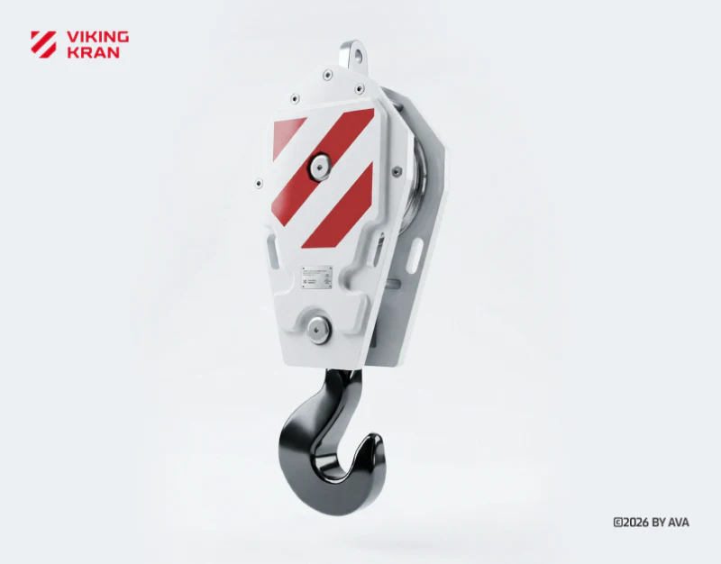
Industrial Equipment Website Design: Scene and Specs
A review of VIKING KRAN’s valley hero, model catalog, project archive, and contact page, examining the roles of scene photography and fixed specifications.
 Interface Design
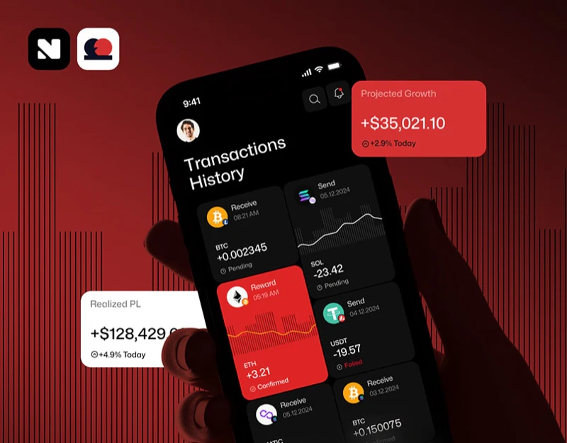
Digital Asset Trading Interface Design: Status Beyond Red
Paytech’s red branding, explicit trading statuses, swap inputs, and deposit conditions show how labels keep interface meanings clear.
 Interface Design
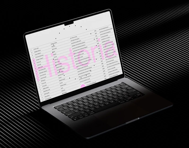
Aviation Website Design: Make Fine-Line Graphics Readable
JVDS reviews an aviation concept’s history index, airport diagram and weather matrix, asking how labels and legends explain fine-line graphics.
 Interface Design
Business Finance Dashboard Design: Scope Before Numbers
JVDS reviews Runo’s account overview and cash flow forecast, focusing on account scope, periods, currencies and links to underlying records.
 Interface Design
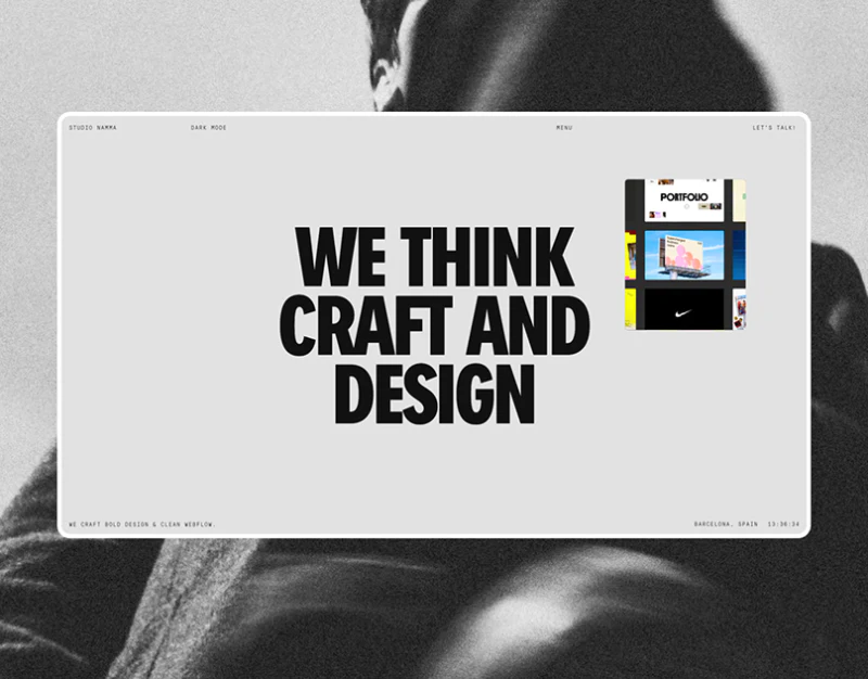
Design Studio Homepage Design: Large Type, Small Images
Studio Namma’s monochrome statements, colored previews, narrow text, and footer index show how different scales organize a studio’s identity.
 Interface Design
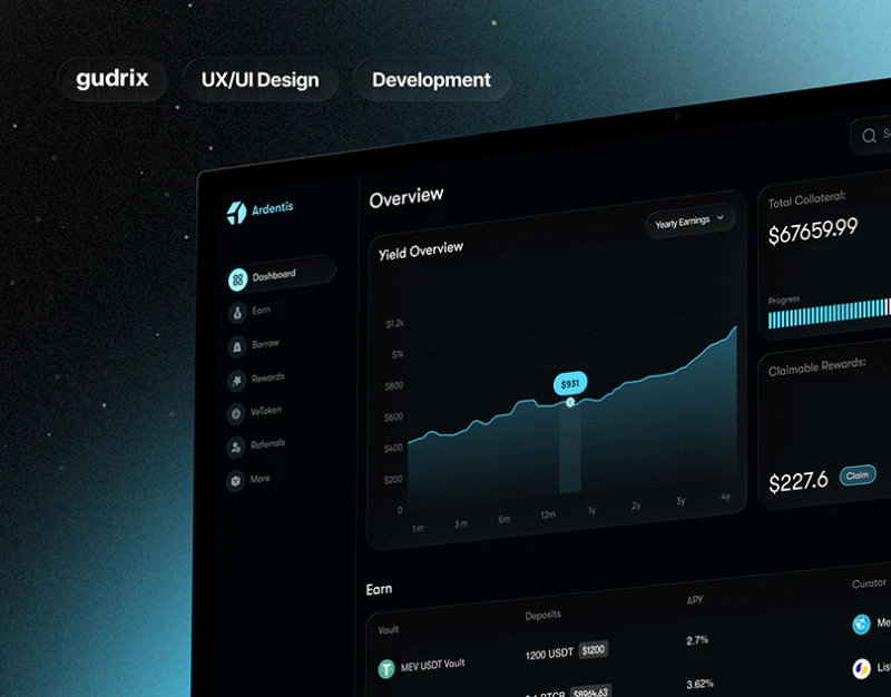
DeFi Dashboard Design: Cyan for Data and Actions
Ardentis’s dark overview, cyan charts and asset rows show how totals, personal scope and action panels are arranged.
 Interface Design
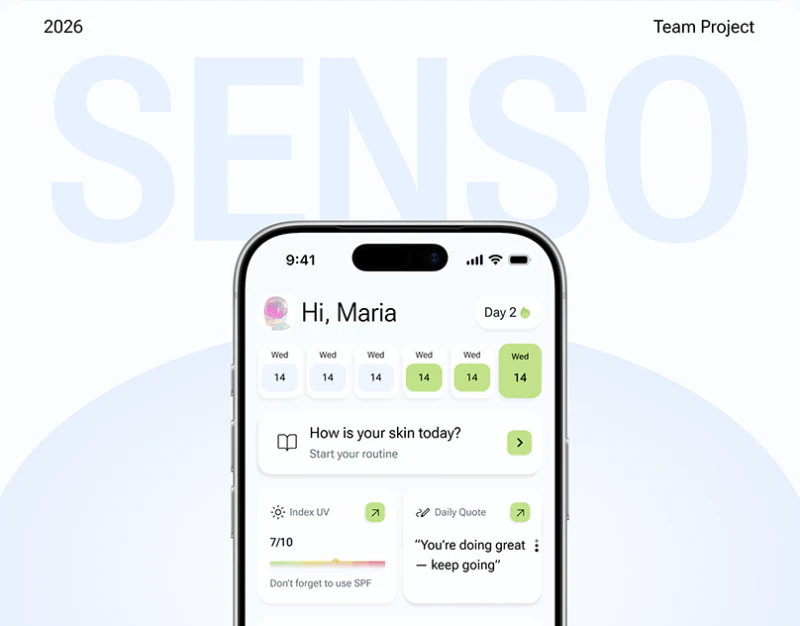
Skincare Tracking App Design: Senso’s Recording Layers
Senso’s daily plan, diary levels and review page separate quick checks, personal notes and access to past records.
 Interface Design
Personal Brand Website Design: Topics Connect Content
JVDS reviews Mark Woodland’s topic entries, life-story timeline, and media categories, examining identity and different routes into content.
 Interface Design
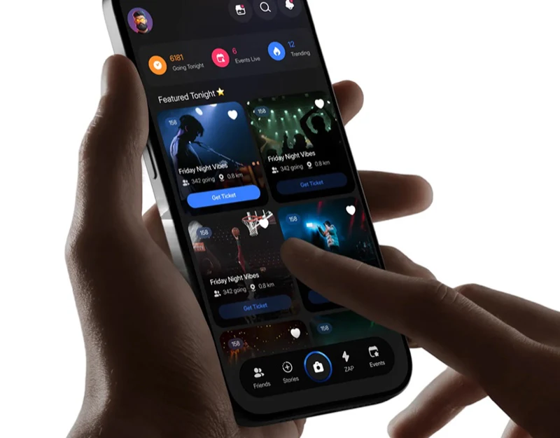
Social Event App Design: Photos, Maps, and Ticket Cards
Momento’s friend lists, event map, blue ticket entries, and checkout summary show how social interest can become a specific event plan.
 Interface Design
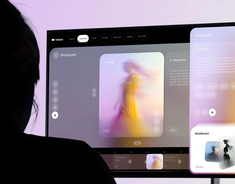
Video Generation Tool Design: Prompts for the Current Shot
VidGen’s desktop storyboard, mobile assistant, and website show how descriptions, parameters, and reference images can stay attached to one shot.
 Interface Design
Curatorial Website Design: Index and Red Features
A review of Ulysses de Santi’s exhibition archive, red feature pages, and people-and-object content, examining a shared visual language across formats.
 Interface Design
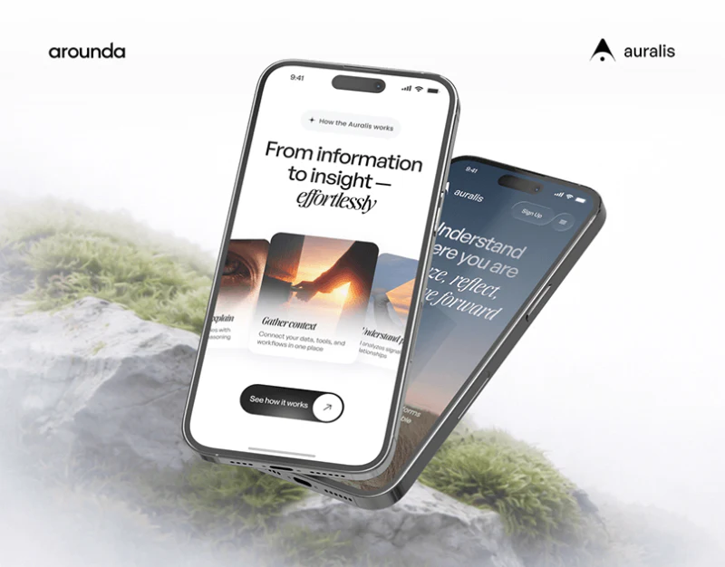
AI Product Website Design: Auralis’s Gentle Explanations
Auralis’s natural hero, curved work cards, feature grid, and mobile plans show how gentle visuals can support product explanations.
 Interface Design
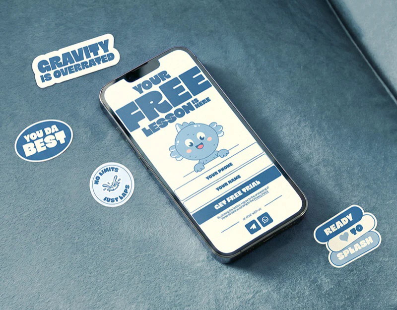
Children’s Course Website Design: An Ocean Theme
A review of SOI’s cream backgrounds, bold blue type, ocean characters, and class photographs, examining playful introductions and booking entries.
 Interface Design
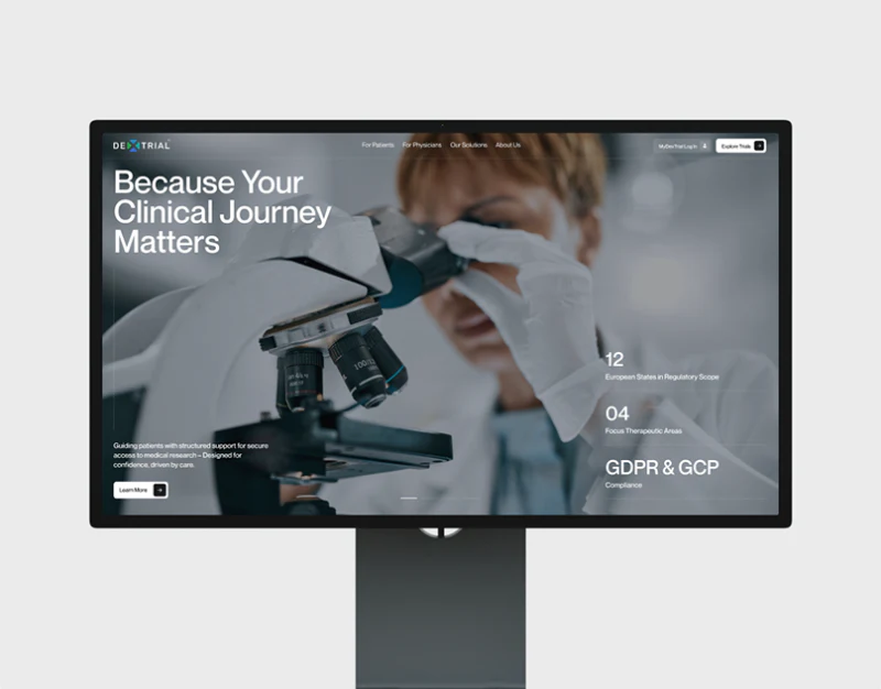
Clinical Trial Website Design: Shared Study Cues
JVDS reviews DexTrial’s role cards, patient information, study list and detail navigation, focusing on shared record identity.
 Interface Design
Bill-Splitting App Design: Personal Share and Whole Bill
JVDS reviews Instant’s personal shares, activity summaries, payment methods, and results, examining clear distinctions between splitting and ticketing.
 Interface Design
Course Website Design: Two Paths Through a Nature Theme
JVDS reviews ISA’s nature theme, course summaries, instructors, and business training entries, examining separate paths for individual and team learning.
 Interface Design
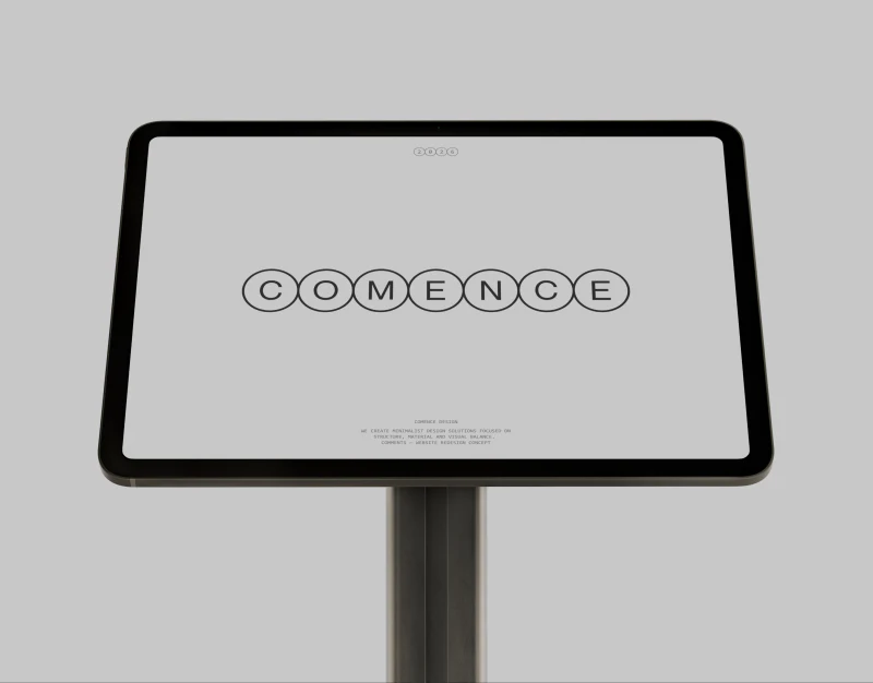
Material Portfolio Design: Name and Explain the Close-up
Comence’s concrete close-ups, project fields, and expanded descriptions show how a material portfolio can balance visual exploration with identity.
 Interface Design
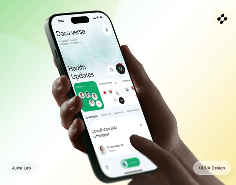
Health Service Booking Design: Keep the Choice Identifiable
JVDS reviews DocuVerse’s map cards, booking schedule and data components, focusing on service identity and the scope of each card.
 Interface Design
Recruitment Platform Design: Job Context in Chat
Review Career GO’s stage tabs, job cards and chat role summaries, and how application identity continues through communication.
 Interface Design
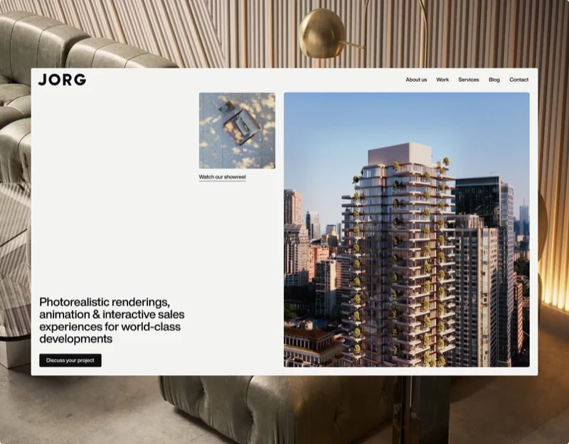
Architectural Visualization Website Design: Image Rhythm
JORG’s featured project, three-column index, facade and article page show how image proportions and text positions support browsing spatial work.
 Interface Design
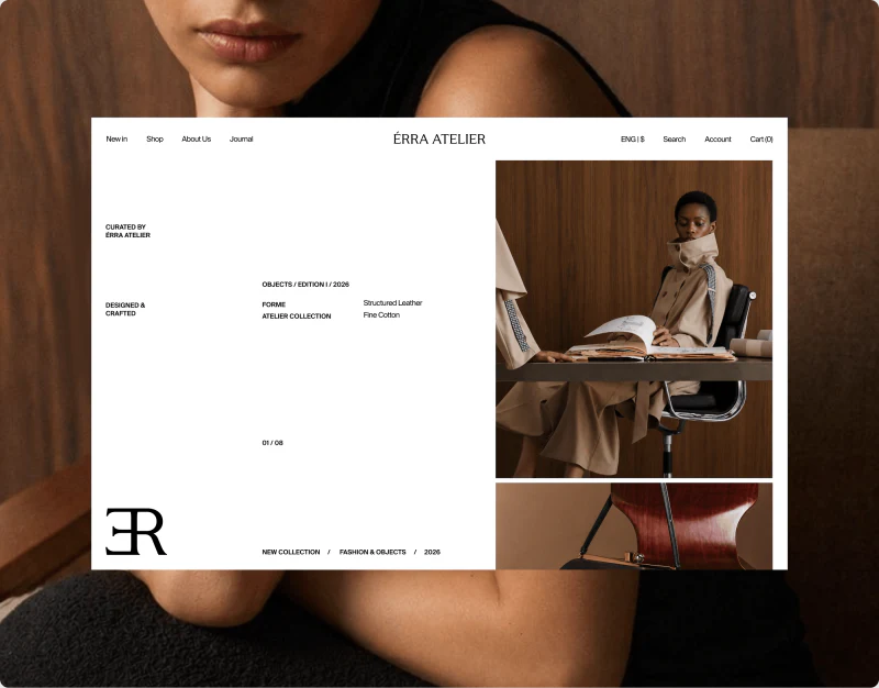
Fashion Ecommerce Design: Space for Styling and Products
A review of ÉRRA ATELIER’s editorial photographs, pale product grid, and dress details, examining space for style and specification choices.
 Interface Design
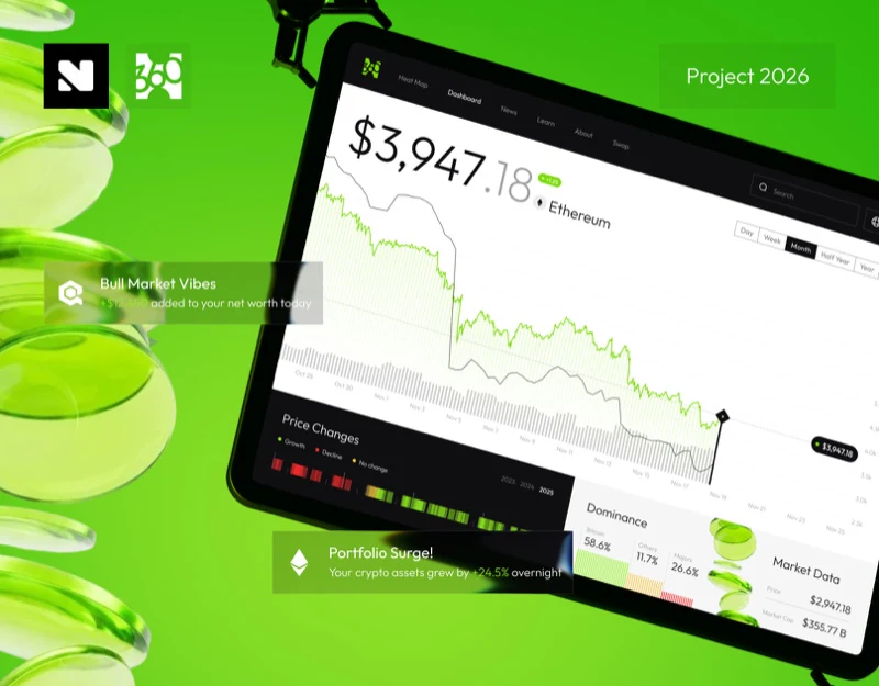
Market Dashboard Interface Design: Read Trends with Periods
Coin360’s large price, monthly curve, annual change strips, and mobile views show how time scope and information layers work together.
 Interface Design
Footwear Ecommerce Design: Heel Filters to Size Checks
JVDS reviews Marella’s footwear filters, selected sizes, and checkout summaries, following category-specific conditions from discovery to purchase.
 Interface Design
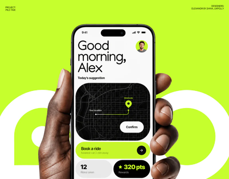
Autonomous Ride App Design: Explain the Trip State
Review Pilo’s address drawer, destination and arrival estimate, and the relationship between trip totals, optional support and Done.
 Interface Design
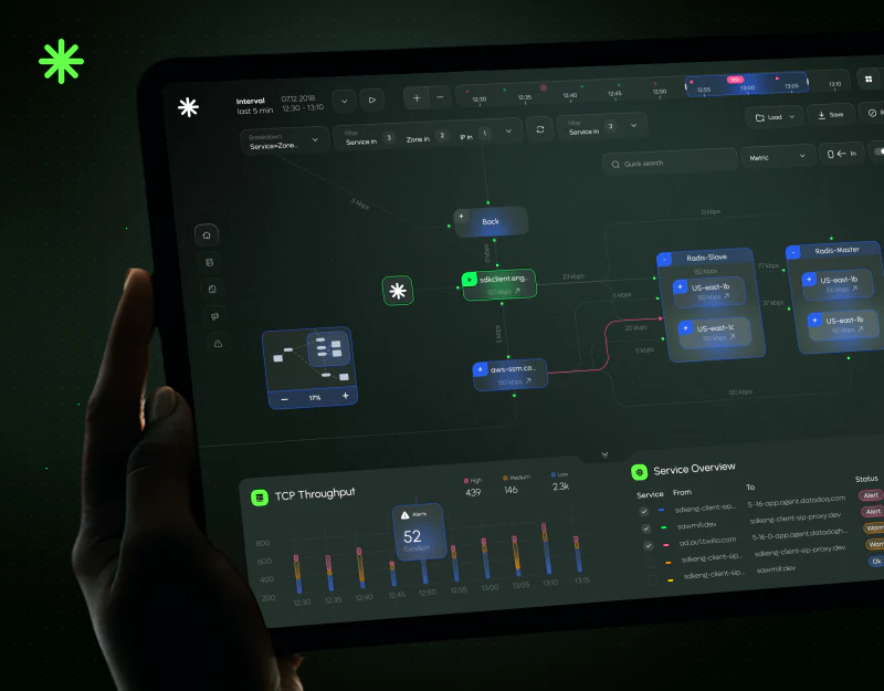
Monitoring Dashboard Design: From Topology to Status
JVDS reviews FlowTune’s service topology, mobile time controls, and alert summaries, examining consistency between objects, periods, and status.
 Interface Design
Technology Brand Website Design: A System in Blue
A review of Sui’s visual archive, mobile content, and branded charts, examining how blue graphics adapt to summaries, rules, and data.
 Interface Design
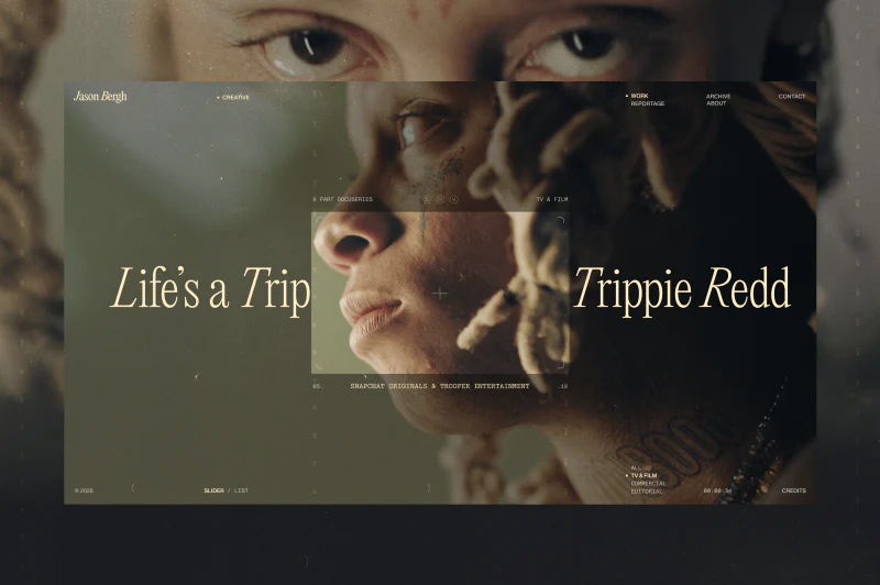
Film Portfolio Website Design: Images with an Index
Explore Jason Bergh’s layered images, project lists and categorized contact pages, and how cinematic style supports finding work.
 Interface Design
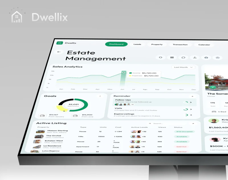
Real Estate CRM Interface Design: People and Properties
JVDS reviews Dwellix’s pale green dashboard: white cards organize dense content, and reminders give everyday follow-up actions a place.
 Interface Design
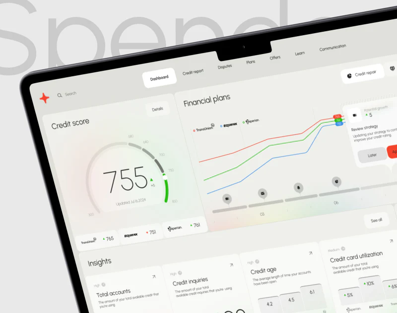
Credit Dashboard Design: Scores, Sources, and Trends
A review of Spendex’s score gauge, three agency cards, colored trends, and factor summaries, examining a dashboard that invites further checking.
 Interface Design
AI Wallet App Design: Voice Creates an Editable Draft
Review Fintora’s voice draft, transaction names, separate categories and states, and the definitions behind wallet analytics.









