
Design Insights
Explore case studies, design methods and practical insights across UI design, user experience, brand identity and website development.
All Insights
 Web Insights
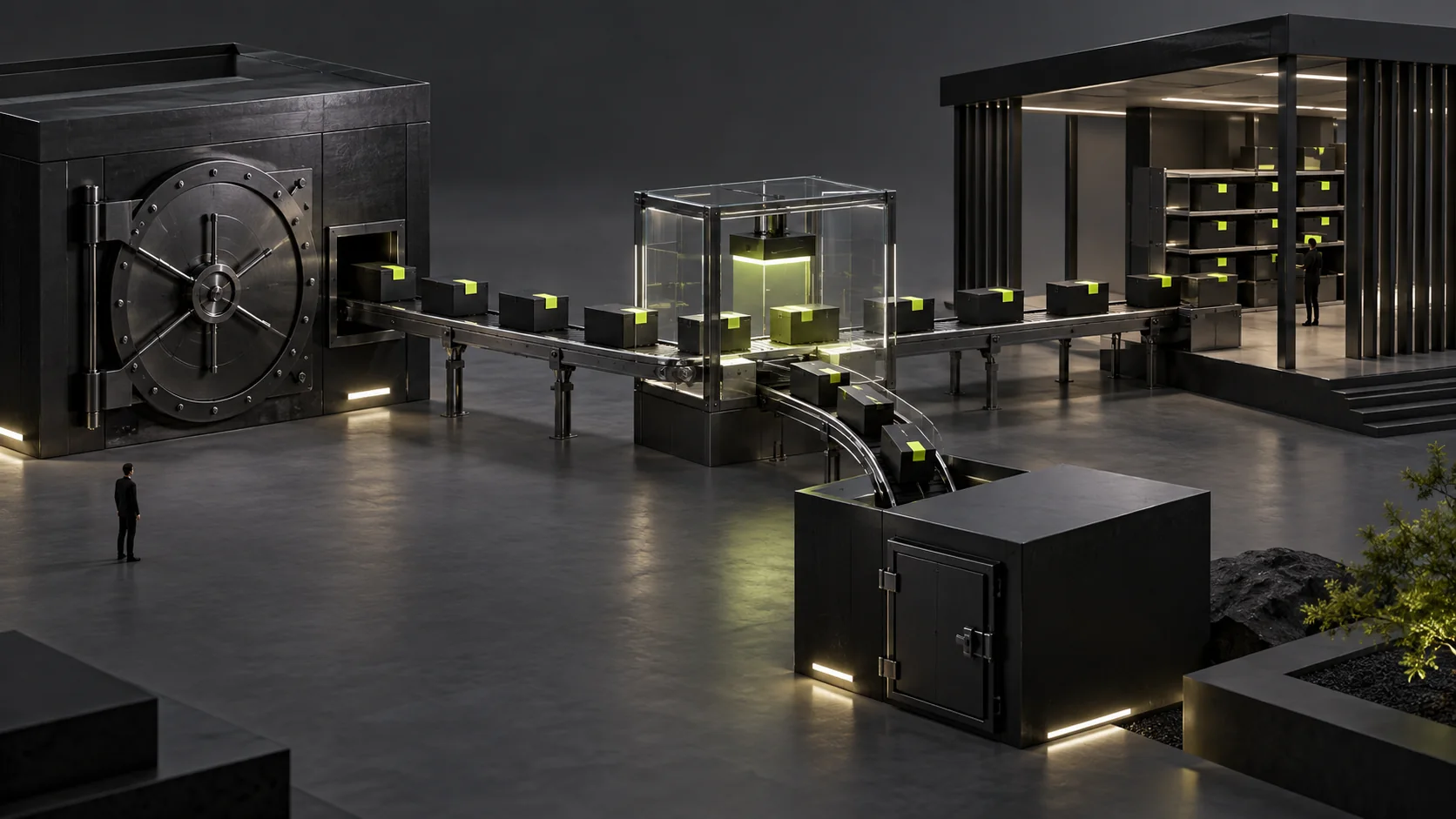
Where Should a Trade Show QR Code Lead? Keeping a Website Event Page Useful Before, During and After the Show
Check address ownership, event stages, material destinations and actual inquiry receipt to keep printed trade show QR codes useful before, during and after the event.
 Web Insights
Changing CMS During a Redesign: Should Historical Inquiries, Attachments and Follow-Up Notes Be Migrated Together?
Choose migration or read-only archiving for historical inquiries, verify record identities and related files, and define cutover handling and old-system retirement conditions.
 Interface Design
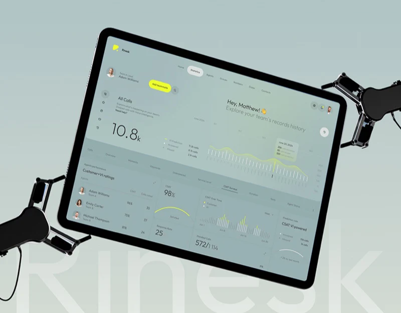
Call Centre Dashboard Design: Give High Scores Context
A look at Rinesk’s call trends, satisfaction cards and agent lists: how a support dashboard connects numbers, rating counts and reporting periods.
 Interface Design
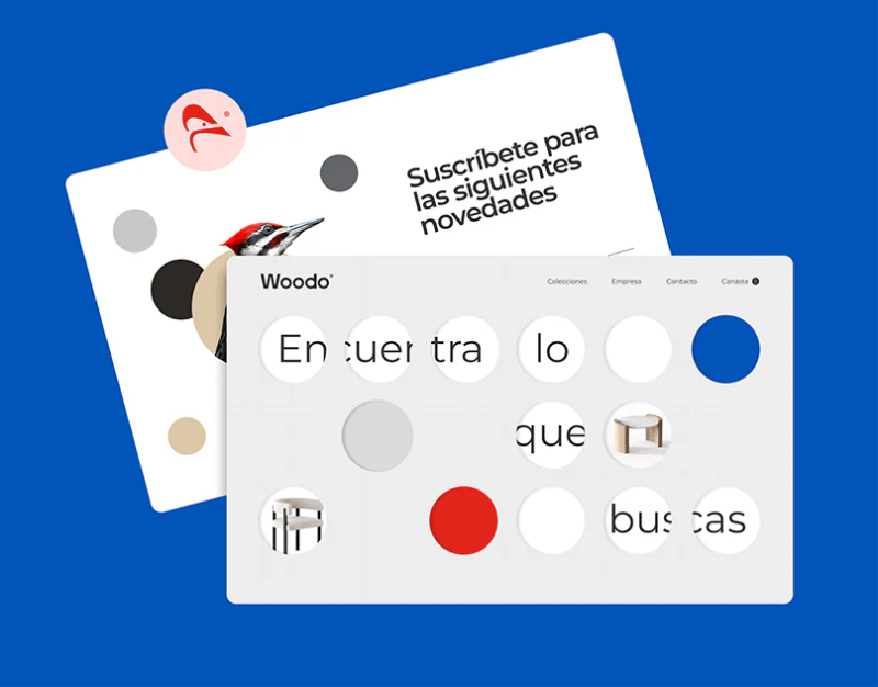
Furniture Product Page Design: Options Through the Order
Woodo’s category colors and product photographs lead into explicit dimensions, finishes and quantities retained through order confirmation.
 Interface Design
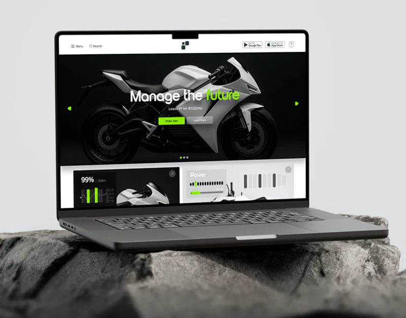
Smart Vehicle App Design: Modes and Device States
NEXA’s motorcycle site and controls separate brand presentation from mode rules, metric definitions and confirmed device feedback.
 Interface Design
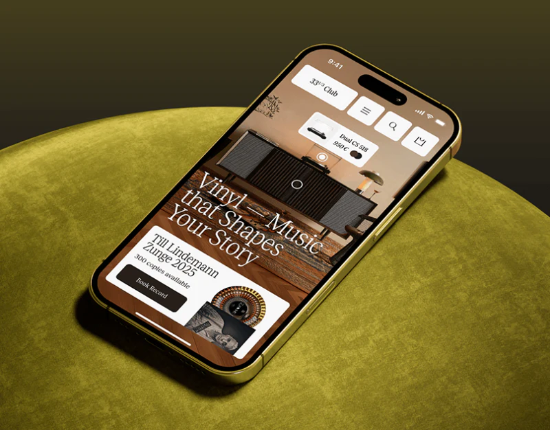
Vinyl E-Commerce Website Design: Samples and Specifications
33⅓ Club combines listening scenes, catalogs, record samples and equipment specifications, with separate event and membership conditions.
 Interface Design
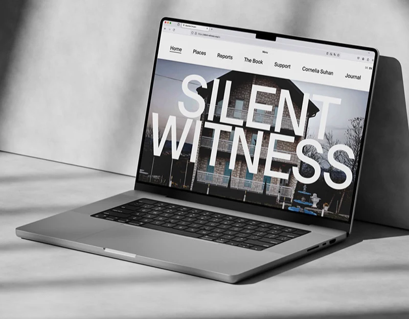
Photography Project Website Design: Beyond the Big Title
A look at Silent Witness’s architectural opening, report introduction and mobile page: how large headlines connect photography with continued reading.
 Interface Design
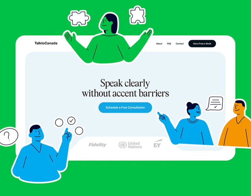
Language Training Website Design: Visuals Explain Learning
TalktoCanada’s consultation hero, activity illustrations, ebook, and FAQs show how approachable visuals can explain language-learning services.
 Interface Design
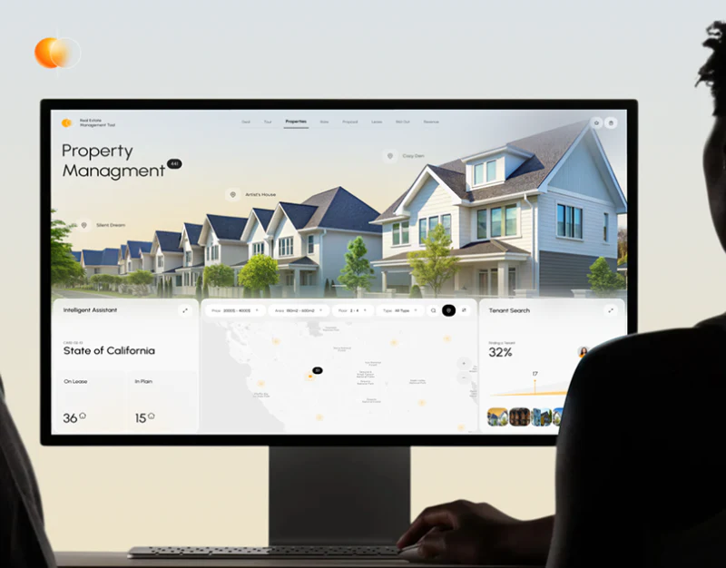
Real Estate SaaS UI Design: Scope Connects Modules
Property Management’s map, summaries and tenant tasks support cross-reference when every module identifies its properties and scope.
 Interface Design
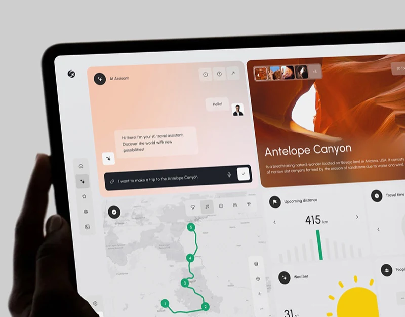
AI Travel Route Results Design: Keep Planning Conditions
A look at Geovea’s chat, numbered route and destination cards: clarify stop order, distance scope and adjustable conditions across a plan.
 Interface Design
Magazine Ecommerce Design: Align Catalog, Details and Cart
A review of Issue Ink’s catalog, product details and cart, showing why publication names, issues, editions, prices and fee explanations must stay aligned.
 Interface Design
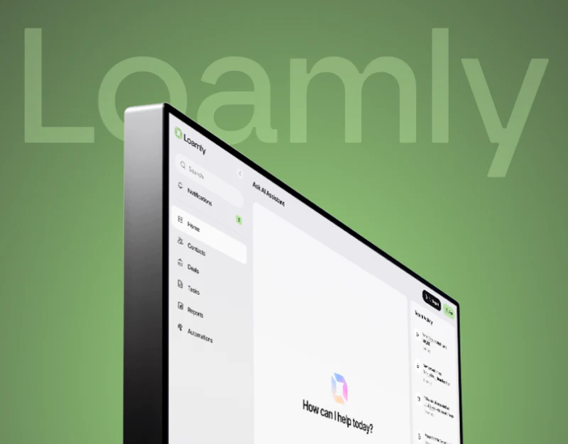
CRM Contact UI Design: Keep Context in the Sidebar
A look at Loamly’s contact table, sidebar, files and meetings: keep identity, action scope and deal context clear across the workspace.
 Interface Design
Creative Studio Portfolio Design: Connect Images to Tasks
JVDS reviews 1:30 Studio’s mixed portfolio grid, testimonial cards and mobile presentation, focusing on task labels, responsibilities and service scope.
 Interface Design
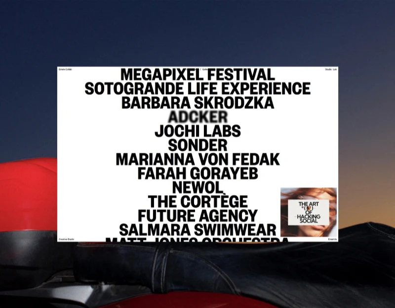
Portfolio Website Design: Keep One Project Across Views
A look at Emele Collab’s name list, project cards and numbered gallery: different browsing routes should retain project identity and position.
 Interface Design
Data Platform Website Design: Explain Inputs and Outputs
JVDS examines Quantexa’s three-step diagrams, capability definitions, benefit metrics and demo form, with attention to concrete inputs and outputs.
 Interface Design
Automotive HMI Design: Modes with Stable Core Fields
Comfort, Sport, and Eco use blue, red, and cyan rings while retaining speed, navigation, and range positions across an automotive HMI concept.
 Interface Design
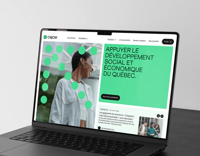
Association Resource Website Design: Carry Topics into Search
JVDS reviews CQCM’s topic labels, initiatives, news and resource search, explaining how content types and applied filters can stay clear.
 Interface Design
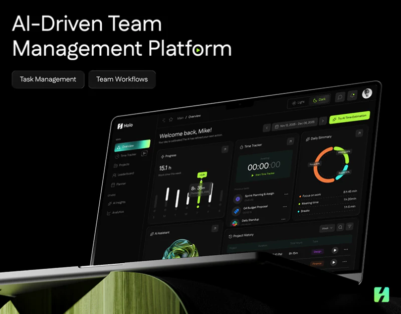
Time Management Workspace Design: Keep Time Types Distinct
A look at Holo’s summaries, timer, planner and AI tips: distinguish tracked time from estimates, and review dates and changes before saving.
 Interface Design
Technical Services Website Design: Connect Stages to Work
A review of EternaCloud’s stage cards, collaboration process and service comparisons, showing how a technical services website can clarify cooperation.
 Interface Design
Ecological Technology Website Content Design: Read the Map
Inversa’s coast imagery, scan-like terrain, ecological map and organization grid connect visual expression with defined information.
 Interface Design
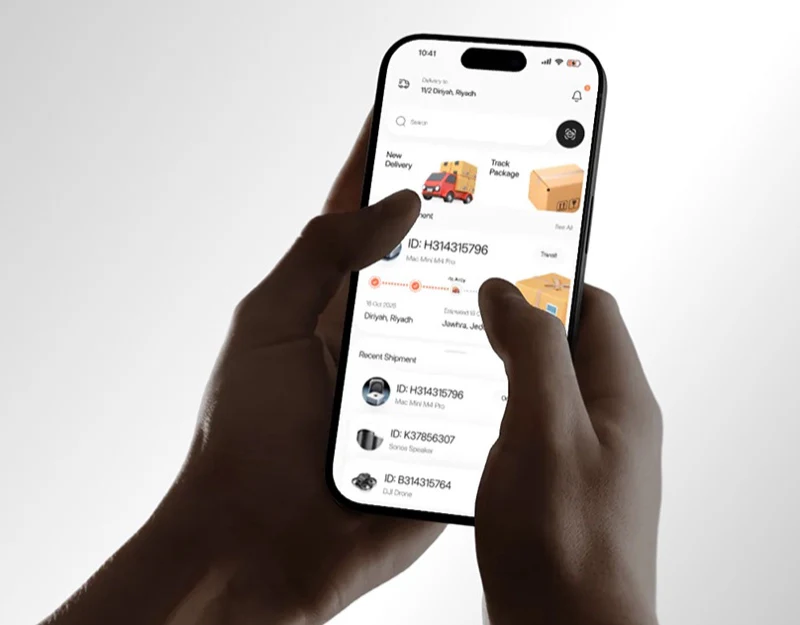
Delivery App State Design: Say What Has Succeeded
Couriq’s order identity connects home, payment and tracking, while saving cards, paying and creating shipments need distinct success feedback.
 Interface Design
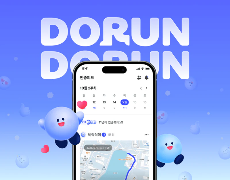
Running Social Check-in Design: Keep the Original Record
A look at DORUN’s friend map, run summary and photo sharing: preserve record identity, timestamps and readable metrics as backgrounds change.
 Interface Design
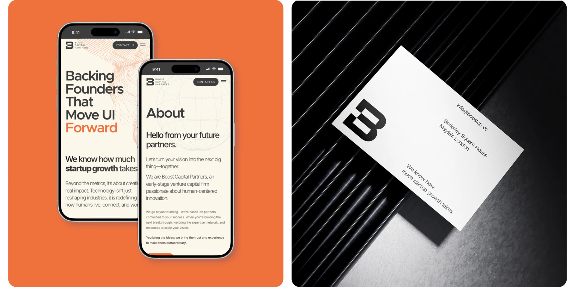
Venture Capital Website Design: People to Contact Purposes
Boost Capital’s team roles, named project cards and purpose-based contacts give visitors clear objects and ways to continue.
 Interface Design
Chat Sticker Emotion Design: One Character, Varied Replies
A character sticker set uses silhouettes, starry eyes, and gesture sketches to retain identity while distinguishing reply meanings and intensity.
 Interface Design
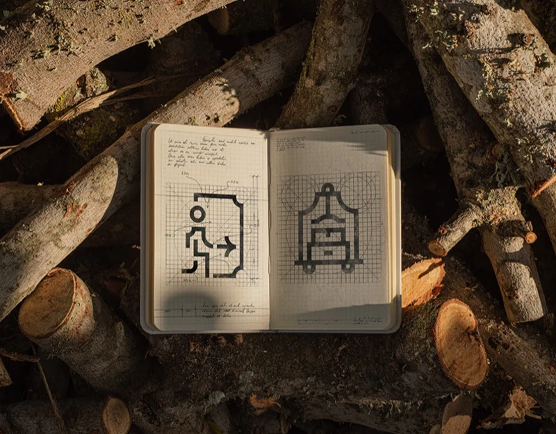
Resort Icon Design: Direction and Facilities in Layers
Evalisse’s grid, arrows and facilities share construction, while names, direction and service scope need explicit pairing.
 Interface Design
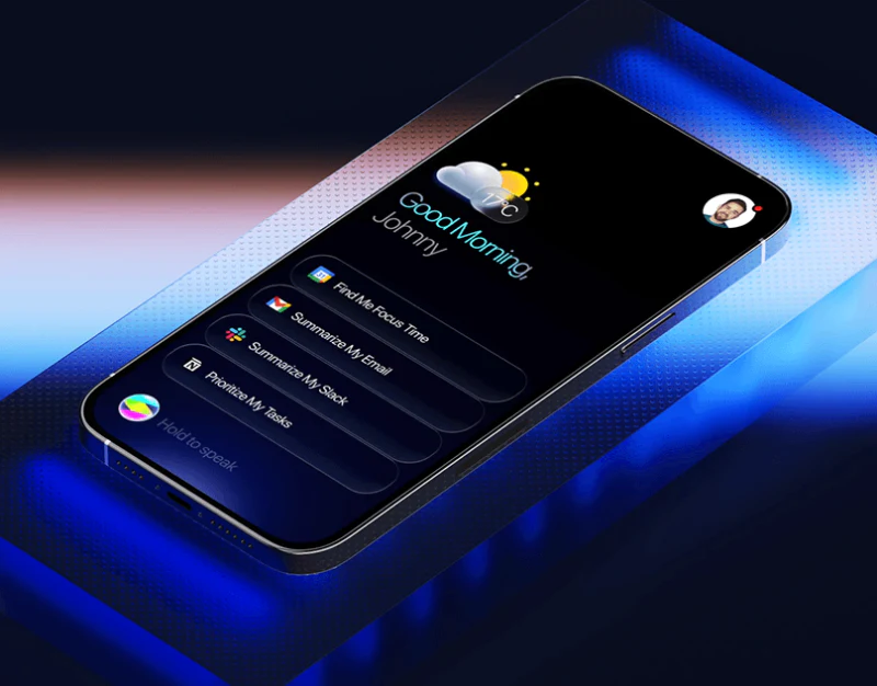
AI Agent Email Confirmation Design: Make Intent Reviewable
A look at an AI agent’s quick tasks, email wireframes and feedback: turn intent into a reviewable file, recipient and final message.
 Interface Design
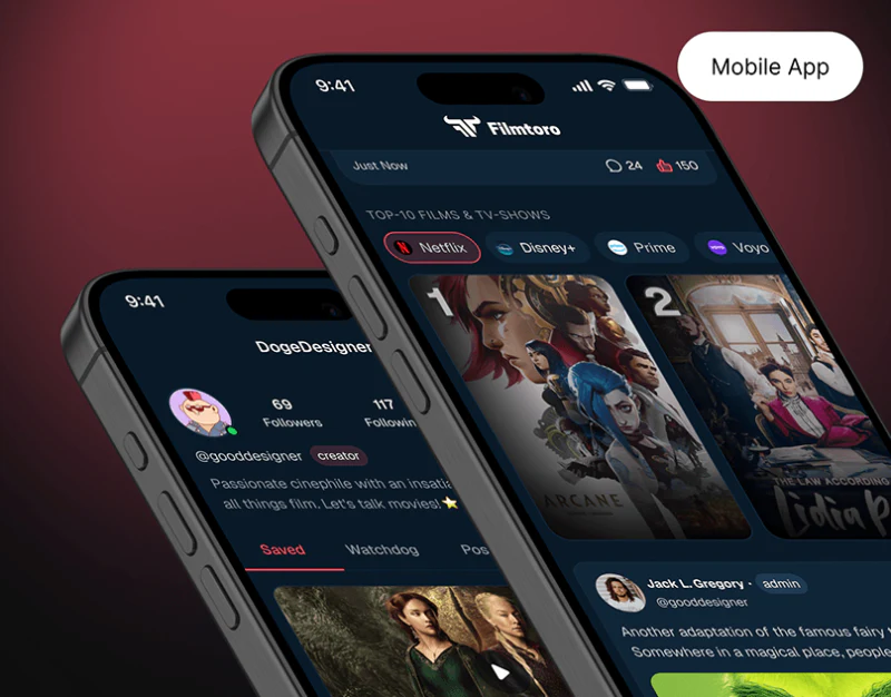
Film Community App Information Design: Forms of Participation
Filmtoro’s channel discovery, post/list/review editors, and quiz feedback show how a community can preserve distinct participation structures.
 Interface Design
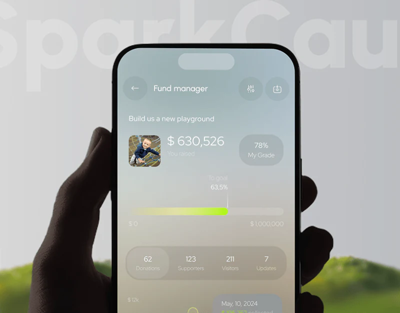
Fundraising Platform UI Design: Separate Progress and Ratings
A look at SparkCause’s public homepage and management screens: distinguish goal progress, ratings and currencies while keeping records traceable.
 Interface Design
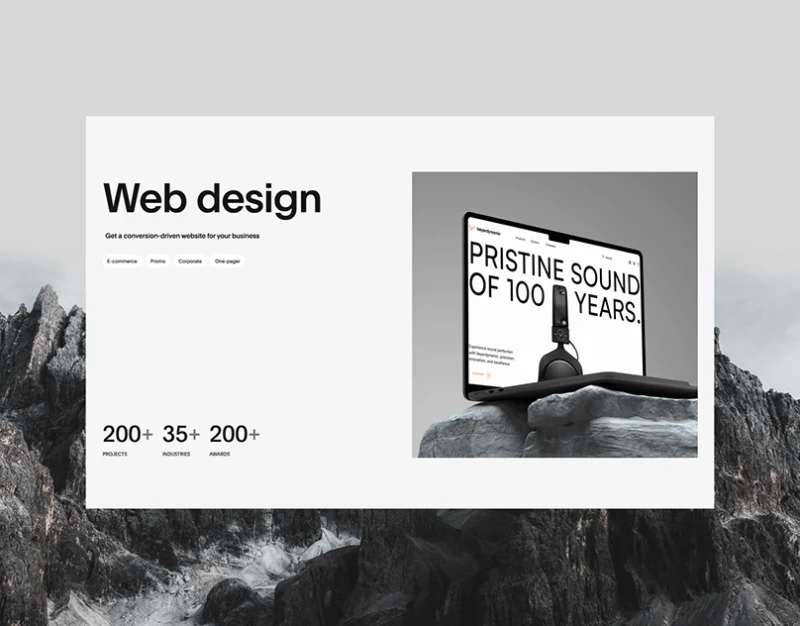
Portfolio Case Tag Design: Separate Service and Industry
Obriy’s filters, design language and contact paths help visitors distinguish service coverage from industry experience.
 Interface Design
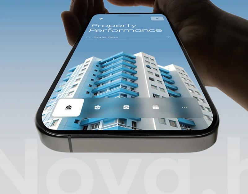
Property Analysis App Design: Objects and Metric Definitions
Nova’s property search, similar properties, and feature explanations show how scope, periods, and definitions make real-estate data understandable.









