
Design Insights
Explore case studies, design methods and practical insights across UI design, user experience, brand identity and website development.
All Insights
 Interface Design
Design Consistency: Shared Rules Without Forced Uniformity
Explore aesthetic, functional, internal, and external consistency, plus design tokens, governance, and progressive legacy-system alignment.
 Branding
Convergent Evolution in Design: Respect Mature Patterns, Innovate at the Boundaries
Explore why designs converge under shared constraints, when paradigm shifts enable innovation, and where brands can build meaningful differentiation.
 User Experience
Design for User Control: Supporting Beginners and Empowering Experts
Explore progressive disclosure, novice guidance, expert accelerators, keyboard workflows, and the safety boundaries that all users share.
 Interface Design
Contour Bias: Balancing Rounded Warmth and Geometric Strength
Explore emotional responses to curved and angular forms, corner-radius hierarchies, nested geometry, and brand-appropriate UI contours.
 User Experience
Constraints in Interaction Design: Prevent Errors and Clarify the Way Forward
Understand physical and psychological constraints, disabled versus hidden controls, upstream filtering, and forgiving input design.
 Branding
Classical Conditioning in Branding: Connect Every Signal with a Better Experience
Explore how repeated sensory cues become brand associations, why broken promises create negative conditioning, and how consistent delivery supports trust.
 Interface Design
Color Systems: Visual Hierarchy, Design Tokens, and Accessible UI
A complete guide to UI color hierarchy, the 60–30–10 rule, semantic design tokens, contrast, dark mode, and redundant state feedback.
 User Experience
Cognitive Dissonance: Building Coherent Value and Reducing Buyer's Remorse
Explore cognitive dissonance, minimal justification, and evidence-based reassurance across SaaS trials, payment flows, onboarding, and retention.
 Interface Design
Common Fate: Making Interface Motion Explain Structure
Understand common fate through synchronized dragging, drawers, staggered transitions, physical motion groups, and reduced-motion fallbacks.
 Interface Design
Comparison in Data Visualization: Consistent Metrics, Baselines, and Clear Decisions
Explore shared measurement, small multiples, meaningful baselines, misleading chart techniques, and responsive enterprise dashboard design.
 Interface Design
The Closure Principle: Reduce Visual Lines Without Losing Meaning
Understand Gestalt closure, the importance of recognizable feature anchors, and how small-size testing helps logos and UI icons stay clear as details are removed.
 User Experience
The Cathedral Effect: Matching Interface Space to the User's Task
Explore how spacious and compact environments relate to thinking, and how websites can shift from broad brand vision to focused comparison and action.
 User Experience
Information Chunking: Group by Meaning, Memory and the User's Task
Learn the difference between recall and scanning tasks, and how meaningful groups, input formatting, whitespace and interruption tests support usable interfaces.
 Branding
Baby-Face Bias: Balancing Approachability and Authority in Brand Characters
Explore how youthful character features affect warmth and perceived competence, and how proportion, context and testing can balance friendliness with authority.
 User Experience
The Biophilia Effect: Bringing Natural Calm into Digital Interfaces
Explore how natural space, curves, light and motion can inform calmer digital interfaces through breathing room, restrained colors and thoughtful micro-interactions.
 Branding
Attractiveness Bias: Turning Visual Appeal into Credible Business Trust
Explore how human imagery influences first impressions, why evidence must support visual appeal, and how authentic, inclusive photography can build business trust.
 Interface Design
Optical Alignment: Why Geometric Centering Can Still Look Wrong
Understand visual weight, optical centering and practical compensation for icons, portraits, text and responsive interfaces, from grids to component libraries.
 Interface Design
Affordances and Signifiers: Make the Right Action Clear
Learn how physical forms and UI signifiers guide action, distinguish interactive controls from decoration, and make hover, focus and disabled states clear.
 Interface Design
Why Alignment Matters in Web Layout: Clearer Relationships and Reading Order
Understand how alignment guides reading, clarifies relationships, and supports responsive grids, tables, forms, and precise interface details.
 Branding
Anthropomorphic Design: Giving Products Personality Without Adding Faces
Explore how shape, motion and tone of voice give brands and digital products a human personality while preserving usability and appropriate boundaries.
 Interface Design
The Aesthetic-Usability Effect: Why Attractive Interfaces Seem Easier to Use
Understand how visual appeal shapes perceived usability, and how to balance first impressions with task performance, accessible controls and long-term retention.
 Branding
Brand Archetypes: Building a Consistent Personality Across Digital Touchpoints
Learn how brand archetypes connect visual identity, interaction, storytelling and design-system decisions into a consistent personality across touchpoints.
 Interface Design
The Pareto Principle in UI Design: Focus Resources on Core Features
Apply the Pareto principle to UI design: prioritize core journeys, organize toolbars and menus, and preserve infrequent but necessary features.
 Web Insights
Accessible Website Design: Perceivable Information, Easier Actions and Error Recovery
Explore accessible website and UI design through multisensory information, keyboard operation, clear feedback, error recovery and practical walkthroughs.
 User Experience
Product Onboarding: Connect New Concepts to What Users Already Know
Use advance organizers for product onboarding: connect unfamiliar concepts to existing experience and introduce contextual guidance without overwhelming users.
 Interface Design
Flight Booking Interface Design: Separate the Itineraries
JVDS reviews Velox’s search, map, flight list, and seat panels, examining shared conditions and clear distinctions between existing and new trips.
 Interface Design
Sports Community App Design: Input, Joining, and Scores
JVDS reviews NestEgg’s input help, separate team paths, and activity summaries, examining explanations beside choices and clear data-sharing scope.
 Interface Design
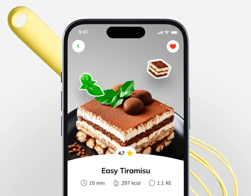
Recipe App Design: Clarify Portions Beyond the Photo
NutriRecipes’s food photos, portion controls, menu scale and shopping list separate browsing from everyday preparation.
 Interface Design
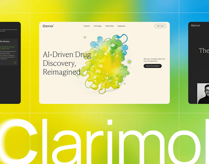
Research Platform Website Design: Stages and Chart Reading
Clarimol’s molecular visuals, development stages, and layered charts show how thematic recognition can lead into reading specialist materials.
 Interface Design
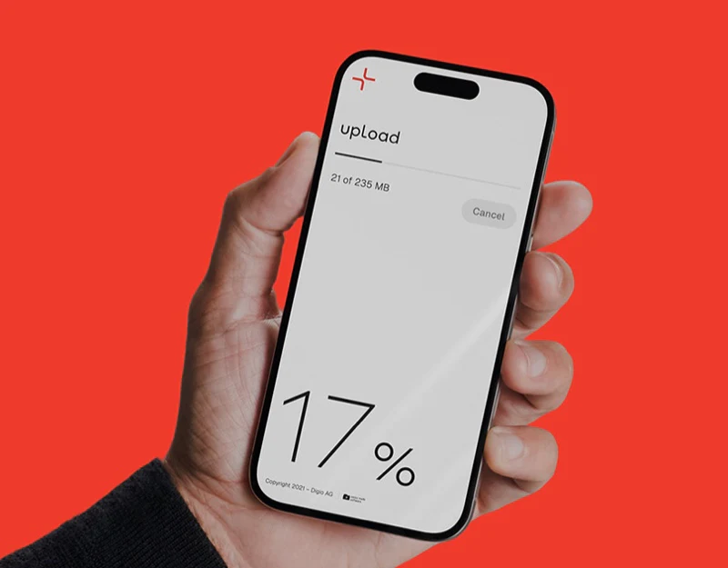
File Transfer Interface Design: Transferly’s Three States
Transferly’s empty state, file queue, and download progress show how limited colors and explicit content can create a lightweight transfer interface.









