Key takeaway (TL;DR)
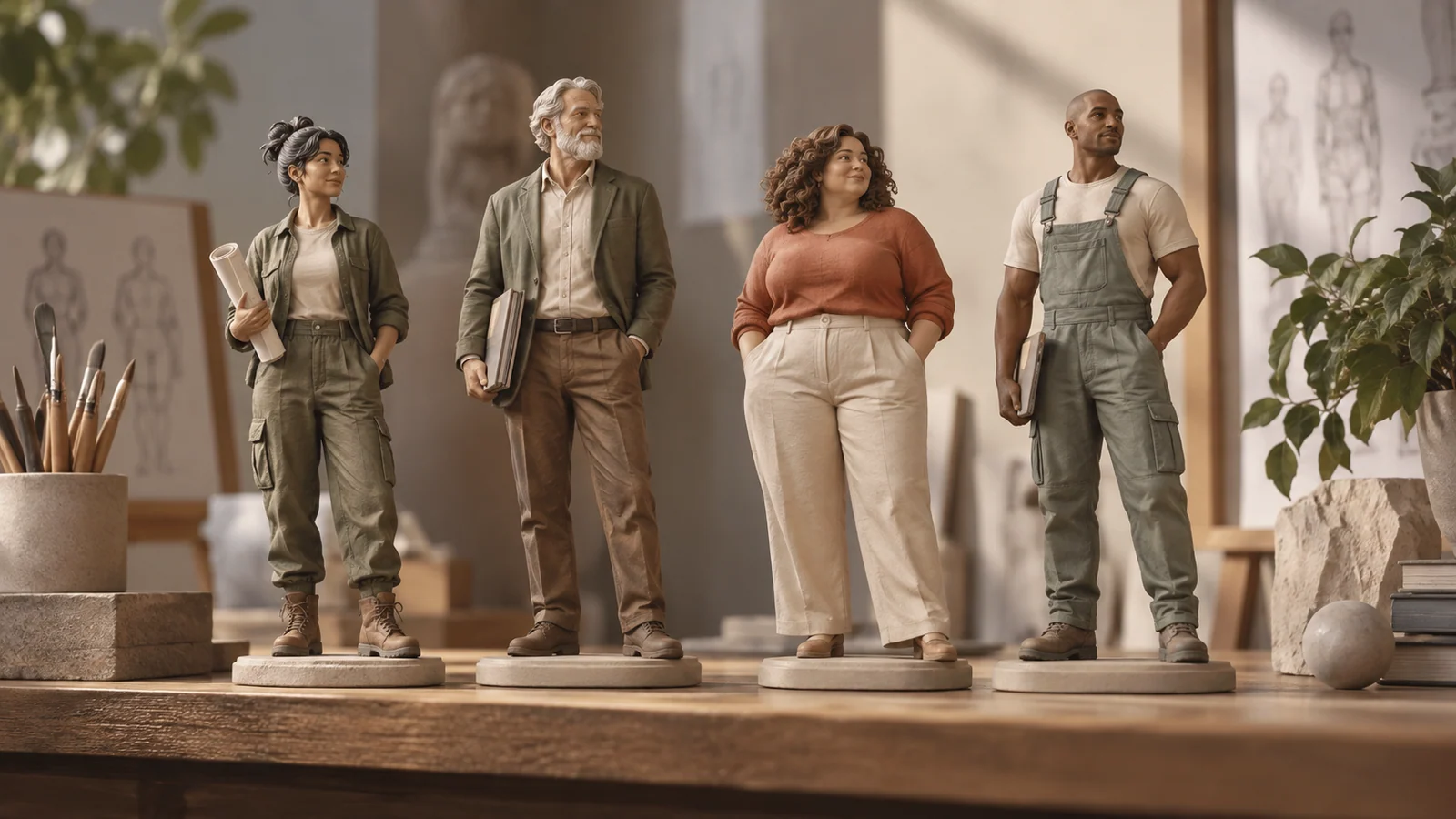
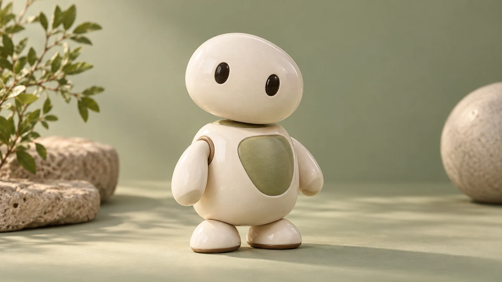
Anthropomorphism in design is a classic principle that gives inanimate objects human warmth, signs of life, and emotional associations through contours, proportions, or interactive feedback. JVDS emphasizes that, in digital products and brand identities, anthropomorphism does not mean childishly drawing eyes and mouths on everything. Meaningful anthropomorphism uses abstract geometric metaphors—a curved bottle, a thoughtful tilt, or lively micro-animation—to awaken a subconscious sense of closeness and trust, bringing humane warmth to cold code and machinery.
1. A face without facial features: how anthropomorphic perception works
The human brain has highly developed regions for recognizing faces and bodies, including the fusiform face area (FFA). Even slight symmetrical proportions, a three-point arrangement, or a torso-like contour can be unconsciously interpreted as a living individual. Anthropomorphic perception typically proceeds through three cognitive stages:
- Stage one: physical geometry evokes bodily features. Symmetrical arrangements of two points and a line, or organic curves that widen and narrow, instantly trigger pattern matching in the primary visual cortex.
- Stage two: pareidolia and projection fill in a posture. The subconscious completes inanimate contours as vivid personality metaphors, such as the gaze of a car's front end or the graceful figure suggested by a bottle's narrow waist.
- Stage three: two kinds of emotional value emerge—connection and mental alignment:
- Emotional attachment and a sense of life. A tool ceases to be merely cold plastic and steel and becomes an everyday companion with warmth and presence.
- Role expectations and mental alignment. A clear, predictable interactive personality, such as a composed sage or an agile assistant, greatly reduces the psychological distance between people and machines.
- The evolutionary advantage of pareidolia. For ancient people in dense forests, quickly recognizing two round spots and a horizontal line as the face of a lurking predator was a matter of survival. This neural legacy makes us instinctively interpret a car's headlights and grille as an angrily roaring sports car or a gently smiling family sedan.
- The Coca-Cola contour bottle and its “Mae West” curves. Designed by the Root Glass Company in 1915, the classic glass bottle has a narrow middle and full upper and lower curves. It could be recognized by touch alone in the dark and acquired the nickname of Hollywood star Mae West. Without any realistic facial features, it gave industrial packaging an exceptionally graceful figure and lively presence.
- Method dishwashing liquid and the countertop butler. The container designed for Method by industrial designer Karim Rashid has a rounded top like a hat, a narrowed waist like a uniform, and a stable base. This abstract human-like form overturned the traditional fate of dishwashing detergent as an ugly, harsh-smelling object hidden under the sink. It could stand proudly on the countertop as an elegant, sculptural household assistant.

2. Three levels of anthropomorphism in digital interaction
When anthropomorphism moves from physical objects into modern websites and software interfaces, it develops along three dimensions:
- Level one: morphological metaphor. Rounded edges on hardware or three-dimensional interfaces and proportions that seem to breathe soften the sharp sense of distance associated with industrial technology.
- Level two: behavioral vitality. Interface controls do not simply appear instantaneously. They use natural micro-animations consistent with physical and biological behavior: a search field may expand smoothly by 2px when focused, like a chest inhaling, or gently rebound after task completion like an acknowledging nod.
- Level three: situational persona. Restrained, empathetic tone of voice communicates understanding and responsibility when a system error occurs, and offers sincere, measured celebration when users achieve their goals.
3. A four-dimensional matrix for anthropomorphism in brands and interfaces
To help teams judge the appropriate degree of anthropomorphism in brand design and product form, while avoiding childish excess, we use the following matrix:
| Evaluation dimension | Frequently used core functions/assets | Infrequent but necessary functions/assets | Redundant distractions, false functionality, or empty formalism |
|---|---|---|---|
| Identity and degree of abstraction | Use abstract human-like postures with distinctive geometric tension and refined aesthetics, such as the liveliness of a Pixar-style desk lamp. | Use a minimal animated helper or cursor derived from the brand's distinctive signature symbol. | Force big-eyed cartoon faces onto every button in serious industrial software or financial interfaces, creating a childish, tasteless effect. |
| Dynamic feedback and lifelike rhythm | Use natural Bézier easing curves consistent with Newtonian mechanics, with an extremely subtle breathing rhythm while idle. | Offer lightweight animated encouragement at important milestones, such as a card gently rocking in acknowledgment. | Make a virtual character perform large somersaults or dances whenever the mouse moves, severely interrupting normal work. |
| Tone of voice and empathetic communication | Use confident, candid, professional, warm business language and take responsibility for system errors. | After a user spends half an hour completing a form, offer a warm, factual message: “Everything is ready. We have taken over from here.” | Fill the interface with cloying, flippant internet expressions such as “sweetie,” “kisses,” or “your humble servant will handle it right away.” |
| Function and business ethics | Always put practical performance before anthropomorphic features; ergonomic grip and button recognition come first. | For dangerous, irreversible actions, immediately shift the persona into a serious, attentive error-prevention warning state. | Use a seemingly cute, deceptive persona to coax users into automatic renewals or microphone permissions. |
4. JVDS practice: restrained human warmth in brand engineering
In premium brand positioning and intelligent-agent interfaces, JVDS applies a principle of quiet, unassuming human warmth:
- Favor abstraction over realism. When creating brand assets for leading enterprises, we reject complex, realistic dolls as a route to anthropomorphism. Through minimal geometric proportions, changing curvatures, and subtle light and shadow, we give the digital system a calm, warm, trustworthy character reminiscent of Nordic solid-wood furniture, without drawing a single literal human face.
- Review the coherence of lifelike cues across modes. Unusual anthropomorphism can produce uncanny-valley discomfort rather than friendliness. When developing interface micro-animations, we carefully inspect the perceived mass of motion curves and rebound damping. Every deformation should follow the natural breathing ergonomics of living organisms; mechanical twitching and abrupt, jarring movement are removed.
- Blind-test emotional connection with real users. Before finalizing a proposal, we place the new company identity alongside competitors and invite target decision-makers to describe its personality using three adjectives. Only proposals that elicit valuable responses such as “professional and stable,” “forward-looking and innovative,” and “worthy of lifelong trust” are approved for launch. Explore our design portfolio for commercial design combining technological rigor with human warmth.

5. Frequently asked questions
Q1: Do heavy industrial B2B products or enterprise cloud-native software need anthropomorphic design?
Yes, but it should establish the personality of a professional guide. Heavy industrial software often contains overwhelming numbers of complex parameters. Calm, slightly darker colors, troubleshooting guidance as clear and methodical as that of an experienced engineer, and composed degradation notices during a network storm can make the system feel like a senior technical adviser who gives customers confidence.
Q2: Why do some brand mascots annoy or repel consumers?
The central problem is usually a loss of boundaries. A mascot that constantly bounces at the screen's edge, obscures important content, or grins while advertising to an anxious user will be perceived as an irritating intruder. A good mascot should resemble a well-mannered British butler: it quietly leaves the stage to the user and appears gracefully only when care or help is truly needed.
Q3: What is a simple CSS animation that gives an otherwise cold web element a sense of life?
Use a subtle breathing scale: transition a button or cursor extremely slowly and smoothly from transform: scale(1.0); to scale(1.02); over a three-second cycle, with a cubic-bezier(0.4, 0, 0.2, 1) easing curve. This barely perceptible 2% rhythm can immediately activate the brain's subconscious sensitivity to signs of living warmth.