Key takeaway (TL;DR)
Wabi-sabi, rooted in classical Eastern philosophy, recognizes aesthetic value in natural change, the traces of time, and subtle imperfection. It accepts organic asymmetry, appreciates the patina of long use, and works with rather than against a material's essential character. JVDS emphasizes that wabi-sabi in digital branding is not an excuse for shoddy work, dirt, mold, or decay, nor a fashionable gray template copied without thought. Its essence is the close relationship between a rigorously restrained structure and authentic material textures that carry warmth and life.
1. The philosophy of wabi and sabi: Sen no Rikyu's garden
Western industrial culture has long favored absolute geometric symmetry, flawless mirror-polished steel, and the promise of plastics that never wear. Wabi-sabi offers design a different set of values:
The aesthetic framework and the lesson of the swept garden
- Wabi: spiritual simplicity and restraint. Be content with modest means, restrain desire, appreciate the slight organic asymmetries of handmade objects, and seek peace in simplicity.
- Sabi: the material traces of time and weathering. Appreciate the patina on natural materials, weathered wood and stone, and kiln-born cracks, accepting the irreversible lifecycle of objects.
- The ideal: Rikyu's thought experiment of shaking leaves from a tree.
- Establish careful order first. Sweep the garden completely clean, creating a rigorously maintained underlying structure.
- Then leave space for nature. Gently shake a branch and allow a few leaves to fall naturally. Skipping the careful cleaning and allowing dirt to accumulate is not wabi-sabi; it is careless imitation.
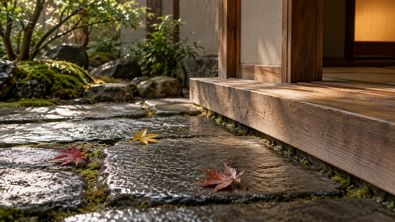
- The garden story of Takeno Joo and Sen no Rikyu. Tradition tells of Rikyu tending his teacher Takeno Joo's garden. He first removed every weed, loose stone, and piece of rubbish until the garden was immaculate. Then he gently shook a cherry tree, allowing a few pink petals and dry leaves to settle on the steps and moss. The central lesson is to establish a high level of care and respect before leaving room for nature's spontaneous presence. Neglected piles of leaves and muddy water are simply poor maintenance.
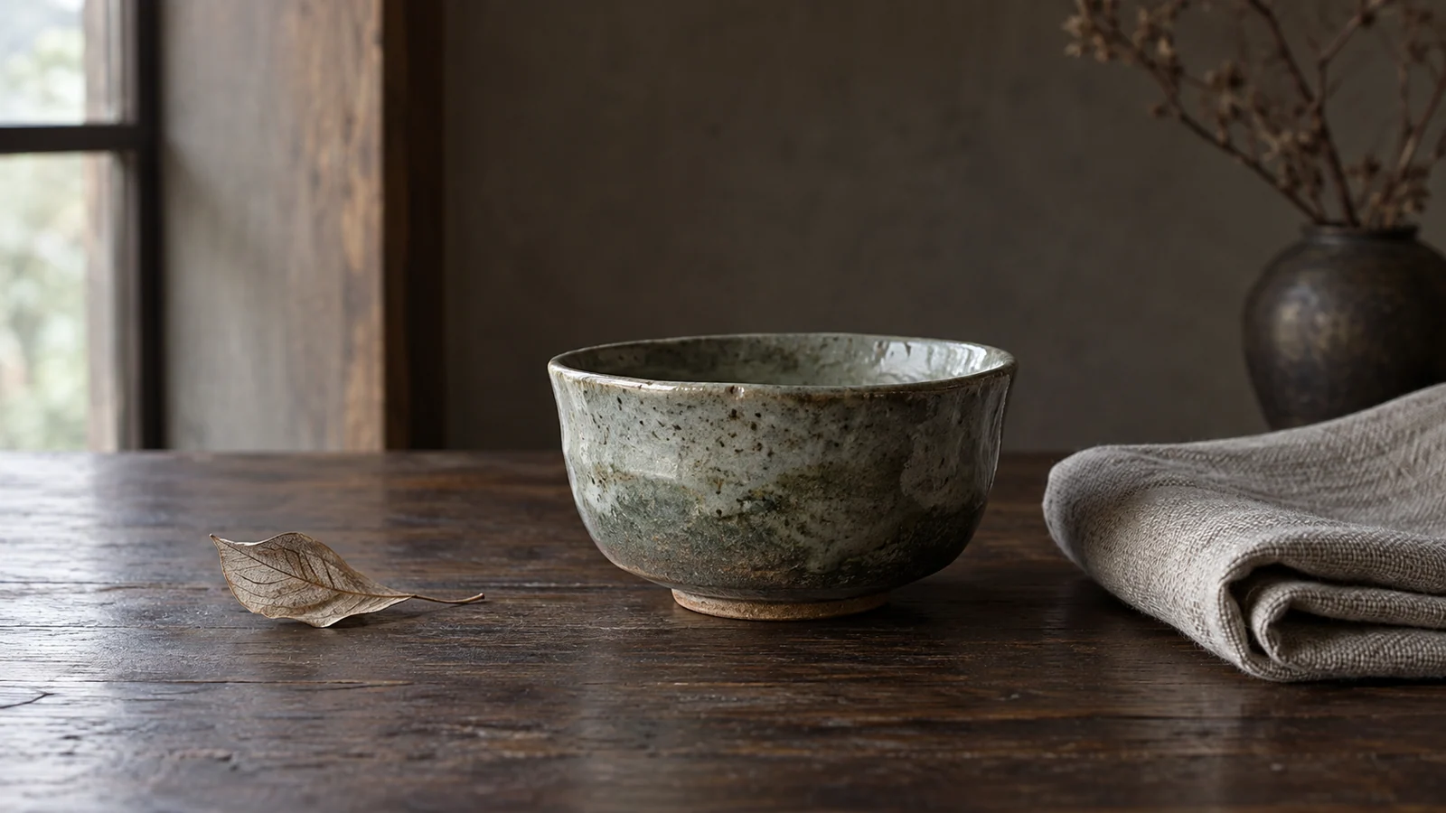
- The asymmetric tension of a handmade tea bowl. Raku ware does not rely on a mechanical wheel to force a perfectly circular shape; it preserves subtle variations made by the craftsperson's palms. During high-temperature wood firing, glaze, flame, and falling ash produce unique surface changes and cracks. These imperfections record the interaction of clay and fire and give the object a character that cannot be replaced.
2. Wabi-sabi and sustainable design: where they overlap and differ
Brands embracing wabi-sabi often confuse it with environmental responsibility and sustainability. Their boundaries need to be clear:
- Aesthetic sensibility versus measurable engineering performance. Wabi-sabi addresses the emotional relationship between people, traces of time, and inner calm. Sustainable design requires physical evidence and carbon accounting, such as closed-loop recycling rates, lifecycle assessment, and degradation times. A tea table carved from untreated wood may look appropriate to wabi-sabi, but if it molds and becomes unusable after three years in a damp environment, it wastes resources from an ecological engineering perspective.
- An architectural example: Rick Sundberg's Wabi Sabi House. The Seattle architect's house brings the two approaches together. Its exterior uses cedar left to oxidize naturally in sea air and rough volcanic stone, while the interior follows clear ergonomic circulation and high standards of passive, energy-efficient heating. Natural traces nourish the occupants' experience while modern technology protects everyday comfort.
3. A four-dimensional matrix for wabi-sabi in digital branding
The following matrix helps brands distinguish considered wabi-sabi from mere roughness in brand design and premium websites:
| Experience dimension | Frequently used core functions/assets | Infrequent but necessary functions/assets | Redundant distractions, false functionality, or empty formalism |
|---|---|---|---|
| Color and visual texture | Use quiet earth tones, clay gray, moss green, and off-white with extremely subtle natural grain. | Adapt slightly warm tonal levels to different reading environments for comfortable extended use. | Cover the site with crude, mold-like noise textures that blur important text. |
| Layout structure and composition | Maintain a rigorous invisible grid, complemented by local asymmetry and organic breathing room. | Use whitespace as a visual pause that guides the eye toward the central value proposition. | Abandon the grid entirely and present unstable alignment and jumping text as asymmetrical beauty. |
| Product photography and authentic presentation | Show real material fibers, handmade details, and the natural patina developed through use. | Present products being used in real lighting rather than repetitive, cheap-looking renderings. | Add fake rust and wear to new industrial technology products, conflicting with their business purpose. |
| Typography and interaction usability | Preserve modern display standards: strong contrast, accessible character clarity, and smooth task flows. | Use gentle, natural Bezier easing for clicks and page transitions. | Use illegible, distressed calligraphy on essential controls in pursuit of an aged or incomplete appearance. |
4. JVDS practice: a contemporary digital interpretation of wabi-sabi
For lifestyle brands, independent craftspeople, and premium hospitality and cultural destinations, JVDS follows an engineering philosophy of wrapping a precise modern framework in warm natural texture:
- Respect materials rather than manufacture artificial age. We reject heavy-handed Photoshop aging filters. If a client's products use fine purple clay or pure cotton and linen, we use commercial large-format cameras for true-color, extreme-macro, low-light capture, digitally reproducing the clay's mica highlights and the fabric's natural slub texture in complete detail. Authentic materials provide the physical evidence that discerning buyers seek.
- Restrained breathing room built on careful order. We apply Rikyu's garden lesson to code and layout. The underlying proportions, response speed, and accessibility contrast follow exceptionally demanding engineering standards. Only then do we add a gentle micro-interaction within the whitespace, like a breeze passing across water, allowing modern technology to convey quietness and calm.
- Design for longevity. We do not chase superficial trends that become dated every three months. Our digital assets are intended to remain appealing like a well-used copper kettle, retaining their aesthetic character five or even ten years later. Explore our design portfolio to see the relationship between modern digital engineering and Eastern aesthetics.
5. Frequently asked questions
Q1: Is wabi-sabi appropriate for a modern technology company or SaaS product?
Its philosophy can be adopted without copying its physical appearance. Technology companies can learn restraint, calm, attention to essentials, and resistance to unnecessary decoration. The interface should remain clean and efficient, with modern typography, while a considered human warmth reduces the coldness and distance associated with advanced technology.
Q2: Why do some fashionable wabi-sabi-style guesthouses and cafes soon feel dirty and tiring?
They have lost the careful cleaning and maintenance at the heart of Rikyu's lesson. Bare concrete, flaking walls, and a few broken pots are mistaken for wabi-sabi while everyday care is neglected. Guests encounter real mold, leaks, and dust. Without sound construction and diligent maintenance, this imitation is simply poor-quality, potentially unsafe space.
Q3: How can a website be checked for confusing roughness with wabi-sabi beauty?
Perform a readability and accessibility audit. If supposedly sophisticated low contrast makes body text so pale that even people with typical vision must squint, or a deliberately incomplete appearance makes button boundaries hard to identify and click, the design has abandoned its responsibility to support people. It needs immediate correction.