Key Takeaway (TL;DR)
Self-similarity—structural correspondence in fractal geometry—is a central principle of internal order in complex systems and formal aesthetics. When a design's microscopic details, intermediate components, and overall structure share geometric logic, proportional rhythm, and recurring forms across scales, the system gains the powerful sense of unity found in natural fractals. JVDS emphasizes that self-similarity in modern brand identity and enterprise design systems does not mean mechanically shrinking and repeating the same logo one hundred times. It means extracting a core set of generative rules that work across scales, making each part a reflection of the whole and the whole a symphony of its parts.
1. Fractal Aesthetics and Resonance Across Scales: The Scientific Core of Self-Similarity
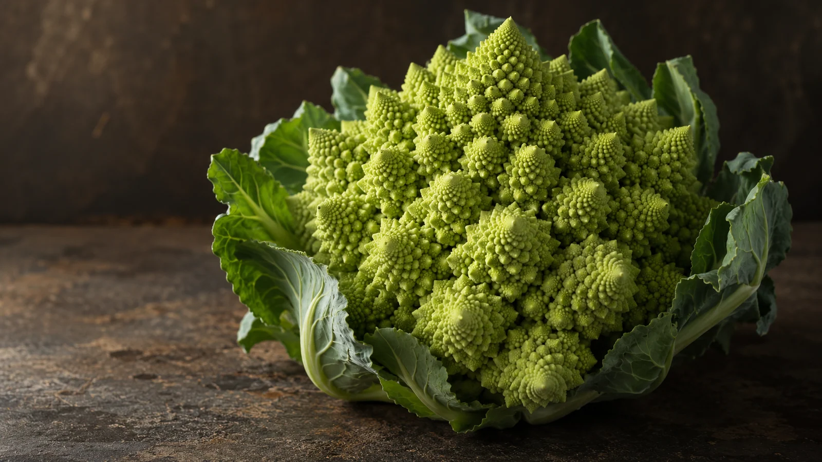
From rugged coastlines to the Mandelbrot set, nature demonstrates how simple rules can produce immense order:
A Multiscale Model of Fractals and Design Systems
- Generative logic: Hierarchical iteration of simple rules: Nature creates vast order from a small number of generative rules. A design system should extract a consistent geometric identity—such as a distinctive chamfer or grid unit—and carry it throughout.
- Natural inspiration: Coastlines with corresponding structures across scales: Britain's outline from space and a rock viewed through a magnifying glass share geometric irregularity. A local slice of a system must retain the complete lineage of its parent.
- Aesthetic examples: Escher's prints and mosaics: Forms shrink in an orderly progression and interlock with the overall spiral, creating layers that reward both distant viewing and close inspection.
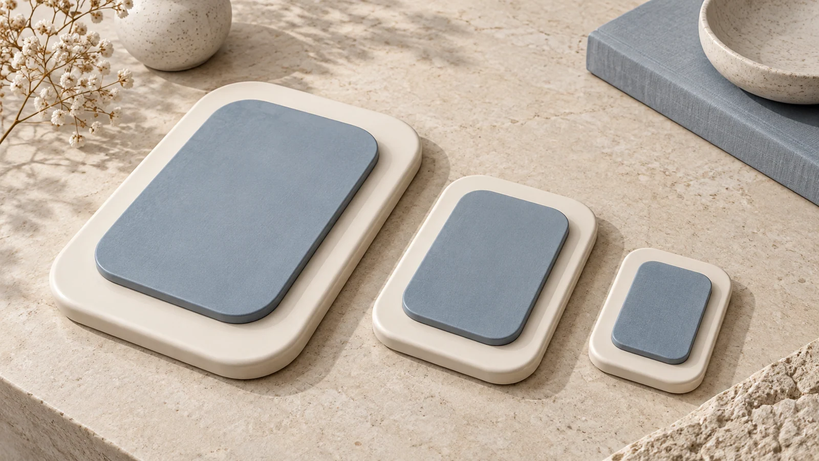
- Engineering application: Cross-platform design tokens: Outer and inner corners follow concentric geometry, while spacing echoes an 8 px module through successive levels, maintaining structural unity on web and mobile.
- The lesson of the coastline paradox: The renowned British mathematician Benoit Mandelbrot observed that Britain's coastline appears as winding bays from a satellite, while the jagged edge of a rock examined through a magnifying glass has statistically almost the same geometric irregularity as the whole island. The same structural form at different scales is nature's core code for creating order within chaos.
- The remarkable dynamics of Escher's Smaller and Smaller: In this masterpiece, Dutch printmaker M. C. Escher progressively reduces similar lizard forms from the outside toward the geometric center. Every reduction interlocks precisely with the composition's spiraling direction. Viewers do not perceive a pile of disconnected patterns, but a striking visual symphony of form, scale, and spatial depth.
- The two-scale narrative of a photomosaic: Artist Robert Silvers assembled Leonardo da Vinci's Mona Lisa from eight hundred small Renaissance paintings. From a distance, the familiar enigmatic smile is unmistakable; up close, each independent painting reveals its own detail. Self-similarity gives the work rich layers that reward both the overall view and close inspection, greatly extending its visual interest.
2. Pseudo-Self-Similarity Disasters in Brand and Interface Design
In digital branding and enterprise software, inexperienced teams that interpret self-similarity mechanically often produce aesthetic failures:
2.1 Plastering the Logo Everywhere
Many traditional businesses assume a unified visual language means stamping their logo on everything: in the middle of business cards, across webpage backgrounds as dense translucent watermarks, inside every small icon, and even as the mouse cursor. Such crude repetition does not produce sophisticated unity. It becomes cheap, pervasive visual pollution.
2.2 A Rigid, Uniform Grid with No Breathing Room Across Scales
Some UI designers set all card, button, and input dimensions and corners to identical values. A full-screen poster card receives an 8 px radius, and so does a tiny 16 px checkbox. Without scale-sensitive geometric compensation and hierarchy, the entire interface feels rigid, mechanical, and lifeless, like a plastic mold.
3. A Four-Dimensional Self-Similarity Matrix for Design-System Engineering
To help teams establish a flowing aesthetic order between small components and the overall system, we use the following four-dimensional screening matrix:
| Evaluation dimension | Frequently used core functions/assets | Infrequent but necessary functions/assets | Redundant distractions, false functionality, or empty formalities |
|---|---|---|---|
| Generating a brand's geometric motif | Extract core geometric traits, such as a distinctive 12° angle or concentric arc, and carry them through the layout | Enlarge and develop the same traits into the overall structure of a brochure cover or website hero | Meaninglessly tile the complete company logo across every corner of the interface |
| Hierarchical corner-radius relationships | Follow concentric nesting: outer container radius = inner component radius + padding, or Router = Rinner + P | Use subtle rounding on the smallest atomic tags to retain the same geometric identity | Hard-code one radius for every container regardless of size, causing broken-looking nested corners |
| Type scales and proportional progression | Follow a consistent ratio such as the 1.25 major-third scale, with each level relating to the others | Use the same geometric multiples for large display typography to create a strong presence | Scatter arbitrary 13 px, 17 px, 21 px, and 29 px type sizes without a modular rule |
| Cross-platform design tokens | Abstract global spacing, color, and shadow tokens to preserve structural unity across web, iOS, and Android | Map surface-lightness levels for dark mode while retaining the same depth hierarchy | Give each platform unrelated layout rules, making the brand look completely different on every device |
4. JVDS's Engineering Practice of Unified Fractal Design Systems
In the industrial-grade design systems and comprehensive brand design work that JVDS creates for major enterprises, self-similarity is a core tool for building enduring recognition:
- Extracting a Visual DNA Particle: When rebuilding brand identity, we reject superficial logo repetition. We extract the purest geometric “DNA particle” from the brand's central motif—for example, a distinctive, energetic Bézier curve or a particular positive-and-negative-space cut. At the macro level, it becomes a powerful dividing line in the hero layout. At the intermediate level, it shapes a card's chamfer or guides the gaze. At the micro level, it supplies the finishing stroke of an icon. Even with the logo completely hidden, an audience can glance at any detail and immediately recognize the brand created by JVDS.
- A frontend algorithm for Concentric Nested Geometry: Our component library embeds self-similarity into the CSS calculation layer. Card and overlay radii are not fixed arbitrarily; they use the dynamic formula
border-radius: calc(var(--inner-radius) + var(--padding)). This keeps the curves of inner buttons, intermediate cards, and outer dialogs concentrically aligned at every scale, eliminating visual roughness. Explore our design portfolio to see industrial-grade aesthetics that connect micro and macro geometry. - The Slice Blind Test as an acceptance criterion: Before delivering a brand or UI system, JVDS performs a demanding slice review. We randomly crop five small 100 × 100 px regions from the final interface, excluding logos and text. Target users are asked: “Do these five slices belong to the same parent system?” Self-similarity is approved only when more than 90% can recognize their shared structural lineage at a glance.
5. Frequently Asked Questions (FAQ)
Q1: Why can people recognize Apple's entire hardware family at a glance even without a logo on the front?
Because Apple applies self-similarity to the fullest extent in industrial form. From iPhone and iPad to MacBook and Apple Watch, physical corners consistently follow the same continuous-curvature squircle geometry, or G3 continuity. The fine anodized, bead-blasted aluminum finish, the reflected color temperature of Space Gray, and even the curvature of screen corners reveal a strikingly consistent geometric lineage across hardware scales. The product's physical form becomes its strongest identifying symbol, expressing dominance without a logo.
Q2: How do spacing tokens express self-similarity in a software design system?
Through hierarchical repetition of a base unit's multiples. If the atomic unit is 8 px, internal component spacing of 8 px, card padding of 16 px, card gaps of 24 px, and section gaps of 32 or 48 px evolve around that constant at 1×, 2×, 3×, 4×, and 6×. Viewers do not carry rulers, but their subconscious is highly sensitive to the mathematical order of this shared proportional network, creating a deep sense of tidiness and comfort across the screen.
Q3: How do you prevent self-similarity from becoming monotonous repetition?
Allow rich changes of scale and varied content within unified geometric rules. Escher's prints are striking because shrinking lizards also rotate elegantly and guide the eye. Snowflakes follow sixfold fractal structures, yet no two have identical details. In design, self-similarity supplies firm underlying constraints, such as consistent radius logic and layout axes. Within that framework, photographic textures, dramatic color accents, and rich verbal storytelling should flourish, achieving variety without losing the shared foundation.