Key takeaway (TL;DR)
Baby-face bias means that youthful features, or neoteny—large eyes, a round face, and a high forehead—instinctively evoke protectiveness and gentle affection when they appear in fictional characters or human imagery. Yet they can also lead to subconscious judgments of immaturity, inexperience, and an inability to handle serious responsibilities. In digital products and corporate branding, indiscriminately making mascots or virtual assistants cute and childlike can undermine the authority of important business guidance. JVDS proposes separating roles by intent and calibrating proportions. Through subtle expressions, posture, and contextual cues, brand design and UI/UX can balance approachability without childishness and professionalism without coldness.
1. The psychology of youthful features: from protective instincts to underestimated competence
Hundreds of thousands of years of evolution have given the human brain a highly sensitive system for recognizing infant features. This biological mechanism continues to influence visual culture.
1.1 An ethological perspective: Lorenz's model of infant features
Austrian ethologist Konrad Lorenz proposed the well-known baby schema, or Kindchenschema:
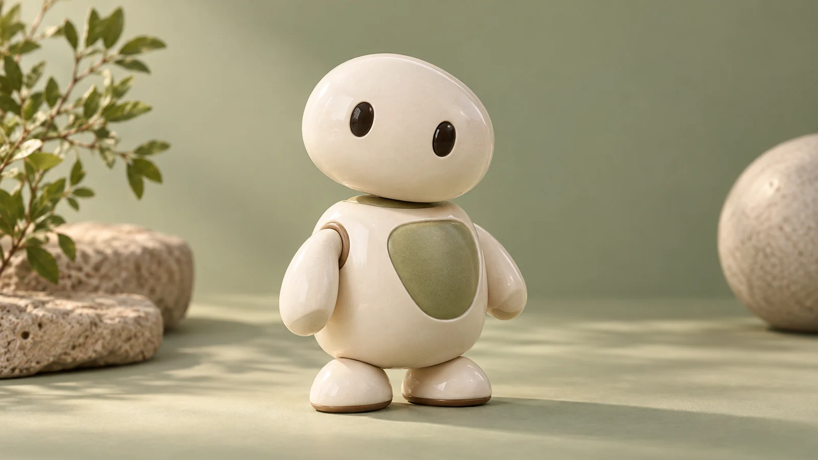
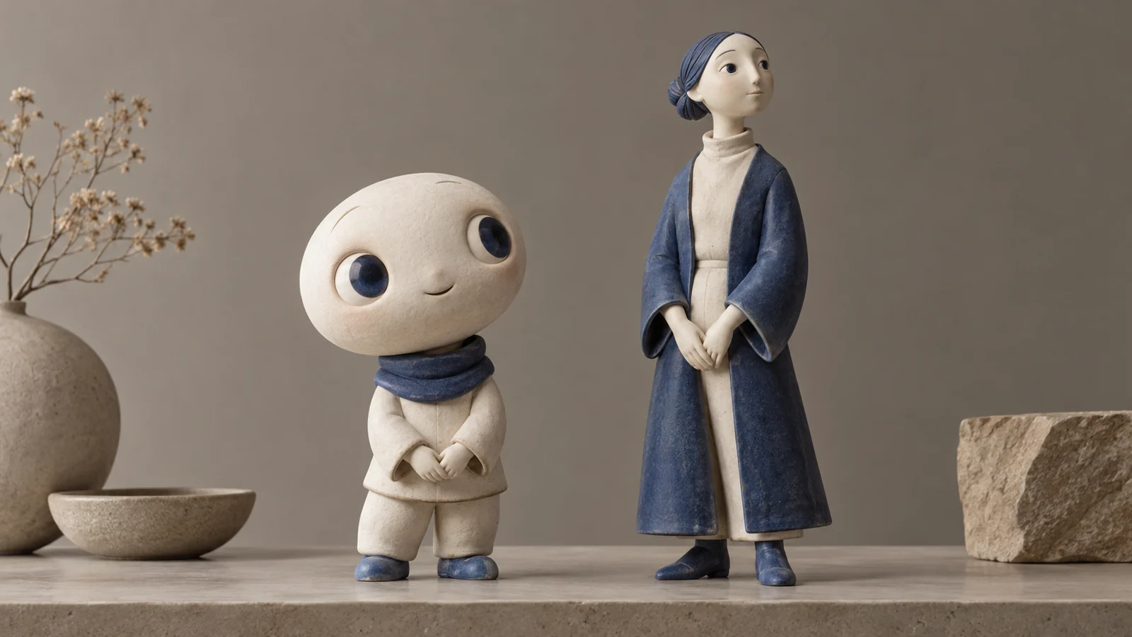
- A head large relative to the body, a high smooth forehead, widely spaced large eyes below the face's horizontal midline, a small short nose, and a plump round chin.
- These physical cues instantly activate the adult hypothalamic dopamine system, suppress aggression, and evoke strong tendencies toward affection, care, and tolerance.
1.2 A double-edged effect in commercial characters: warmth versus professionalism
Applying these traits to cartoon mascots, AI assistants, or product illustrations can lower users' guard at very little cost:
- Positive benefit: the interface feels friendly, approachable, and nonthreatening, encouraging an initial interaction.
- Serious liability: the evolutionary label of harmlessness comes with subconscious assumptions of weakness, limited maturity, and an inability to handle risk. When a professional virtual representative responsible for asset security or medical diagnosis has a baby-round face and a body only three heads tall, users will hesitate and distrust it when real money is at stake.
2. Lessons from legal psychology: distorted attribution behind perceived innocence
Empirical research on small-claims litigation provides a useful mirror for examining baby-face bias:
- In civil cases involving alleged intentional fraud, defendants with distinctly baby-faced features were significantly more likely to win than those with mature faces: juries were more inclined to consider their conduct an unintentional mistake.
- In cases involving professional negligence or failure of duty, however, baby-faced defendants encountered greater skepticism because people assumed they lacked the professional maturity to act independently.
Applied to modern software interaction, this suggests that when a system fails or warns of serious risk, an excessively childlike character may anger users instead of reassuring them. The platform can seem flippant, evasive, and unserious about important business.
3. A comparison matrix for character and imagery assets
When developing corporate characters and website illustration systems, teams must carefully define where approachability and authority belong:
| Asset level | Character traits and applications | Interaction value and user response | Common failures and ways to avoid them |
|---|---|---|---|
| Frequently used core characters Maintain professional balance | • In-app assistants guiding business workflows. • Expert virtual representatives in finance, healthcare, and enterprise services. • Mature young-adult to middle-adult proportions with firm yet warm subtle expressions. | Convey dependable stability, soften the coldness of serious software, and preserve authoritative guidance. | Drawing an enterprise productivity assistant as a pacifier-sucking or big-eyed, blinking pet weakens its identity as a tool. |
| Infrequent but necessary characters Localized emotional icebreakers | • Companions on registration welcome pages and beginner empty states. • Light interactive characters in holiday promotions or rewards stores. • Playful reassurance on 404 pages or during minor network interruptions. | Provide an emotional buffer during minor setbacks or noncore activities and strengthen brand warmth. | Forcing cute pets onto critical transfer, contract-signing, or high-risk deletion pages can provoke serious complaints. |
| Redundant childish decoration Damages perceived professionalism | • Excessive big-head stickers across core dashboards. • Preschool-style cartoon speech bubbles in serious technical-documentation indexes. • Requiring users to feed a virtual baby pet before upgrading an enterprise plan. | Dilute brand value, make the product appear amateurish to serious decision-makers, and block enterprise conversion. | Self-indulgently applying Japanese or Korean kawaii aesthetics to industrial B2B software as though it were an early-childhood learning product. |

4. JVDS implementation of character systems and approachability
When redesigning brand-character portfolios and digital-product UI/UX, JVDS favors precise anatomical parameters and dynamic adaptation to context over simplistic either-or design:
[JVDS Character Approachability Engineering Matrix]
Set the tone from the business context → Fine-tune facial proportions → Build a contextual state machine → Run end-to-end usability stress tests
- Anatomical proportion tuning. When creating brand characters or interactive virtual people, JVDS avoids extreme 1:1 head-to-body proportions. For professional applications, the preferred range is 1:5 to 1:6, with eye height occupying 20%–25% of the face. Mature faces typically fall within 15%–18%, while infants can exceed 35%. This removes the helpless quality of very young children while retaining openness and warmth around the eyes.
- A context-aware state machine. Characters must be able to change their expressive persona dynamically according to business context:
- Welcome and encouragement: use gently uplifted expressions and open gestures during onboarding and task completion.
- Serious alert: during risk control, compliance checks, or system alarms, shift immediately to an upright stance, a serious expression, and a clear gesture toward the source of the problem, conveying the vigilance of a professional adviser.
- An anti-falsification and anti-infantilization rule for real employee portraits. For photographs of experts and executives, JVDS sets a firm delivery standard: retouchers must not use enlarged-eye or slim-face filters to turn experienced leaders into youthful influencer faces. Genuine facial lines and the light in their eyes express decades of accumulated technical experience and form a powerful source of commercial credibility.
5. Frequently asked questions
Q1: What is the fundamental difference between B2C and B2B character design in the use of youthful features?
The key is how impulsive or serious the decision process is. B2C serves individual consumers and can emphasize emotional purchases and dopamine-driven rewards. It can accommodate stronger youthful features, such as the big-eyed innocence of POP MART and other collectible figures, to encourage an emotional desire to collect. B2B purchasing may involve budgets from tens of thousands to hundreds of millions of yuan, with finance, legal, and risk teams behind the decision-maker. These buyers need certainty and protection against risk. B2B characters should therefore keep youthful traits below 15% and use crisp lines and geometric structure to communicate rational order.
Q2: If serious software needs a persistent AI-assistant icon, how can it feel friendly without looking childish?
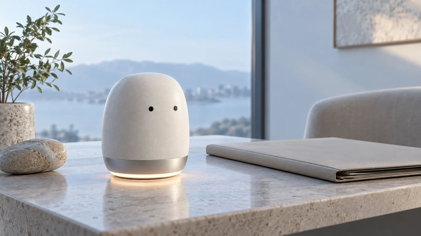
Use an anthropomorphic geometric symbol rather than a realistic little doll. A leading approach extracts the minimum necessary emotional cues from the human face: for example, two subtly moving dots suggesting eyes, paired with a minimal luminous ring or geometric glow. At rest, it feels like a composed technological instrument; during interaction, a small blink or pulse adds measured human warmth. This avoids associations of limited intelligence from a baby face while also avoiding the uncanny valley.
Q3: How can a team cheaply test whether a new brand character feels both friendly and professional?
Use blind testing with a semantic differential scale. Create five-point scales for three pairs: childish versus mature, cold versus approachable, and amateur versus professional. Show the character without text or background context to 30 real customers in the target industry and collect their intuitive ratings. Ideally, approachability should score at least 4, while maturity and professionalism should score at least 3.8. If maturity falls below 3, increase the chin proportion and reduce eye diameter immediately, regardless of how much younger team members like the design. Explore the JVDS design portfolio for the practical evolution of character systems across industries.