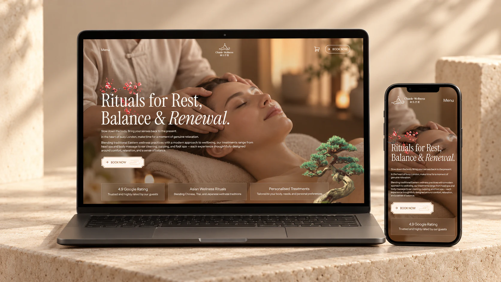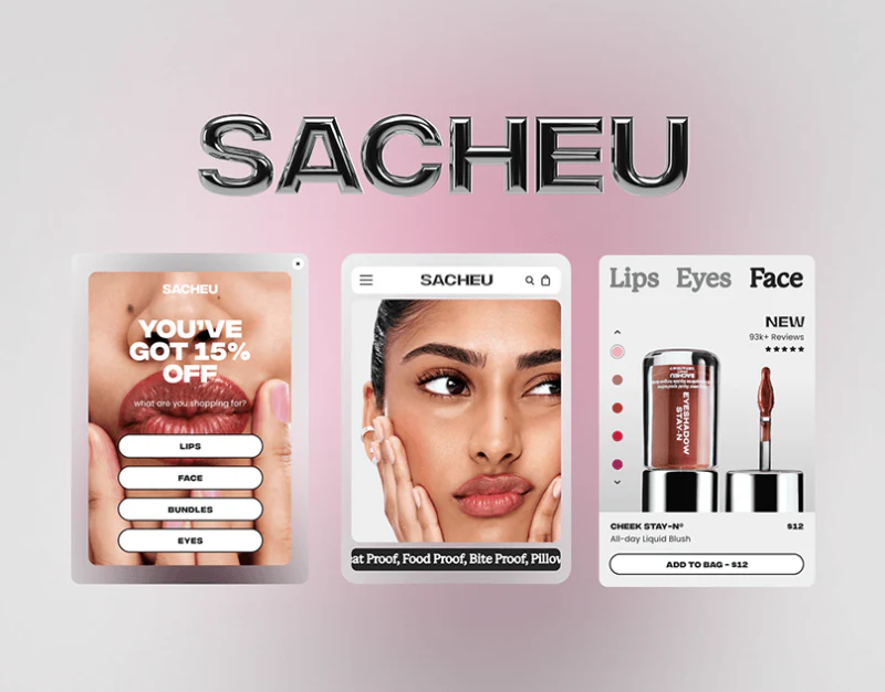
In independent online stores for beauty and skincare, fragrance and personal care, and DTC lifestyle brands, close-up editorial photography with rich macro detail is often the first powerful way to engage consumers. A rich sheen on the lips, authentic skin texture, and carefully chosen nail colors can communicate a brand's aesthetic in one second.

However, a critical shopping guidance gap separates being impressed by a beauty campaign image from knowing which product to buy to recreate the look. If the hero section is simply a huge poster with a generic Shop All button, users can easily lose their way after entering an all-products listing with hundreds of SKUs.
1. Keep the Surrounding Interface Restrained and Reserve Color for Products and Skin Tones
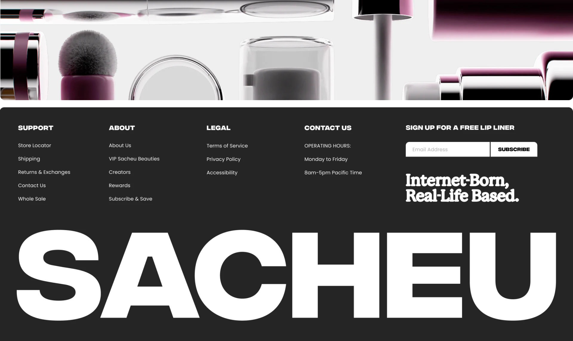
Consider established DTC beauty stores such as SACHEU, alongside the approach to visual restraint we used for the HOMIVA home furnishings website. When the main hero image contains rich skin tones, lip colors, and material details, the surrounding website framework—the announcement bar, navigation, typography, borders, and cart drawer—should strictly use high-contrast black, white, and gray, with very small amounts of muted soft pink or nude tones. Decorative gradient blocks should never interfere with the accurate presentation of product colors.
2. Build a Three-Step Bridge from Makeup Look to Product Category to Hero Product
- Hero image hotspots (Shop the Look) or buttons with a clear intent: Beside the close-up makeup image, in addition to the main call to action, directly identify the exact shade worn by the model, such as
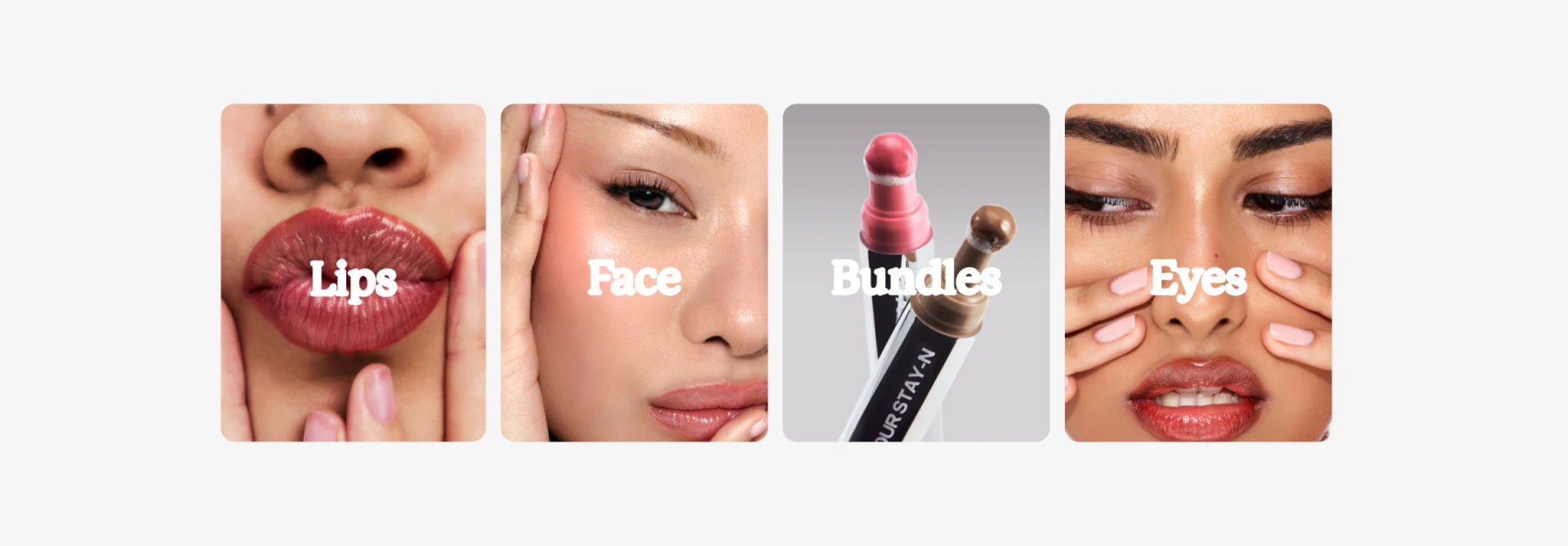
Wearing Lip Liner Stay-N in pINKED. Clicking it can immediately open that product's Quick Add card. - Follow immediately with a four-card grid of core categories: The first screen reached by scrolling down from the hero should not immediately be crowded with a disorganized assortment of products. Instead, present four category entry cards with clearly defined benefits and application areas, such as lip setting, facial contouring tools, skin prep, and bestselling sets. These direct visitors who like the overall brand toward the specific needs they most want to address.
- Reassure shoppers with service commitments at the bottom of the page: At the end of the browsing journey, clearly display icons for cruelty-free products, ingredient transparency, free shipping above a minimum spend, and 30-day no-questions-asked returns and exchanges. This completes the journey from emotional interest to a considered purchase.