Key Takeaway (TL;DR)
The Picture Superiority Effect (PSE) is one of the most robust effects in human cognitive neuroscience: in long-term memory retrieval and recall tests, retention of vivid, concrete, distinctive visual assets—potentially exceeding 65%—overwhelmingly outperforms retention of plain text lists, which is typically below 10%. Yet in commercial websites and digital brand systems, indiscriminately piling up generic stock photographs with no semantic connection does not activate this advantage; it creates cognitive interference and dilutes trust. JVDS emphasizes that excellent imagery is not inexpensive cosmetic decoration at the edges of a page. It is a dual-coding cognitive engine that fits closely with the core business copy, turning abstract business value into lasting visual memories.
1. Dual-Coding Theory: Why Do Images Take Deeper Root in Memory?
Dual-Coding Theory, proposed by cognitive psychologist Allan Paivio, provides a rigorous neuroscientific explanation for the Picture Superiority Effect:
A Model of Dual-Coding Processing and Memory Anchoring
- Channel One: The verbal coding system—linear processing of abstract words. When reading text alone, the brain calls only on its left-hemisphere symbolic processing channel, forming a single propositional representation. Retention is fragile and prone to decay.
- Channel Two: The nonverbal coding system—parallel processing of concrete images. When looking at a specific, vivid image of a physical object, the visual system processes light, outline, and spatial volume in parallel, constructing a strong mental image.
- Mechanism Three: Bidirectional cross-activation—precisely connected images and copy. When a rigorous business claim and a precise photograph of real supporting evidence sit close together and align closely, the two systems build dense synaptic connections in the cerebral cortex.
- Outcome Four: Strong memory anchoring—long-term information retrieval above 60%. Two retrieval channels allow either kind of cue to activate the complete memory immediately, bringing the Picture Superiority Effect into full play.
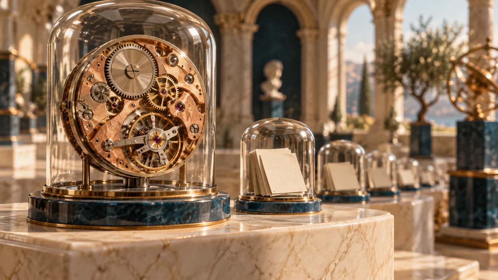
- The decisive difference between one channel and two. When someone reads a line such as “a precision Swiss mechanical watch,” the brain usually activates only the left hemisphere's linguistic symbol-processing channel, forming a single propositional representation. When a detailed, high-resolution photograph of the exposed watch movement accompanies those words, the brain activates both the visual imagery system and the verbal semantic system. The two independent memory retrieval channels form dense synaptic connections in the cerebral cortex; triggering either can immediately bring back the whole memory.
- The memory gap between concrete objects and abstract symbols. A physical flag with vivid red-and-white stripes and stars can form a strong mental image in 0.1 seconds. Abstract philosophical concepts such as “freedom, democracy, and justice,” by contrast, cannot acquire a concrete visual anchor through a forced association with a few empty handshake photographs. The more concrete, familiar, clearly outlined, and distinguishable from competitors an object is, the stronger its Picture Superiority Effect.
- Historical evidence from classified advertising. During a rapid scan of traditional Yellow Pages listings, businesses represented only by their names and telephone numbers left almost no trace in memory. Repair shops that printed a clear gear or pocket-watch silhouette beside their names were different. Even if the reader did not need a repair at the time, months later, when a watch broke, the location of the advertisement with that pocket-watch image could immediately return to mind. The image served as a fast retrieval beacon for a dormant memory.

2. Imagery Disasters in Corporate Website Design
Many businesses spend substantial budgets on corporate websites and brand promotion, yet turn the Picture Superiority Effect into visual clutter:
2.1 The Off-Putting Stock-Photo Smile
Open many corporate homepages and you encounter photographs of white Western models already used by countless inexpensive websites worldwide: people in suits flashing unnervingly artificial smiles in glass offices, or four people stacking their hands in a staged team gesture. Within 0.05 seconds, the audience's brain activates its banner-blindness filter and ignores these empty stock photographs. They can also suggest that the company is inauthentic, insubstantial, and lacks real delivery capabilities.
2.2 Meaningless Decorative Illustrations Detached from the Copy
Some design teams unthinkingly follow trends from design communities. Whether the company sells heavy industrial pumps and valves or serious enterprise compliance software, the pages are filled with colorful flat illustrations of people with distorted proportions. The text discusses high-precision pressure-vessel explosion-prevention standards, while the picture shows a small figure grinning with a laptop among brightly colored plants. Image and copy tell separate semantic stories. Instead of forming dual coding, they create serious cognitive dissonance.
3. A Four-Dimensional Comparison Matrix for the Picture Superiority Effect in Commercial Interfaces
To help teams connect visual imagery with commercial conversion efficiently, we use the following four-dimensional filtering matrix:
| Evaluation dimension | Frequently used core functions/assets | Less frequently used but necessary functions/assets | Redundant distractions, false functions, and empty formalities |
|---|---|---|---|
| Presenting real business evidence | Photograph actual company research laboratories, manufacturing facilities, precision-product details, and delivery locations, using entirely real subjects | Add genuine customer photographs taken at work, with portrait-use permission and clearly attributed quotations | Fill the website with indistinct, inexpensive stock-model photographs already overused by competitors |
| Explaining complex logic and causality | Create rigorous, clear infographics for abstract technical principles and service processes | Provide a lightbox that supports full-screen, high-resolution viewing without loss of detail | Use scenic photographs with no explanatory value as vague backgrounds for technical sections |
| Demonstrating product interfaces and interactions | Show actual high-fidelity software interfaces, key interactions, and real business dashboards | Provide silent, automatically looping, high-resolution GIF or MP4 micro-interactions lasting 5–8 seconds at key features | Tilt the software interface by 60 degrees inside an elaborate phone mockup, making its text illegible |
| Responsive adaptation across devices | Provide appropriate crops for different screens, such as 4:5 portrait images for mobile and 16:9 for widescreens | Introduce modern WebP/AVIF formats for exceptionally fast, millisecond-level lossless loading and no layout shift | Load the same original 15 MB image on phones and computers, leaving users waiting for it to appear |

4. JVDS's Engineering Practice for Building Visual Trust Through Dual Coding
In the premium custom corporate website design and digital brand transformations that JVDS creates for industry leaders in China and internationally, we elevate imagery into a powerful instrument of business persuasion:
- The “Real Asset Shoots” visual direction system. The JVDS project team takes a firm stand against false corporate stock photography. In our comprehensive custom-design process, senior visual directors lead industrial photography crews into clients' actual production and research environments. Macro cinema lenses capture the cool texture of brushed metal, while dramatic lighting shapes the concentration of an engineer examining a chip in a cleanroom. Every captured frame represents substantial real assets, immediately overcoming overseas professional buyers' doubts about credibility.
- The “Text-Image Symbiosis” narrative architecture. In the layout systems JVDS plans, neither isolated copy nor imagery without meaning has a place. We strictly apply an interlocking principle: every image needs an explanation, and every claim needs evidence. Each core business claim, such as “extreme machining tolerances of 0.01 millimeters,” is precisely paired, 24 px away, with a real close-up of the workpiece including a macro scale, accompanied by a concise engineering-parameter caption at the image's lower right. Dual coding combines in one point of attention, making an exceptionally powerful impression on memory. Explore our design portfolio to experience the integration of industrial photography and rational business architecture.
- Memory acceptance checks using image-free blind testing and delayed recall. Before delivering visual assets, JVDS conducts rigorous memory-retention reviews: target-industry participants view a design for 30 seconds and are contacted again 48 hours later to answer, “Can you still clearly recall what this company's core product looks like? What are its technical advantages?” The results show that corporate websites built around JVDS's dual-coding approach achieve spontaneous recall of their core technical features at 4.2 times the industry average.
5. Frequently Asked Questions
Q1: What imagery should a B2B technology company use when its software or cloud services are intangible and there is no physical hardware to photograph?
Avoid empty images of fingers touching glowing halos, floating globes, or robotic handshakes. There are three strong practical approaches: (1) Product Screenshots in Action: show high-fidelity interfaces using real, anonymized business information and highlight key analytical insights; (2) Customer in Environment: photograph a customer's analyst using the system in a multi-screen monitoring room, with a wide composition and spatial depth; (3) Technical Architecture Diagrams: translate abstract algorithms and microservice connections into rigorous, refined, highly ordered vector maps of data flows.
Q2: Could too many website images slow loading and harm SEO and user retention?
This is a false dilemma caused by outdated frontend engineering. Modern frontend techniques can resolve it: (1) use efficient formats such as WebP or AVIF, reducing file sizes by 60%–80% compared with conventional JPG; (2) enforce native lazy loading, using loading="lazy", so images download only when scrolling brings them close to the viewport; (3) use responsive-image syntax (srcset) to send lightweight images to mobile devices and large images to desktop devices. The entire website can remain lightning-fast while providing striking visuals.
Q3: Why do many designers use black-and-white photographs on corporate websites? Does this fit the Picture Superiority Effect?
Use them with great care: black-and-white photography is a sharp double-edged sword. Its strength lies in filtering color noise from busy backgrounds and emphasizing outlines, light and shadow, and a timeless, composed human presence—suitable for high-end law firms, leading investment institutions, or advanced-technology pioneers. Its drawback is the removal of realistic color details and everyday warmth. A website consisting entirely of cold, lifeless blacks and grays can feel oppressive. Strong design often preserves a single brand color precisely on a core product or highlighted data within a broadly restrained monochrome composition, creating a focused visual accent.