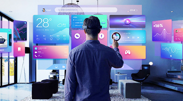
With digital products evolving rapidly, UI (user interface) and UE/UX (user experience) design have long moved beyond superficial debates over “flat versus skeuomorphic design.” False trends that exist only in speculative concept mockups and sacrifice readability for flashy visuals will quickly be rejected by the market. What businesses should actually adopt in product upgrades and website redesigns are the following 4 practical trends that directly improve conversion efficiency and collaboration with development:
1. Trend one: Bento grids become the best solution for presenting complex information
Whether for technology hardware launches, SaaS feature overviews, or corporate website capability presentations, the Bento Grid—an asymmetric grid of rounded rectangles inspired by the compartments of Japanese bento boxes has become the dominant approach. It packages video demonstrations, key growth metrics, miniature interface previews, and short descriptions into modules of varied sizes with precisely aligned outer edges. This creates a strong sense of order on desktop and naturally breaks down into a single-column stream of cards on mobile, fully resolving cluttered layouts when presenting multiple selling points at once.
2. Trend two: moving from text-only chat boxes toward “generative structured interfaces (Generative UI)”
As AI becomes deeply integrated into enterprise and consumer applications, future UE design will no longer make users struggle to invent a prompt in front of an empty input box. Instead, systems will use the current task context to dynamically generate hybrid interfaces containing quick filters, interactive charts, real-time comparison cards, and one-click action buttons, substantially lowering the effort required for users to express their needs and take action.
3. Trend three: Design Tokens drive systematic “design-as-code” collaboration
In medium-to-large projects delivered by JVDS, Figma color, font size, corner radius, and spacing variables (Variables / Design Tokens) map directly one-to-one to front-end CSS variables and Tailwind configuration. Whether switching between dark/light modes or extending themes across multiple brands, designs and front-end code can remain perfectly synchronized.
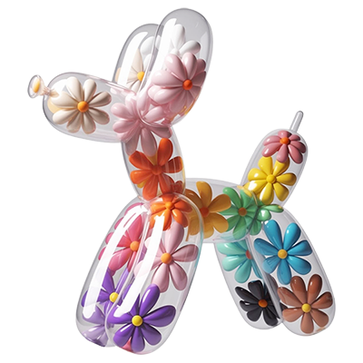
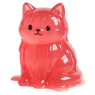
4. Trend four: “lightweight 3D and micro-animations” combine expressive visuals with high performance
Move away from the heavy full-screen videos of the past and use WebP/AVIF frame sequences, Rive state machine animations, and restrained local 3D focal elements instead. These give interfaces subtle depth and physical feedback while ensuring the first screen loads rapidly within 1.5 seconds.