After investing heavily in a custom website with modern visuals and a clear structure, many B2B companies find that their conversion rate from “website visit → inquiry submission” improves significantly, but their close rate from “initial conversation → moving toward a signed contract” does not keep pace.
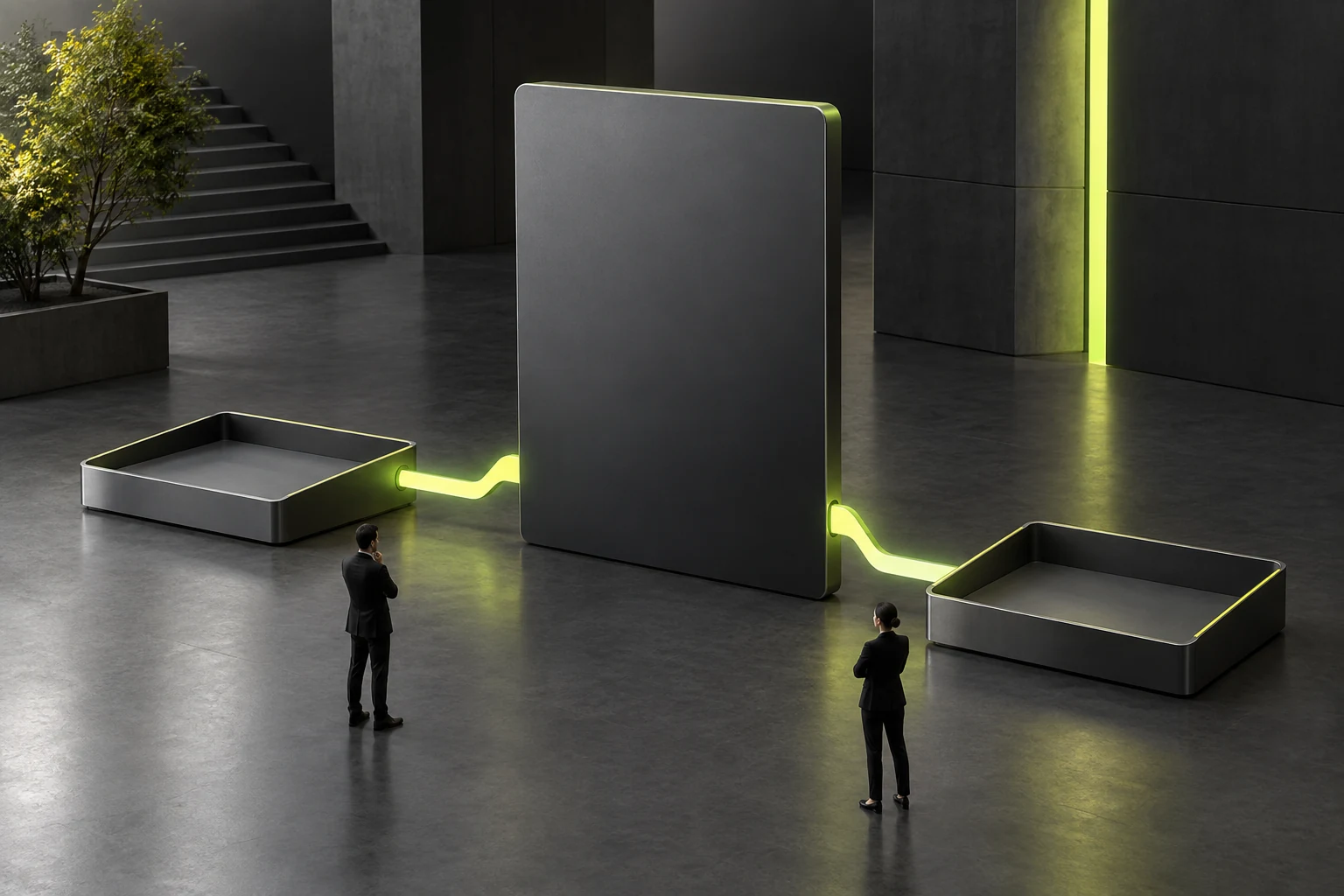
The cause is often a severe “Touchpoint Disconnect”: on the website, the customer sees an international technology company that is minimalist, restrained, and rigorous in its engineering. Full of expectations, they scan a code to add a sales consultant or open the first email, only to encounter a blurry, distorted personal landscape photo as a WeChat avatar, a Word quotation cobbled together from a flashy template from ten years ago, and disorganized, overly casual follow-up questions. This gap instantly makes customers wonder: “Was your website just dressed up by an outside agency? Your actual team is nowhere near as professional as the website claims!”

1. Beyond the website: 5 crucial follow-up touchpoints that complete the customer trust journey
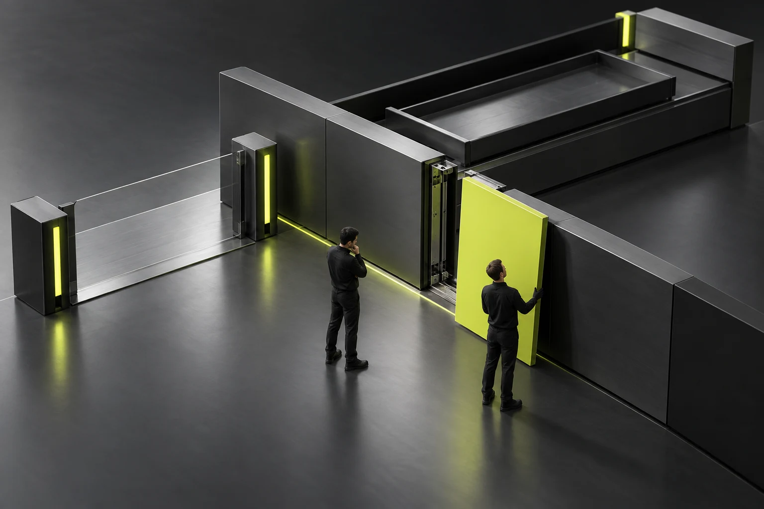
In JVDS's brand delivery across all touchpoints, we recommend aligning the visual and communication standards of the following 5 sales touchpoints while upgrading the website:
- The first automated email / SMS after form submission: avoid merely displaying a cold “Submitted successfully.” Also send a beautifully formatted branded confirmation email to the customer, containing a summary of the requirements received, an expected response time (such as within 2 hours during business hours), and a “Company Introduction and Selected Case Studies PDF” to read in advance.
- The WeCom / business card presentation of sales and presales consultants: consistently configure external WeCom business card backgrounds with the standard brand background color and a clear logo, professional headshots or standardized branded avatars, and a structured welcome message when first adding a contact (proactively confirming which business section the customer viewed on the website).
- The “Company Introduction Deck” and “Product Solution Brief” sent externally: retire old PPT files cobbled together internally, and ensure that every PDF briefing sent by sales shares 100% of the new website's visual language in its fonts, colors, grid spacing, and case study images.
- The professionalism of quotations and requirements assessment forms: if the website promises “transparent, module-by-module assessment,” quotations sent to customers must never contain only a vague bundled total. Instead, they should use standard branded headers and clearly list the work phases, detailed deliverables, schedule, and the limits of the underlying assumptions.
- Online meeting backgrounds and presentation environments: when presenting remotely through Tencent Meeting, Feishu, or Google Meet, consistently use a restrained branded virtual background or a tidy meeting room setting to maintain professionalism throughout.