At almost every kickoff meeting for a brand design or corporate website project, when asked “What impression do you want your brand to convey to customers?”, 90% of business leaders offer the same words: “Professional, reliable, international, technological, premium, and impressive.”

There is nothing wrong with these words themselves, but for designers they describe “outcomes that cannot be judged directly as right or wrong”: “professional and reliable” for Swiss precision medical equipment means a pure white background, fine black grids, and rigorous specification numbering. For heavy mining machinery, it means high-contrast deep charcoal, industrial yellow diagonal stripes, and powerful heavy sans-serif type. Unless these abstract adjectives are translated in advance into specific visual and content criteria, the initial design review will inevitably descend into a subjective tug-of-war over “I don't think it looks impressive enough.”
1. A reference table for translating abstract adjectives into “visual criteria that can be assessed”
During JVDS's initial briefing stage, we guide clients through the following four dimensions to make “professional and reliable” concrete:
| The client's abstract wording | Business-context questions requiring further clarification | Translated visual and content implementation criteria |
|---|---|---|
| “It needs to look professional and reliable” | What evidence primarily leads your customers to trust you? (Laboratory test data, engineers' qualifications, or failure-rate records accumulated over many years?) | Visual restraint + evidence up front: prohibit flashy gradients and cartoon illustrations; use strict 12-column grid alignment and tabular numerals, placing certification badges, measured-data charts, and actual engineering drawings at the visual center |
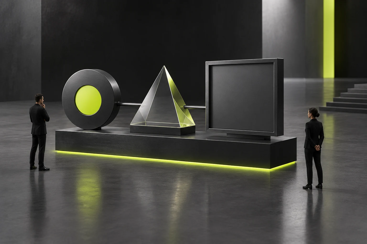
| “It needs to feel technological / modern” | Do you mean the sharp, pioneering feel of a cutting-edge laboratory (such as AI algorithms/chips), or an approachable technological feel close to everyday life (such as smart homes/healthcare)? | The former: dark/high-contrast interfaces, subtly glowing geometric borders, and code and architecture-node visuals; the latter: bright whitespace, softly rounded containers, clear glassmorphic layers, and natural light and shadow |
| “It needs to feel international / not dated or provincial” | Which 3 European, American, or industry-leading brands are your main benchmarks? Which practices on traditional competitors' websites do you dislike most? | Create a list of Don'ts: explicitly prohibit obviously composited handshake-and-globe imagery, bright red and gold promotional banners, and dense text with no whitespace; adopt a fluid type scale that matches overseas reading habits |
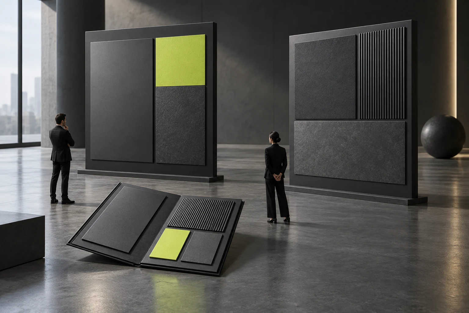
2. Define the aesthetic range with “3 reference images you like + 3 examples you would never accept”
Verbal descriptions are often interpreted differently. Before design begins, the client and provider can review 6 actual websites or brand cases together and make specific observations such as “I like the whitespace and type proportions here, but not the excessively cold black background.” In just 30 minutes, this aligns their understanding of those abstract adjectives.