

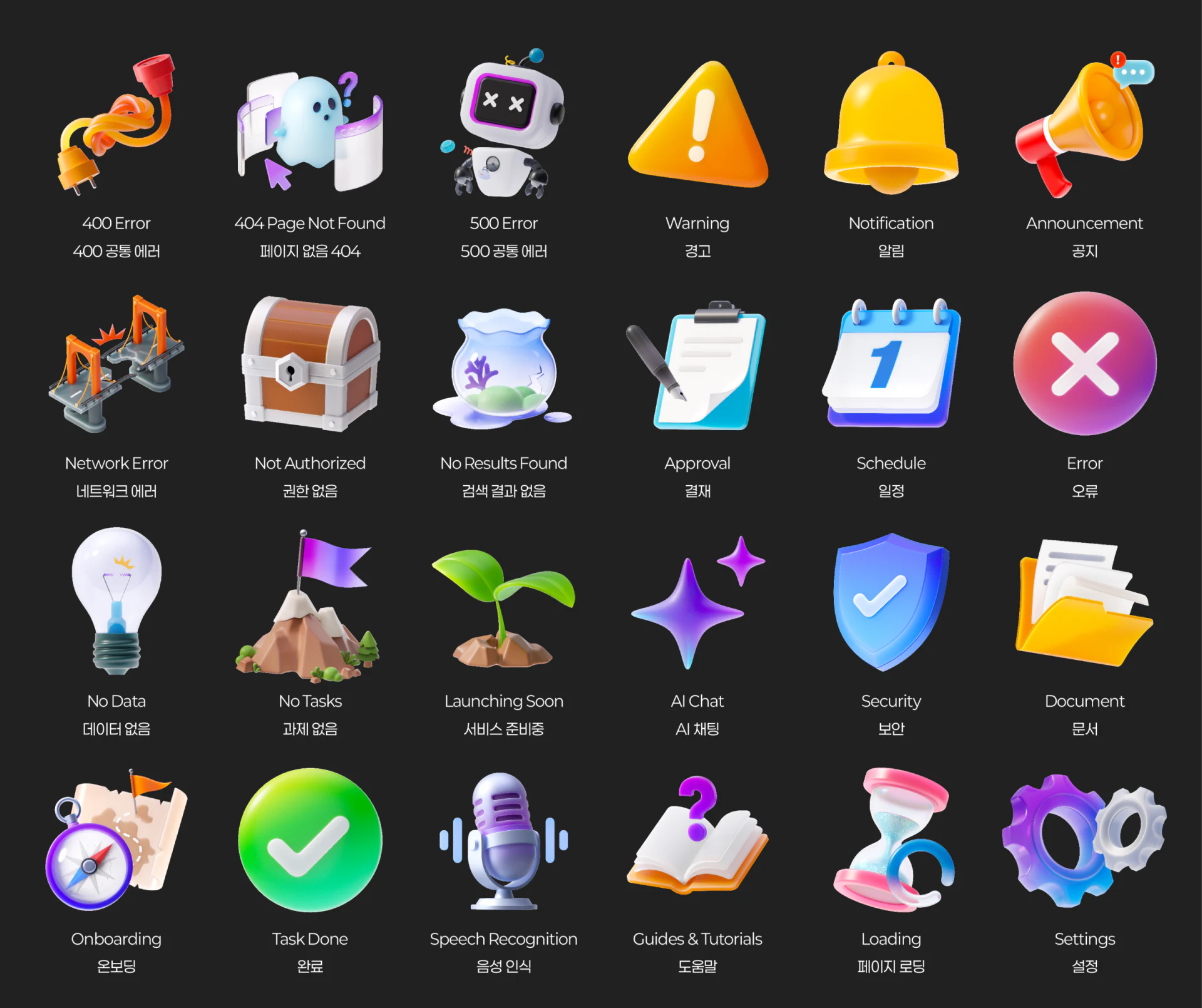
In recent years, as rendering technology and hardware performance have improved, 3D Status Icons with rounded forms, translucent materials, and soft lighting have become common in smart-vehicle HMI interfaces, financial apps, and enterprise SaaS platforms. In practice, however, some teams prioritize visual technique over meaning. A designer may spend days rendering an attractive geometric model, only for users to remain unsure whether it means “network disconnected,” “no data,” or “restricted access.”
1. Why can 3D icons not explain everything on their own?
Unlike flat line icons such as a standard magnifying glass or trash can, 3D icons often involve strong brand metaphors and artistic distortion. Without text, the same translucent sphere or exclamation-mark model can mean different things in different business contexts. Mature design systems such as Hyundai Auto Ever follow a central principle: the image establishes the emotional tone and general state, while the label and guidance specify the task:
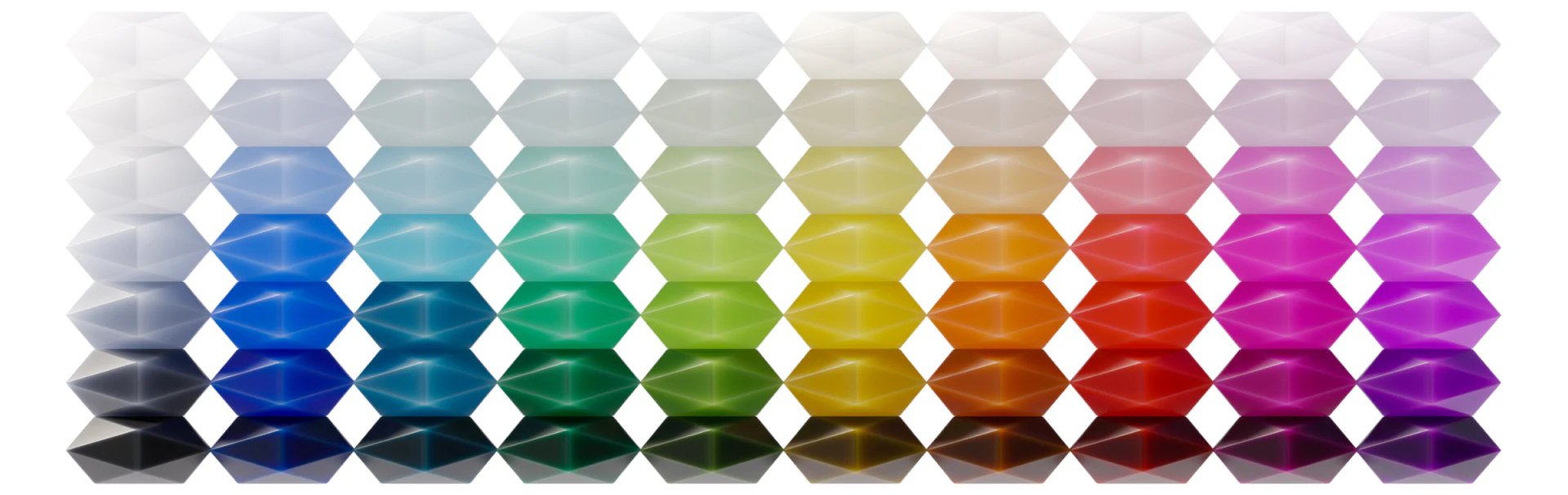
- Distinguish the nature of the state through color and material: Use translucent cool tones or neutral gray for an Empty State or no records; warm orange and amber materials for warnings or items needing attention; and bright green or a primary brand color for a successfully completed process.
- Always pair the icon with structured three-part copy below it: Every 3D status icon should be immediately followed by (1) a status heading explaining what has happened, (2) a reason explaining why, and (3) a next-action button such as “Reload” or “Create Your First Project.”
2. Managing 3D icon performance and consistency across interfaces and devices
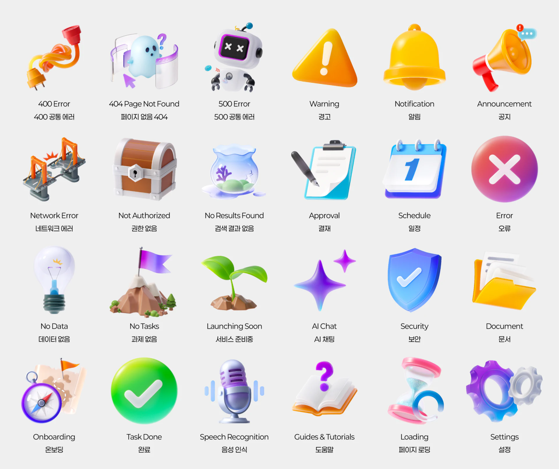
When handing 3D status icons to frontend developers (see UI/UX Design Services), avoid exporting uncompressed PNG or video files several megabytes in size. Export static .webp / .avif assets at multiple pixel densities appropriate to the container, or use lightweight Lottie / Rive skeletal animation. Ensure all 3D icons on the site share the same lighting angle, such as a key light at 45° from the upper left, perspective focal length, and material reflectance, so they do not look like a collection of unrelated assets.

















