
Creator communities, art-curation platforms, and design agency portfolio sites share a branding challenge: the platform must display hundreds or thousands of user-generated works (UGC) in radically different styles, from minimal black-and-white lines to saturated cyberpunk illustrations and animated 3D imagery. If the platform's own colors are too strong, they compete with the creators' work. If the platform has no visual character at all, it becomes an indistinct image-storage site.
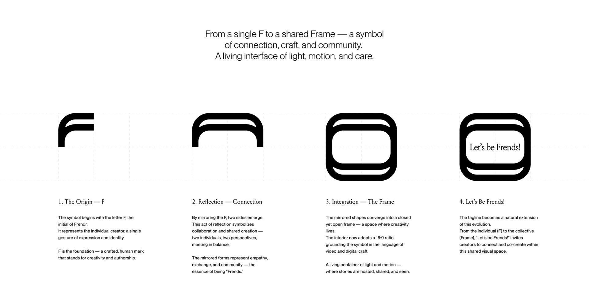
1. Extend the logo into a signature frame
Brand identity systems such as the creator platform Frendr show an effective way to reconcile diversity and consistency: carry the brand's core identity into the outer containers and layout structure that hold the work, rather than forcing filters onto the work itself:
- Extend a consistent geometric vocabulary: Extract key proportions from the main brand mark, such as a corner in the letter F or a rounded rectangle with a particular curvature. Translate these into consistent corner guidelines for card borders, avatar masks, tag buttons, and modal containers.
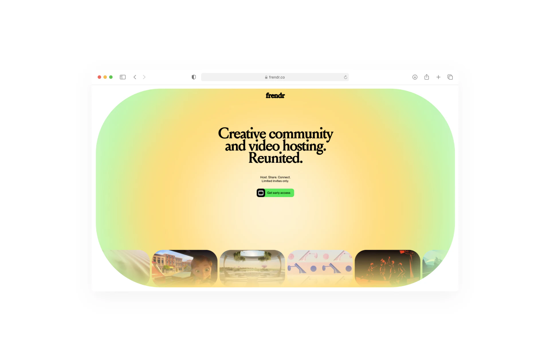
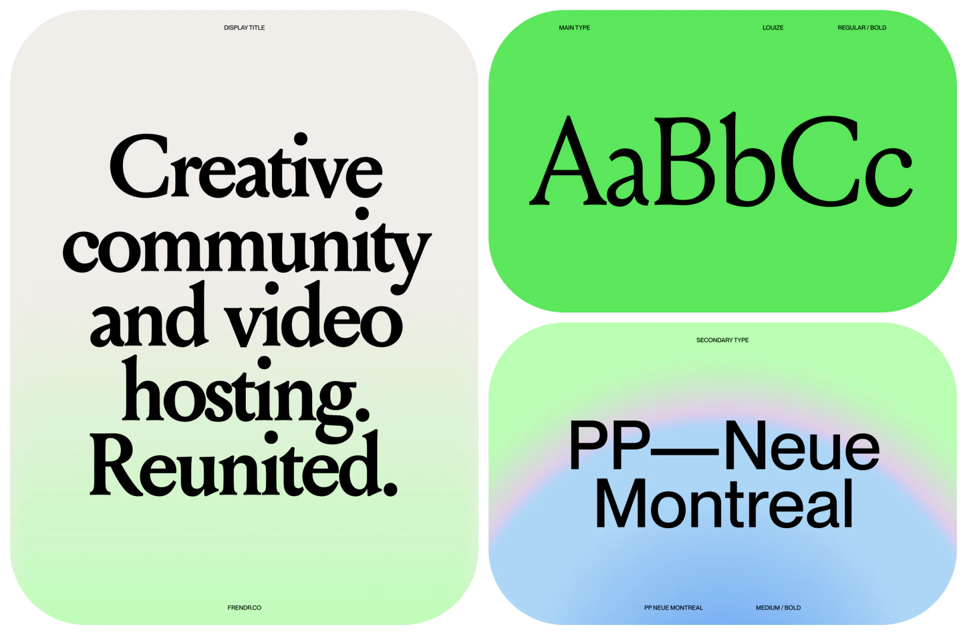
- Reserve primary brand colors for non-content areas and key touchpoints: The homepage introduction, Early Access signup page, and empty states can use distinctive gradients, such as yellow-green, and large serif headings to express the community's attitude. Once visitors enter the gallery, the background should recede to restrained white or dark gray, giving 100% of the visual color space back to the work.
2. Give varied content a consistent framework for reading metadata
Alongside the outer shapes, consistent grid spacing and metadata arrangements beneath cards—creator avatars, work titles, category tags, interaction counts, and their type sizes and alignment—form an invisible gallery frame. Whatever happens inside each thumbnail, the surrounding order stays stable. This is also a central approach at JVDS when planning brand identity and website design.

















