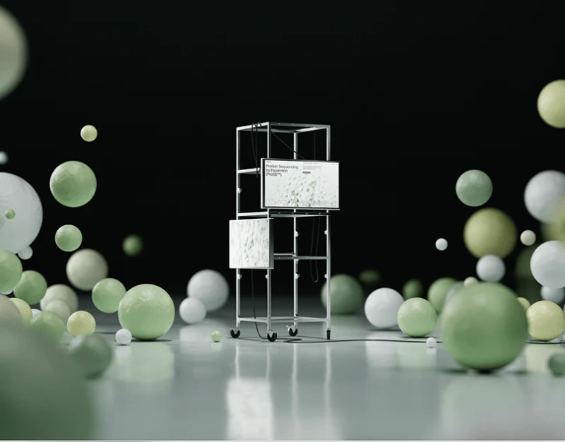
Glyphic’s biotechnology website design combines pale-green spheres, white space and black words for a light scientific atmosphere. Technology is named first, then three steps sit beside structural graphics. Visual attraction and specific entries for asking about principles coexist.
Key takeaways
- Technology names establish the topic before graphics; steps offer further questions.
- Unselected gray steps and job summaries need readability, with further viewing tied to current objects.
A large technology name gives spheres a subject
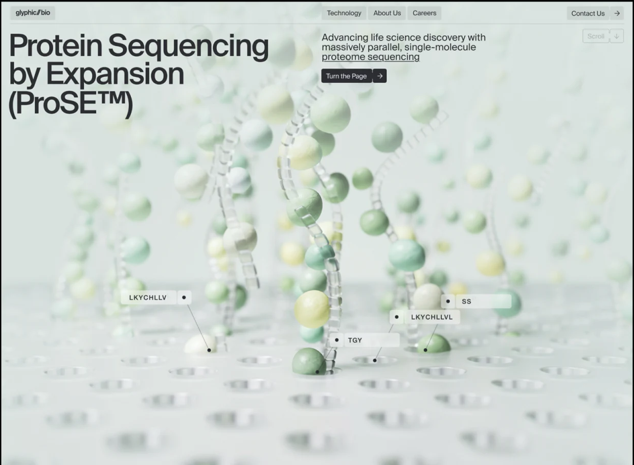
Protein Sequencing by Expansion runs in large lines upper left, with a short explanation and Turn the Page right. Pale-green and white spheres fill lower space with node labels. Rich imagery leaves the name as the clearest text focus.
This suits naming a topic before attracting interest through graphics. Short Technology, About Us and Careers navigation keeps professional reading separate from company discovery.
JVDS checks for further readable content beside images. Spheres are presentation forms and are not interpreted here as scientific models or experiments. Principles, accuracy and uses need corresponding material rather than imagined from pictures.
Three steps make change describable
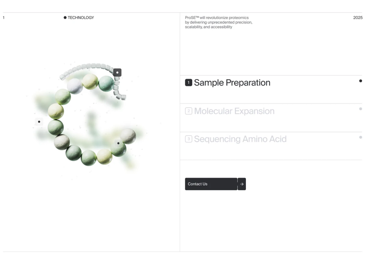
How it Works places a ring structure left and Sample Preparation, Molecular Expansion and Sequencing Amino Acid right. Numbers and end dots establish order across two balanced areas.
Steps support questions about individual stages more directly than a continuous diagram. Selection should synchronize graphic, title and explanation and persist on return rather than restart at step one.
The first entry is black while two are very pale and resemble disabled states. Keep all accessible names readable, with independent selection markers. JVDS favors different states for unselected and unavailable rather than one gray level.
Recruitment changes tasks but retains summaries and details
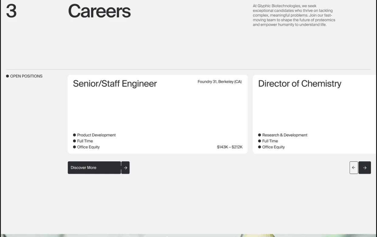
Open Positions sits beside two white job cards, with names above work type and format and Discover More and arrows nearby outside. Broad space reduces density and makes names scannable.
Recruitment need not enter the technology process. Roles, location, format and detailed scope should correspond, with further viewing tied to the current job. Horizontal cards aid comparison, while mobile still needs complete long names.
JVDS would share layout rules across steps and job summaries while retaining object identities. Dimensional imagery can preserve atmosphere; concrete wording answers subsequent questions rather than sending everything to generic contact.
Frequently asked questions
Must scientific websites use complex 3D animation?
Graphics attract interest, while names and steps explain reading objects. More complex forms need short, concrete explanation entries.
Design review checklist
- Distinguish unselected from inaccessible steps.
- Match further job viewing to the current name.
Connect professional themes to readable explanations
If your technology or research site combines visual themes with principles, team and recruitment, start with core reading questions.
JVDS provides UI/UX design and website design and development. We can work through page content, interface structure and implementation needs together.