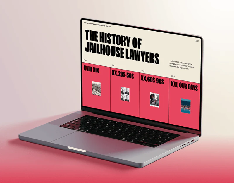
Jailhouse Lawyers avoids museum-like gentle small type, opening with compressed black headings and red chapters. Newspaper collages, green profiles, and black cases then change the rhythm. Distinctive form needs content structure to connect eras, people, cases, and data, showing where each material belongs in the narrative.
Key takeaways
- Shared era rows establish chronology; chapter themes could guide entry choices.
- Newspapers, people, and cases vary backgrounds and scales while retaining heading language.
- Chart notes add narrative points; units, periods, and source scope still need correspondence.
Four era cards follow a strong heading
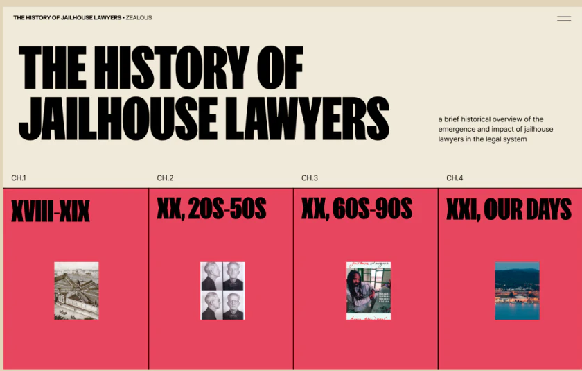
The History of Jailhouse Lawyers uses heavy condensed type across two broad lines, contrasted with a small introduction right. CH.1–CH.4 mark the cream/red boundary, with each red card naming an era and showing a small image. The heading establishes the whole; cards offer a route from earlier to later periods.
Shared red and fine boundaries group the periods, while images give chapters a little recognition. Eras identify when, but not each chapter’s focus in a separate phrase. Topic summaries would support chronological reading or entering through a question.
This suits a long feature whose chapters are sections of one topic. Current chapter, directory return, and adjacent chapters could remain visible while viewing material. Large type provides opening force; chapter cues maintain orientation.
Material types change the reading rhythm
Mobile newspaper imagery overlaps a person background, with Muhammad Speaks and large news headings dominant. A green page carries Richard Mayberry, introduction, and underlined material text; a black case page uses white paragraphs before a media card. Material changes space according to viewing needs rather than using identical small cards.
Collages invite an impression of sources, profiles identify a person, and cases prioritize explanation. Condensed forms, underlines, and broad backgrounds retain a common language. On green, text sits lower and needs checks of pauses between long headings and paragraphs.
JVDS prefers labels accompanying materials: name, type, time, and chapter can form a brief group. They need not dominate the collage, but return newspapers, introductions, and media to one narrative. A case media card shows play, title, and 02:06:00; playback should retain material name and control state.
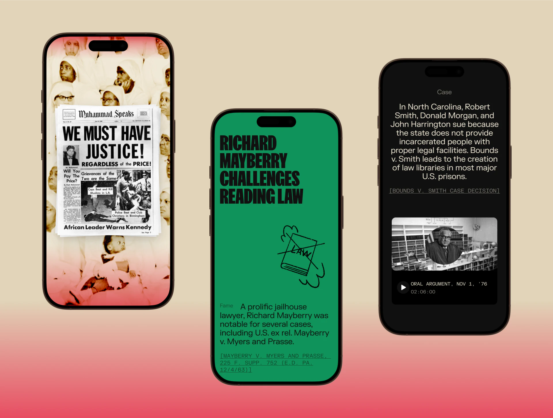
Chart notes sit beside trend points
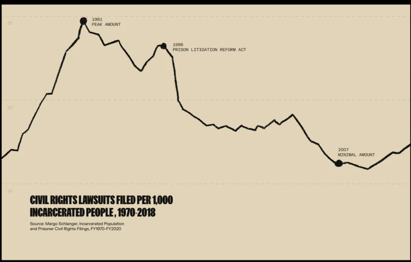
The cream chart uses a heavy black line, dots, and notes at 1981, 1996, and 2007. Left ticks and horizontal rules are faint. The line comes first, with selected annotations bringing points into the story beyond an unexplained trend.
The bottom title describes civil-rights lawsuits per thousand incarcerated people over 1970–2018, while the source line says FY1970–FY2020. Display and source coverage may differ, but their meanings need explanation. Pale ticks and incomplete horizontal years also make precise lookup harder than reading the overall shape.
Charts can summarize a narrative section while details retain metric definitions, time, and record scope. Selected annotations are not the whole explanation; body or interaction could explain their selection alongside stable axes and units. Visual strength and source reading can then support one another.
Frequently asked questions
Must historical chapters follow eras?
Chronology is a clear main line and can coexist with topic summaries. Knowing both period and discussion supports sequential reading and question-led browsing.
Design review checklist
- Add topic summaries to eras and retain chapter position and return routes.
- Bring people, newspapers, and media into the story with type and time labels.
- Check units, displayed periods, source scope, and axis readability.
Connect feature visuals with source reading
If a historical or cultural feature needs eras, archives, and multimedia, JVDS Design Studio can help with UI/UX design, website design, and development, organizing chapters, labels, and chart hierarchy.
Begin with existing materials and the narrative outline to discuss suitable viewing and reading formats.