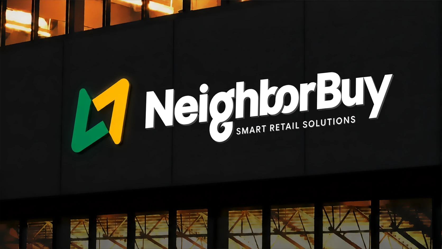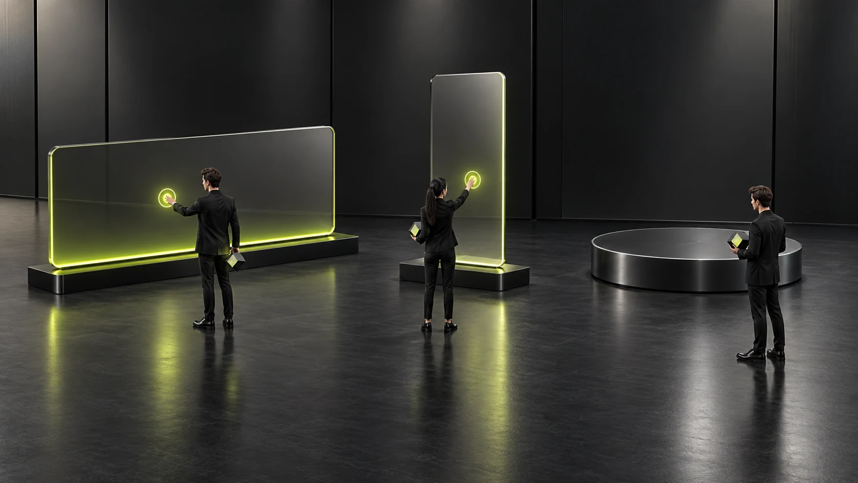
In brand visual presentations, a 5-second 3D logo reveal animation featuring flowing light and grand sound effects often generates the most excitement among decision-makers in the room. Yet from the perspective of rational business budgeting, many companies buy an animated intro, show it once on the big screen at their annual gathering, and then have no idea where to use it in everyday work. Some even force an 8MB animated logo video into the first screen of their website as a loading animation, making visitors watch 3 seconds of animation every time they open the page and sending bounce rates soaring.
1. Check these 3 frequent touchpoints before deciding to invest in an animated identity
| Intended business touchpoint | Is an animated logo worth producing? | Recommended duration and technical format specifications |
|---|---|---|
| 1. Product demonstration videos on corporate WeChat Channels / Douyin / YouTube accounts | Very worthwhile (a frequent, essential need) | Keep it within 1.5–2.5 seconds; never place it at the start of a short video (the first 3 seconds must get straight to the point to retain viewers). Instead, use it as an outro bumper with branded sound effects, and supply .mov / .mp4 templates with an alpha channel for editors to drag directly into their timelines |
| 2. LED screens at trade shows and exhibition hall standby displays | Worthwhile (strong attention-grabbing effect) | A 5–10-second seamless loop; in a noisy exhibition hall, rhythmically animated brand graphics and key messages are more likely than a purely static backdrop to make passing visitors stop |
| 3. Website navigation corner marks and mobile app launch screens | Only extremely lightweight micro-animations | 0.6–1.2 seconds; large video files are strictly prohibited. Use vector-based Lottie (.json) or CSS/SVG animation (keep the file at or below 30KB), and do not block the rendering of the page's main content |
2. Every animated identity must begin with a solid “static freeze-frame”
Motion design extends a static identity system rather than replacing it. If a logo looks structurally weak or unrecognizable in static black-and-white print, on a fax, or as a small 24px icon, flashy particle effects will not rescue it. First refine the static symbol and logotype, then create a crisp 2-second animated end card tailored to the real video touchpoints above. That is the most cost-effective investment.