
Design Insights
Explore case studies, design methods and practical insights across UI design, user experience, brand identity and website development.
All Insights
 Interface Design
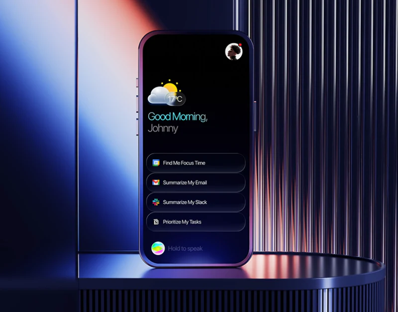
Team AI Assistant Interface: Channel Before Sending
JVDS reviews a team assistant’s summary, draft and feedback, checking channel, content and consistent sending status.
 Interface Design
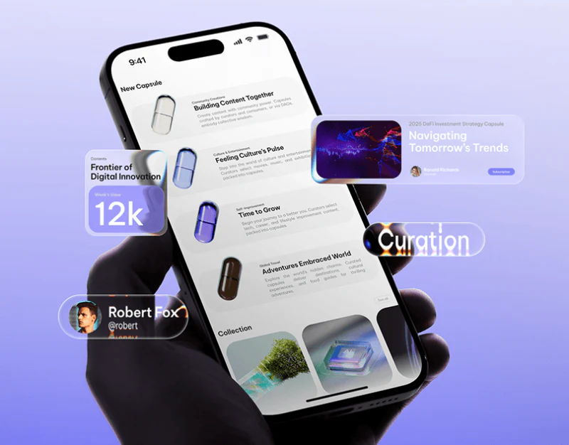
Content Platform Brand Design: Capsules and Category Text
How should brand identity systems be designed for multichannel content platforms, knowledge communities, digital publishing, and education portals? Drawing on design experience including the EDUCARE campus portal, this article explains how “capsule-shaped containers + highly recognizable category labels” can establish…
 Interface Design
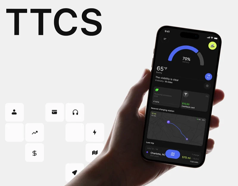
Charging Station App Interface Design: Routes and Bills
A review of TTCS’s battery home, station bookings, route conditions, and payment history, examining charging journeys and identifiable service records.
 Interface Design
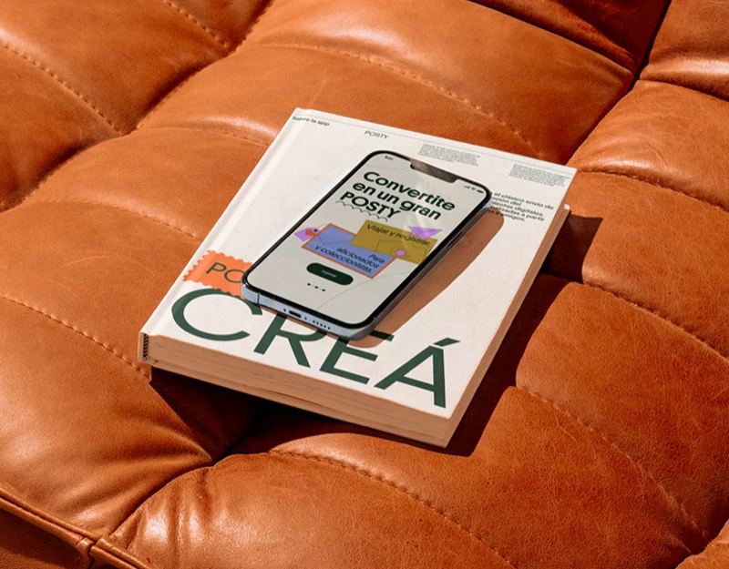
Postcard App Interface Design: Create Then Send
JVDS reviews POSTY’s map, creation flow and contacts, separating finished work, recipient choice and sending status.
 Interface Design
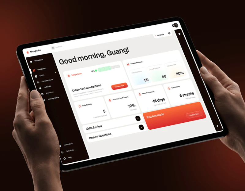
Learning Platform Interface Design: Tasks Before Settings
JVDS reviews Miyagi’s daily focus, practice modes, filters, and assistant, examining clear task choices and the conditions that shape each session.
 Interface Design
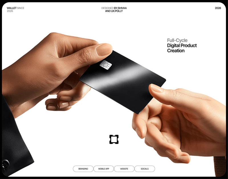
Digital Wallet Interface Design: Name the Actions
JVDS reviews Vare’s labeled Request and Send controls, recipient and unit visibility, and focused credential screen, examining clarity in a dark wallet.
 Interface Design
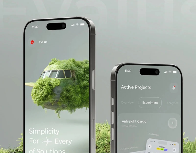
Experiment Platform Interface Design: Results in Gray-Green
A review of an experiment-analysis concept’s summaries, variant comparison, and score scale, examining gray-green materials and readable result context.
 Interface Design
Security Product Website Design: Guardbase’s Modules
Guardbase’s blue dot field, result examples and 404 recovery page show how a technical product organizes explanations.
 Interface Design
Dental Workspace Interface Design: Tools Near the Model
A pale-blue dental workspace divides parameters, tools, and views around the model, with task identity connecting editing to business summaries.
 Interface Design
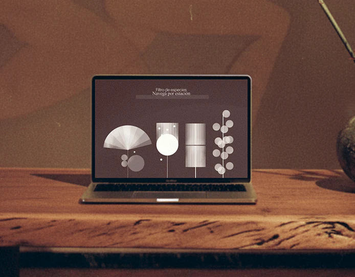
Art Course Platform Interface Design: From Map to Practice
HANAMI’s winter course map, arrangement diagrams, and preparation lessons show how themed navigation can connect course finding with practical steps.
 Interface Design
Personal Finance Website Design: Receipts to Plans
Nuvance connects receipt examples, three plans and contact choices, combining blue emphasis with detailed feature comparison.
 Interface Design
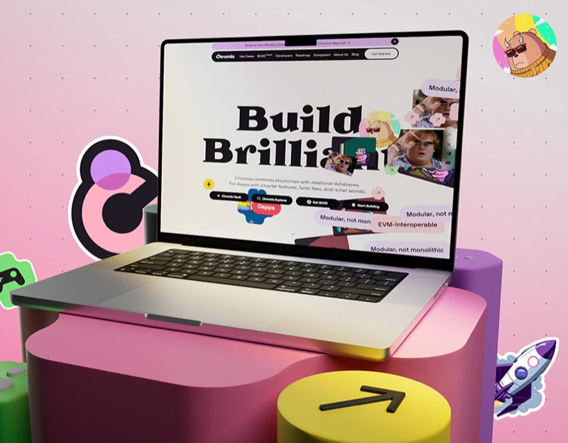
Blockchain Website Design: Tasks Beyond the Stickers
Chromia’s colorful stickers establish identity, while task buttons, roadmap nodes and data legends provide distinct ways to continue.
 Interface Design
Parking Platform Interface Design: Spots and Sessions
JVDS reviews Voltera’s parking cards, vehicle scenes, and charging summaries, examining comparable conditions and distinct candidate and active states.
 Interface Design
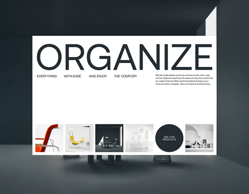
Furniture Brand Website Design: Möbel’s Viewing Distances
Möbel’s large-type hero, categories, and chair details reveal different viewing distances for furniture, from space to object to material.
 Interface Design
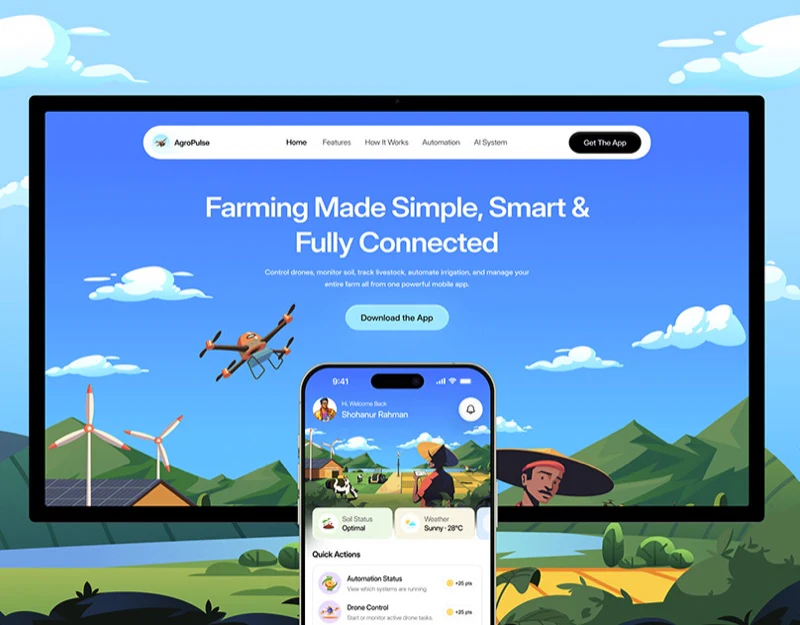
Agricultural App Design: Put Equipment Back on the Farm
AgroPulse’s farm illustrations, equipment cards, and task pages show how scenes and named areas make agricultural technology understandable.
 Interface Design
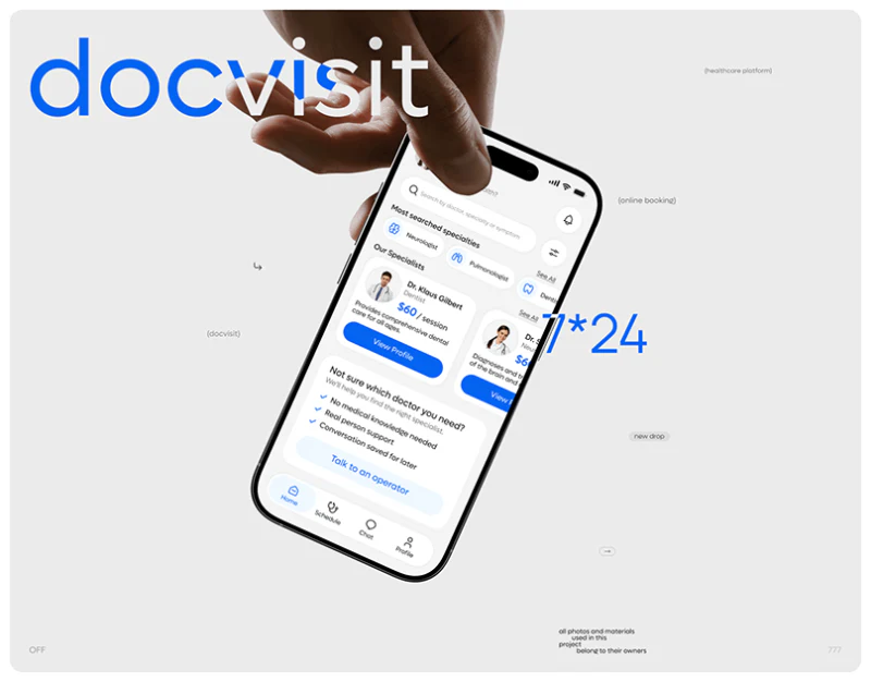
Doctor Appointment App Design: DocVisit’s Two Starts
A review of DocVisit’s specialty search, human assistance, doctor details, time choices, and appointment states, examining two routes into booking.
 Interface Design
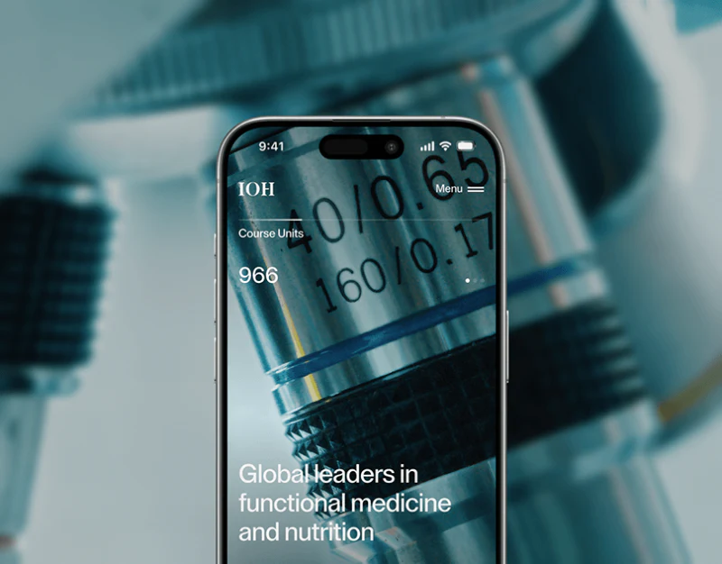
Health Education Website Design: Course to Application
JVDS reviews IOH’s course imagery, conditions, application steps and contact page, focusing on the information needed to continue.
 Interface Design
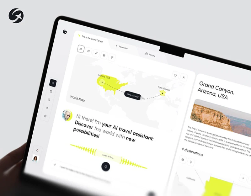
AI Travel Assistant Interface Design: Requests to Places
A review of Geovea’s voice waveform, text input, yellow regional map, and destination cards, examining how conversation becomes browsable places.
 Interface Design
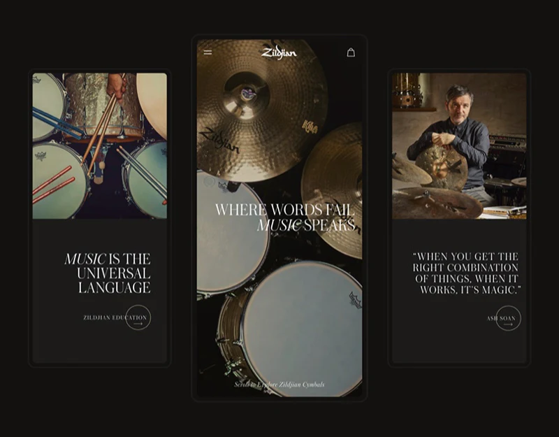
Musical Instrument Store Design: Three Kinds of Options
A music store uses one selection rhythm for diameters, color swatches, and clothing sizes, retaining category differences through checkout.
 Interface Design
Fashion Store Interface Design: R3’s Outfit Photography
R3’s outfit grid, alphabetical store index and yellow size selection divide photography and text tools within a dark fashion store.
 Branding
Waist-to-Hip Ratio in Character Design: Understanding Proportion Without Turning Numbers into Beauty Standards
Understand waist-to-hip ratio research and its limits, then build believable, inclusive brand characters through role fit, clothing drape and natural movement.
 Interface Design
The Von Restorff Effect: Why Distinctive Content Is Easier to Remember
Apply the Von Restorff effect to interface focus, pricing cards, calls to action and alerts while avoiding competing emphasis and notification fatigue.
 User Experience
Wayfinding and Navigation Design: Helping Users Recognize Their Location, Route and Destination
Design coherent navigation through orientation, route selection, progress confirmation and destination recognition, with breadcrumbs and practical recovery paths.
 Branding
Wabi-Sabi Design: Preserve Natural Character Without Mistaking Roughness for Beauty
Explore wabi-sabi in digital branding through natural materials, precise layout, careful maintenance and accessible interfaces, without confusing patina with neglect.
 User Experience
The Weakest Link: How Controlled Local Failure Can Protect an Entire System
Apply sacrificial design to digital resilience with circuit breakers, draft recovery, graceful degradation and row-level error isolation that protect essential work.
 Interface Design
Interface Visibility: Make System Status, Available Actions and Results Clear
Design clear status feedback for enterprise interfaces, distinguish requests from completed results, and explain progress, permissions, synchronization and recovery.
 Branding
The Uncanny Valley: Choosing an Approachable Style for Digital Humans and Brand Characters
Explore the uncanny valley, stylized avatars, retail mannequins, and a safe-peak approach to designing useful, approachable AI and brand characters.
 User Experience
Does Measurement Change the Results? Reducing Interference in User Research and Performance Testing
Understand measurement interference in usability studies and software monitoring, from leading questions to logging overhead and adaptive sampling.
 Branding
The Veblen Effect: Why Higher Prices Can Increase Desire and What Brands Should Communicate
Explore the Veblen effect in premium branding, including craftsmanship, social signals, restrained visual design and evidence that supports a higher price.
 User Experience
Threat Detection in Design: Capturing Attention Without Creating Alert Fatigue
Understand threat cues, attention capture, and alert fatigue, with a risk-aligned approach to visual warnings, brand imagery, and interface states.









