
Design Insights
Explore case studies, design methods and practical insights across UI design, user experience, brand identity and website development.
All Insights
 Interface Design
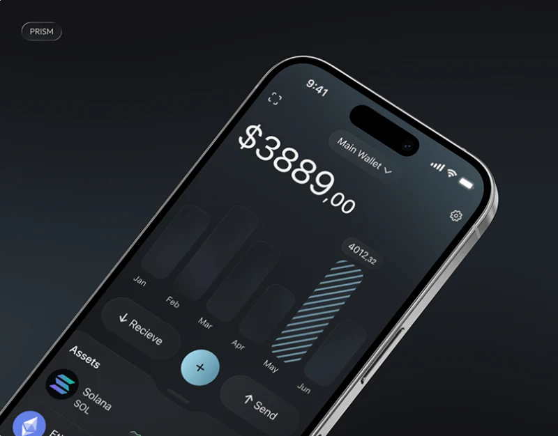
Asset Wallet Information Hierarchy Design: PRISM’s Numbers
PRISM separates asset balances, environmental charts, mission rewards and assistant entries within one dark visual system.
 Interface Design
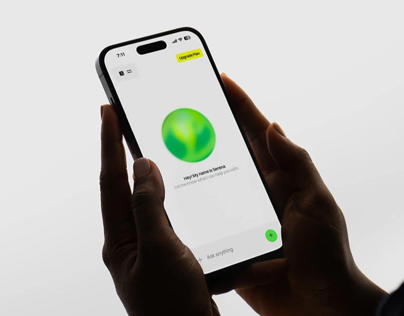
Agricultural AI Assistant Interface Design: Identify Objects
Silo questions, invoice filing, and stock details show how an agricultural AI assistant can connect answers with identifiable files and facilities.
 Interface Design
Smart Ring App Design: Read the Metrics in Orange
JVDS reviews Luna’s lifestyle imagery, orange metrics, daily summaries, and activation screen, examining readable units, dates, and device/account steps.
 Interface Design
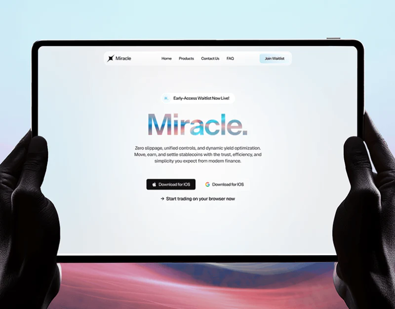
Trading Platform Website Entry Design: Access States
A review of Miracle’s waitlist, downloads, feature cards, and rewards, examining gradients alongside platform availability and explicit rules.
 Interface Design
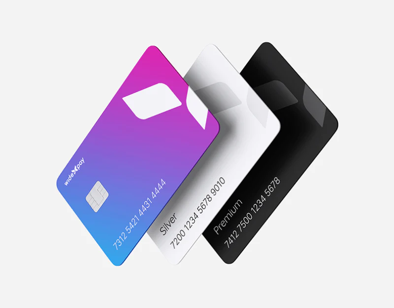
Payment Operations UI Design: Overview to Approval
Widepay’s account cards, payment choices and watch approval show how scope, transaction identity and action wording change across screens.
 Interface Design
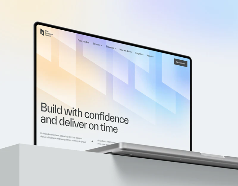
Software Service Website Design: Stable, Specific Pages
The Software House’s technical templates keep headings and inquiries stable, while each page needs specific tasks and scope.
 Interface Design
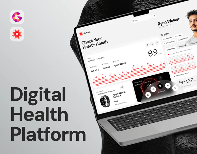
Cardiac Monitoring Interface Design: Context for Readings
Rythea’s individual records, weekly summaries, and measurement states show how health readings can retain time and source context.
 Interface Design
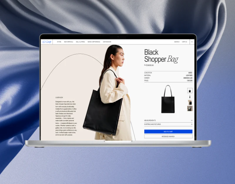
Circular Fashion Ecommerce Design: Curation and Receipts
Loop’s rental catalog, outfit selection, and cart show how editorial imagery works with receipt summaries, pricing units, and product attributes.
 Interface Design
App Brand Asset Design: Key Visuals and Icons
JVDS reviews Wink’s furry eye, white line icons, and wordmark, examining distinct roles for rich promotional imagery and everyday interface recognition.
 Interface Design
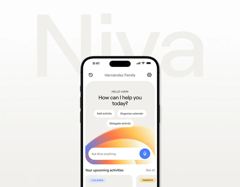
Family AI Scheduler Design: Niva’s Starts and Confirmation
A review of Niva’s three home actions, conversation categories, and calendar, examining easy expression followed by explicit dates and responsibility.
 Interface Design
Children’s English App Design: Feedback Beyond Characters
Characters change size across learning tasks, while answer judgments, dates and metric units need explicit explanations.
 Interface Design
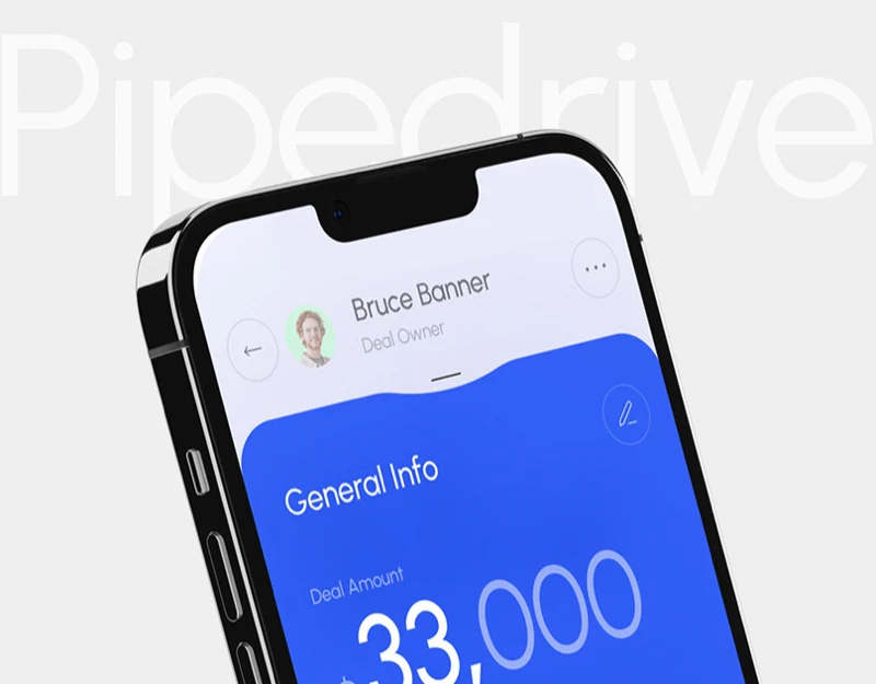
CRM Deal Detail Design: Identity, Stages, and Tasks
A review of CRM desktop themes and mobile Focus, examining deal identity, stage bars, task cards, and distinct completion actions.
 Interface Design
AI Communication Training Website Design: One Clear Practice
Speekr’s practice modules, trial and demo entries, evidence cards, and plans show how one coherent exercise can clarify the product.
 Interface Design
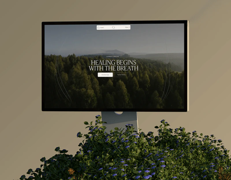
Breathwork Course Website Design: Compare Levels and Plans
Frequency’s natural imagery, training levels, and article categories show how a course website can clarify participation conditions and reading paths.
 Interface Design
Technical Brand Visual Design: GenLayer’s Form and Routes
How should visual identities be designed for foundational technology protocols, AI infrastructure, and developer tool brands? Using technology brands such as GenLayer as examples, this article explains how to turn abstract distributed architectures into an extensible geometric visual language and provide appropriate ro…
 Interface Design
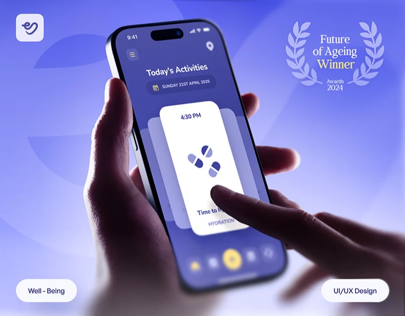
Elder Care App Design: One Reminder per Card
JVDS reviews simple meal and water reminders, record summaries and home maps, focusing on explicit times, actions and status meanings.
 Interface Design
Architectural Glass Website Design: Fluid Glass Scenes
Fluid Glass’s architectural photos, sliding-door module, and mobile process page show how scenes can lead into product inquiries.
 Interface Design
Financial Product Website Design: Distinct Entries in Blue
JVDS reviews Aurum’s account actions, platform entries, enterprise cards, and benefits, examining different tasks within a shared blue-white style.
 Interface Design
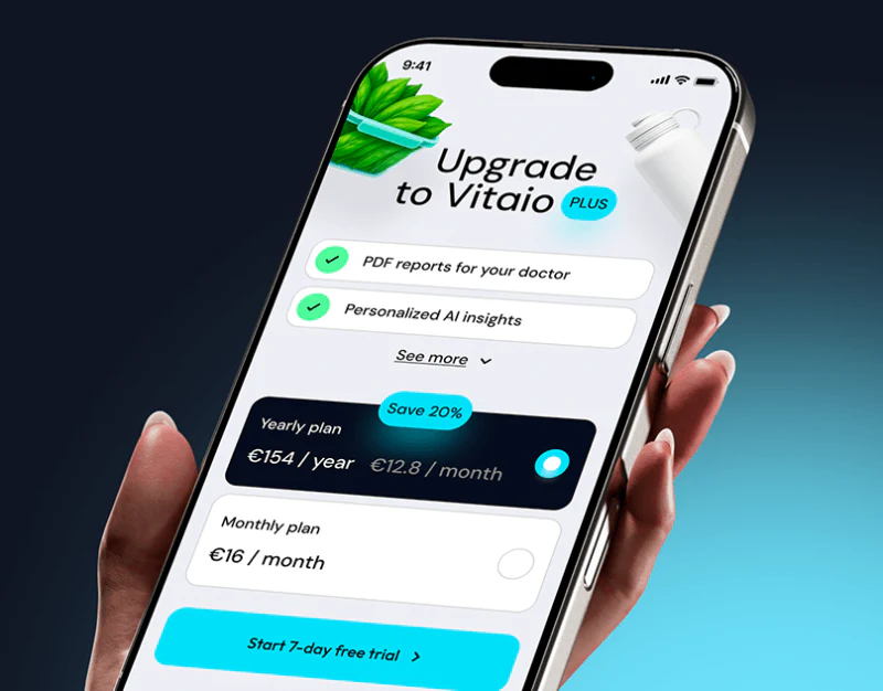
Family Health Record Design: Identity in Every Entry
JVDS reviews Vitaio’s family summaries, heart-rate fields, and tablet layouts, examining identity, time, metric meanings, and explicit sharing permissions.
 Interface Design
Data Service Website Design: Catalog to Custom Needs
BlockDB’s dark-blue pages and wireframe connect catalogs, samples, capability cards and requirement forms for professional evaluation.
 Interface Design
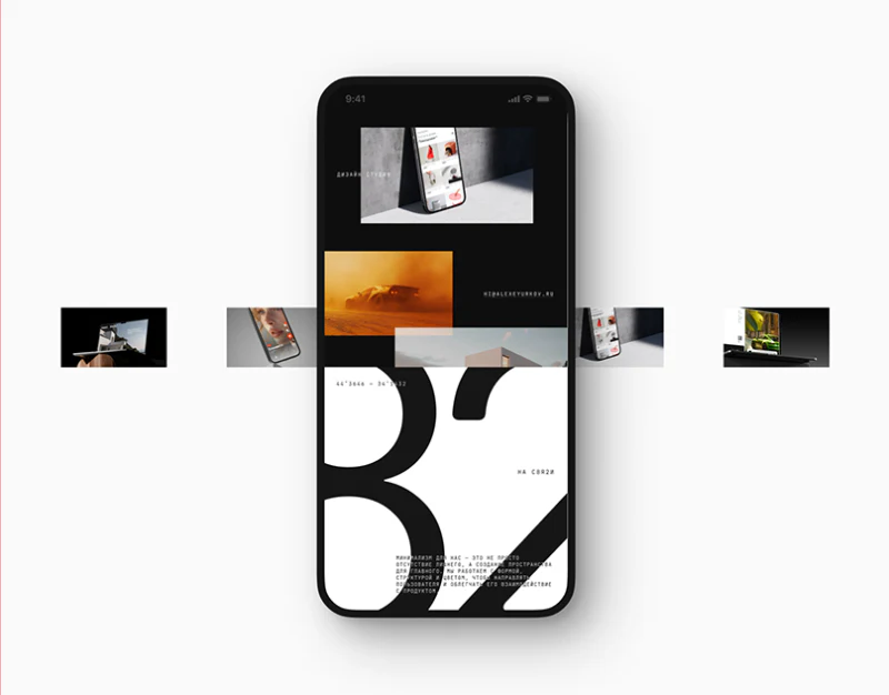
Creative Studio Website Structure: КРЕМ’s Large Type
A review of КРЕМ’s oversized mark, project summaries, and blog layouts, examining how brand expression connects with different reading needs.
 Interface Design
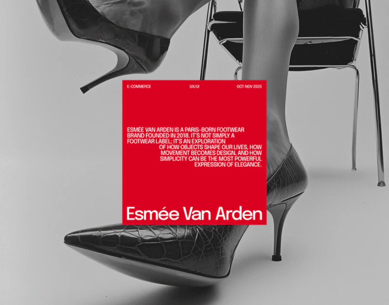
Footwear Ecommerce Size Design: Follow the Red Markers
A review of footwear catalogs, mobile and tablet details, and checkout, tracing red size states and product summaries while checking example amounts.
 Interface Design
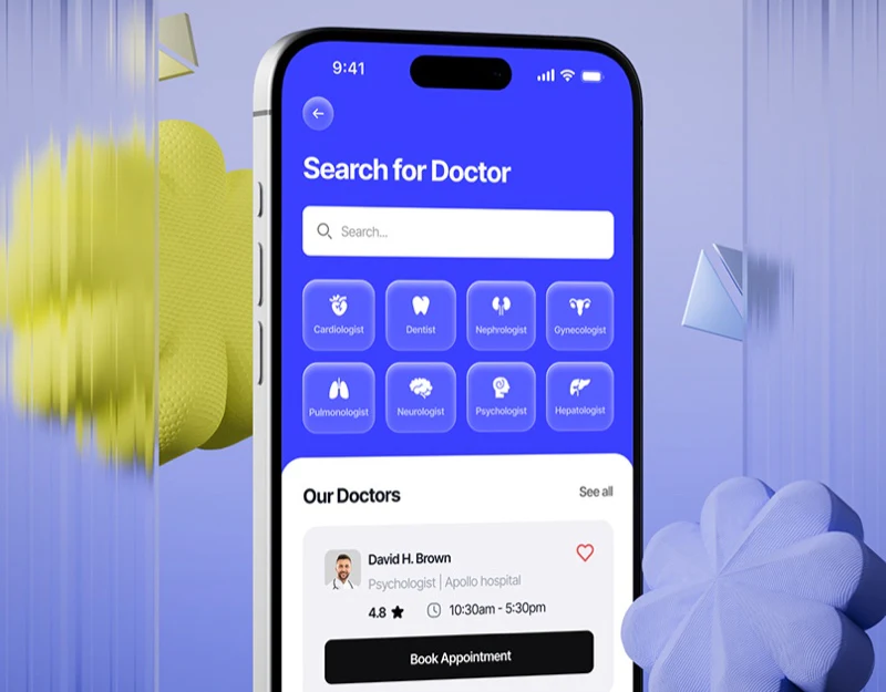
Medical Booking Interface Design: Check Doctor and Time
Blue specialty search and white doctor cards lead into dates, slots, and separate doctor, reception, and facility ratings.
 Interface Design
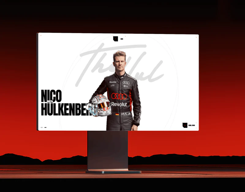
Racing Website Design: People and Technology Routes
JVDS reviews an Audi F1 concept’s portraits, long text and car details, giving people and technical lookup their own routes.
 Interface Design
AI Styling Shopping Interface: Chat, Preview, and Options
Valore’s styling dialogue, recommended cards, upload progress, and product details reveal connected choices and copy consistency problems.
 Interface Design
Outdoor Hardware Website Design: Connect Looks to Uses
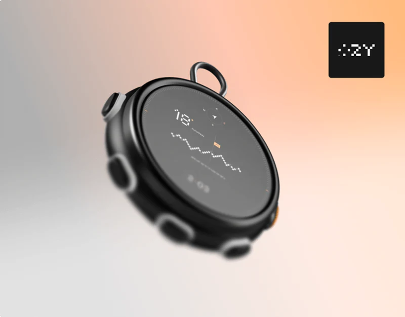
OZY’s pixel palette, device page, and in-hand scenes show how outdoor hardware branding can connect with function explanations and actions.
 Interface Design
Personal AI Automation Interface: lifeOS Task Visibility
lifeOS task settings, workflow nodes, integration permissions, and result messages show how personal automation can remain understandable.
 Interface Design
Banking App Transaction Receipt: Back to the Card
A banking app’s cards, success receipt and lock-screen notifications connect balances, card suffixes, amounts and follow-up actions.
 Interface Design
Digital Archive Exhibition Design: M6 Across Media
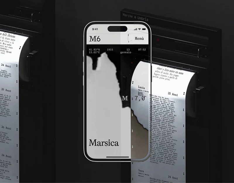
M6 links map cards and exhibition paper rolls, retaining place relationships and content identity within personal narratives.
 Interface Design
Weather App Scene Design: Changing Skies, Stable Forecasts
JVDS reviews weather characters, icon rules, and seven sky scenes, examining stable forecast positions and readability across changing backgrounds.









